1 / 23
Mar 7

Looking to share feedback on upcoming chapters?
Critique for critique!
Post your work down below for honest feedback.

My new comic is still a draft so it's on my site rather than Tapas yet. Prepping multiple chapters in advance so this is several months out, but that just means I can do more extensive rewrites if necessary.
Couple of things I'm not sure about;
- Is the fight too brief?
Didn't want to drag it out too much, keeping it to just the essentials, but would you rather see longer actions scenes?
- Is the dialogue too stilted?
Worried that my dialogue isn't natural enough while still getting across the ideas I want. Any way I can punch it up?
- Are the panels too small?
Feel like some panels are too small and cramped. Are they alright or should I go fewer per page with bigger panels? I'm not making these for a magazine or anything so it's not like I have a hard page limit, but would it make the pacing slower?

https://raichious-muffin.squarespace.com/raikiri-beta10

1° The fight
The fight doesn't seem too brief to me, it's an introductory scene where one of the characters is presumably not that important, we don't know much about the characters yet so we don't really have a reason to care yet, so keeping it short and sweet once we've got all the info we need (one character is a dumb ape, one is a powerless child, natsumi is an angel with a gun that can fight, coolio).
What i will say about your fight scene is you need to be careful of lines of action and general action direction. For example the last two squares of page 6 has Natsumi dart off towards the right of the page, ready to punch, but then the punch comes at the ape from right to left. Though that can seem logical to you because you've moved the "camera" to presumably behind Natsumi kind of like if it was a pov shot, so radically changing the direction of action when the action is supposed to flow fast can be really disorientating for readers. This is where something like the 180° rule could be good training wheels for you until you get your barings enough to learn to break that rule.

2° The Dialogue
The dialogue right at the start is kind of clunky because you're introducing things and you can kind of tell that it's stuff like "as you know bob" (i.e. characters talking about their world in very obvious open ways while explaining basic concepts that both characters already know. That being said this is not the worst case of as you know bobs i've seen so if you want to tweak it a little it'll be fine, no need for total rewrites). As you go on the dialogue gets less clunky and more peppy, occasional hiccups here and there (also ask someone good at spelling to do a pass! There's a couple of minor mispellings at the start, it really helps to get a second pair of eyes on that!)
One thing that is tangentially involved in dialogue that I will bring up: the deman/demen thing is hella confusing. Not the concept, that's easy to understand, but the near identical names. I found myself forgetting immediately which one was the humanoid ones and which one was the animalistic one. Not only is the word extremely similar, in some accents it's pronounced identically. I like the idea of the words being similar to highlight that these two species are either descended from the same thing or are actually more similar than the intro would have you believe, but it is going to be a hinderance to your audience's understanding long term if they're constantly not entirely sure if you're talking human or beast. People get confused if there's too many characters with the same starting letter to their name, this is probably pushing it.

3° Panels
After reading the intro and skimming the rest, I've yet to see a panel that seems too small. Granted I am reading on desktop so the panels are enormous compared to phone sizes, but they seem pretty close to average webtoon proportions, and the text is large enough on desktop that I'll be a comfortable read while scrolling on a phone.
I would'nt advise lowering panel number per page personnally, it looks like you're at an average of 6 panels per page which is a healthy happy medium for smaller sized formats (and is perfectly fine for larger print too). It would likely slow the pacing if you were to drag out some of the scenes onto more pages though, unless you make more things happen per panel. I'd say your pacing in general from what i've seen is pretty solid.

Good luck with the rest of the comic ^^


Here's mine if you want to check it out :3 The first chapter is about 2 years old now so it's more a general feedback type thing.

Couple of points on the first chapter.

Spotted some sentences that didn't start with a capital letter.
"he replied flatly" and "his friend replied bluntly".

Missed a few speech marks.

This one is more nitpicky, but I'd use a different descriptor here.
Comparing the woman to gold in two sentences feels kinda clunky.
Maybe, "she was a vision, a beam of light"?
I really like the line, "hair like spun gold catching the dawn" so I'd keep that, but the previous line could use something else in my opinion.

Positive talk!
Really like the way the description rhymes like a poem. Really smooth.

Solid start; I'll check out the rest in a bit.

Yeah, I was worried that would happen with the Deman/Demen thing. It's why I felt like I had to explain it in the lil' box.
There's also wild Demon, spirits called Demin, and evil ghosts called Demun.

Think I should scrap that idea entirely and come up with something else,
or can I tweek them in some way?
Not too late to change it.

Oh god yeah no that's going to get very very confusing. Even if all of your concepts are clearly explained and understandable, the naming scheme is going to kind of mess up the good work you've done in the worldbuilding. The names can have similar roots if they're linked in some way, for example anything with "hydro" in it is to do with water, but it's easy to differenciate between something hydrophobic, the discipline of hydrodynamics and hydrating.
However if the things you're naming have nothing in common other than "being intelligent life-forms, living or dead" it's usually unlikely that they have similar names because that's a very vague group. Like even Akuma and Oni are coloquially both demons in japanese folklore but their names are totally different.

Loving the painted style. Looks freaking beautiful!
I especially love the visualisation of Khay's freak out when he meets the clones.

The one thing I found off putting was the red filter between pages 12 and 18.
The scene itself felt like it was supposed to have a feeling of safety after escaping the cops, but the red gave me vibes like the ecplipse from Berserk was happening.
Not sure if that was what you were going for but it felt at odds with the scene if you get me.

Loving the art style. Really puts me at ease.
Feels overworldly in a very good way.
It's the kind of thing I can picture myself picking up at a library.

Good energy and good job maintaining a consistent artstyle. This story reminds me a lot of Dragonball and Bleach, in many places.

No, I think you have the right amount. There's probably a way to cut down on the exposition you need, though.

It's very typical of anime, but that's not such a big issue since this is an adventure battle shonen that is also very anime.

No, you're fine.

Some other points, though.
Consider drawing your own speech balloons. You're a westerner, you're writing in English first, you can do horizontal word balloons that fit the text. There are several points where your dialog suffers not from the word choice but by being stuck in narrow word balloons that keeps it from flowing naturally. Also, what's up with the thick speech bubble outline in 4.3 [Page.Panel]?

I wrote a guide a while back that addresses word balloon placement here that you may find useful: https://www.deviantart.com/sirustalcelion/art/Guide-to-lettering-for-Webcomics-1076887562

The split between Deman/Demen/Demon is confusing. For one thing, it reads like Jamaican "The man, the men, the MAN" and a simpler but more varied distinction - like Human, Monster, Beast, respectively - would be easier to remember and wouldn't require any explanation.

It's a bit late now but in the future consider more economy of storytelling. If you'd opened with the two angels on the lam, talking about trying to make money as bounty hunters, and then the bounty hunter guy shows up to kick their butts, you likely could've skipped everything before page 17 with no loss to the audience. Is the green haired peasant girl going to show up again? Is the big monkey not important? If neither of them matter to the overall story, consider cutting them.

That sort of thing is easier to catch if you give yourself a page limit and thumbnail out the whole chapter before you start drawing it. It's a lesson I've had to learn the hard way!

More minor things that came up: On 14.1-4 I wish you'd show us her lower half since her pants are the point of discussion. 21.2 Why was the giant monkey scared of rubber bullets that won't take an angel girl out of action? 23.2 That 4th wall break really took me out of the story.

Overall, I think your story has great energy. I like your runic language, I liked the bankai release, I like the font you're using for the water fx. It's a fun read and very fast-paced. I look forward to seeing more from you! Let us know when you release it!

Hard to describe.
kinda...dream like. Like theres something inherently magical about the world, you know?

Oh, I see. Good! I thought you were referencing some media franchise I didn't know. I think a dreamy vibe is what I'm going for!

Its more that he's afraid of her. Mercenaries are the only people licensed to carry firearms or weapons in general, so it's less the weapon he's afraid of and more the person wielding it.
Think there's some better wording I can use to bring that across?

Nice catch. Not sure what happened there.

I wanted an opening that set the pecking order of this world. Small beast-kin being prayed on by large beast-men and the only defense is this group of freelance mercenaries.
Plus they both come back later around the halfway point in a pretty important moment for Nat as a character.

Sorry to say but I'm kinda tripling down on the 4th wall thing.
Gintama was a bad influence on me.

okey here we go, feedback @Rai_Muffin
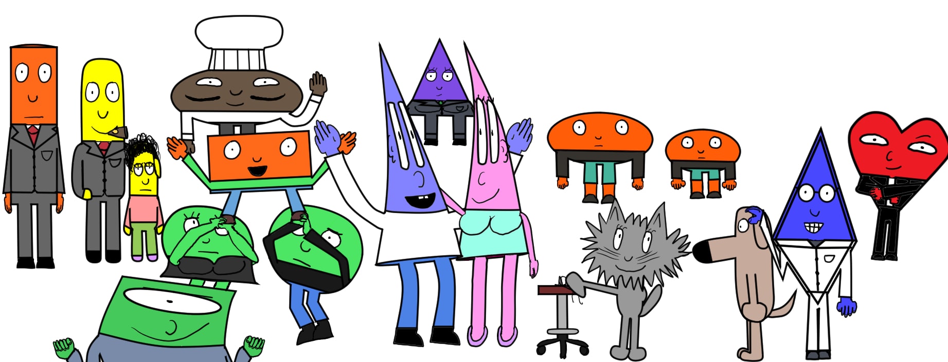
First off, love the art and especially your character design and their expressiveness! And the library / observatory design was cool. Really liked the map at the beginning too!

_`Is the fight too brief? Didn't want to drag it out too much, keeping it to just the essentials, but would you rather see longer actions scenes?-`_

I liked the balance you had. Unless you want to change to tone and focus of your comic intentionally, I would keep it as you have it. Having an elaborate fight scene so early without context to keep the readers engaged would not be beneficial, imo, and the action and energy you have does a good job of picking up momentum.

Is the dialogue too stilted? Worried that my dialogue isn't natural enough while still getting across the ideas I want. Any way I can punch it up?-

I agree on the previous points that for a reader the Deman/ demen is tough, and that the clunkier parts are mostly the dialogue related to background etc. It definitely flows more naturally on later pages. I also got the feeling that a bit of the very beginning was not needed to set off the next bits of your narrative, but since I don't know what comes later I can't make a big judgement on that. Overall while I think you could have a tighter beginning story wise, the energy was good and at no point did I feel like I was really losing focus as a reader. Nice job!

> Are the panels too small? Feel like some panels are too small and cramped. Are they alright or should I go fewer per page with bigger panels? I'm not making these for a magazine or anything so it's not like I have a hard page limit, but would it make the pacing slower?

I'm not a comic artist, so I can't speak to this as well as previous posters have, but as a reader I found it your panel sizes visually appealing and clear when viewing them both on my phone and on a desktop screen

A few minor things, feel free to disregard if you prefer things stylistically of course!:

  • On the first page, example on my edits for grammar. Since that's your first bit of narration, I went ahead and gave some specific edit suggestions here:
    The day our Mama left, the thing that stuck with me the most was, 'why was she smiling as she cried?'
    For clarity, you could also consider rewording it to break up the lines and emphasize the fact that the experience left the MC with a question, e.g. something like
    The day our Mama left, I was left with a question. 'Why was she smiling as she cried?'
    Careful of commas throughout, it's an easy thing to miss; check for other little punctuation things too
    as a previous reply noted, check for spelling. That said, of course dialogue has stylistic grammar choices depending on the character's voice etc so i dont mean to overstep with any of these suggestions

Random thoughts:
Your use of bits of german was interesting! Is that consistent in your worldbuilding later too? If that is one of your sources of inspiration for some words, would it be reasonable to dig into that to revisit the demen/deman naming scheme given the geography and history in-world? (also random, but as a german the idea of Affe sausage scared me until I realized it was not actually made of apes haha)

I thought how you broke the fourth wall on (i think) page 22 was funny! That said, one dialogue related thing i noticed was occasionally some modern / real world terminology slipped into the dialogue. If that's an intentional stylistic choice, that's great, but if you want to make the readers' immersion in your worldbuilding a bit smoother, perhaps you can try avoiding words like 'primetime' etc. unless its in an explicit joke like on page 22, or something that translates into some in-world tech or culture.

Hope this is at least somewhat helpful! Keep up the great work!

Thanks! :3
The red isn't a filter, I made the colour palette like that and just painted it directly. It also just is that colour in universe, it's the first light of sunrise through the heavily polluted atmosphere that severely reduces blue and green light passing through, making it look really really red :3

Can't navigate the site. When I click the arrows or the thumbnail images, all I see is white screen. Image not loading. I'm on a tablet. Don't have a desktop at the moment. Maybe it's fine with desktop I don't know