I have to admit, when I did try to read Chalk Square a while back, a thing that put me off was the visual similarity between characters, and how hard it was to tell who was important or what their personalities were based on design, so I'm glad you're looking into this issue.
When designing a character, there are a bunch of tools in your toolbox to make use of:
- Silhouette: Obviously, this is the one people bang on and on about sometimes to the point of ignoring all the other tools, but it is important. Silhouette also encompasses the general shape in terms of things like pointy = fast, brittle, sharp, aggressive, circle = soft, bouncy, friendly, square = solid, strong, slow, reliable, and how scruffy or smooth the overall shape of the character is. People often overlook these things in a naturalistic art style and think they're just for cartoons, but I'm always thinking about them in my designs.
- Shape breakup: In black and white, I think of this as "which areas do I fill black and which do I leave white?" in Colour it's more complicated, but it's like... how you break up the design? Things like areas of high or low detail, or belts/bands/stripes that break up the monotony of a long area of a single colour/shade. These areas can create internal shapes that follow the same rules as silhouettes. A collar can form triangles or circles, for example.
- Theme: This is hard to define because it's like just... the overall impression this character will give you based on looking at them through the lens of human experience. Do they bring to mind a flower? a certain animal? Do they make you think of darkness? Light? Are they wrapped up and shady or open and innocent?
So when I think about my main character (and her weird pants) here's my thought process behind the design:
Everything about Rekki at this point in the story is either a smooth, clean curve or a point. She's like a shiny red sports car! Aggressive, tense, sleek and powerful, like a curling lick of flame, or a jaguar ready to pounce. She has this overall kinda retro 70s theme going like a "loose cannon detective!" that tells you something about who she wants to be and what she thinks is cool. The jacket exaggerates her shoulders, making her look more assertive and angry than she might without it, and the hairstyle similarly gives her this aggressive visual presence, but both also give the impression of a small woman trying to make herself look bigger too. There's nothing drapey, so there's no softness to her and she feels athletic and practical.
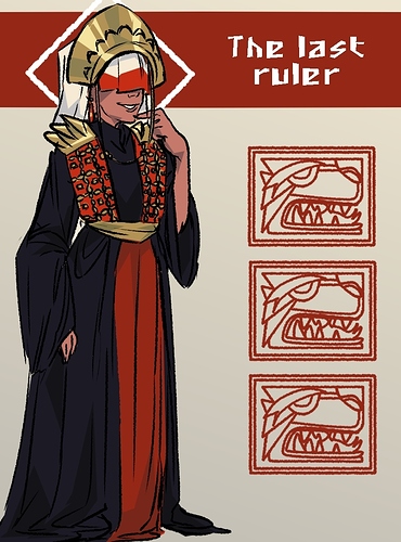
It feels like your setting has some strong internal rules about materials and colour, controlled probably by things like practicality, culture and comfort (looks like they live in a hot country where cotton or something similar is used to make cloth, the clothing looks quite Mediterranean or middle eastern), so my specific advice is that "style finds a way". Even in the most aggressively oppressive society in terms of rules of dress, people will find a way to express themselves with accessories, or styles of wearing the clothes they have. In the British Army, this is called "Being Ally"; deliberately trying to find unusual bits of kit or styles which are still technically within uniform guidelines so you can look different but can't be reprimanded for it because you're not breaking rules. I always assume that a main character is kind of defined by being Ally; kind of like in those anime set in high schools or the Persona games where the main characters are immediately recognisable by their wild customisation of their school uniforms and distinctive hairstyles. I do also like the trope of the "proper" student whose stand out trait is that they follow all the uniform rules to the letter to the point it stands out because nobody else has such a neat, buttoned up look going on, but this tends to work better for a supporting character than the protagonist. The whole point of a protagonist is that they want more than what they have and they're going to go on a physical or metaphorical journey that separates them from other people.
Try some things like rolling up the sleeves or pants or having them sheared off with a ragged edge, leaving the collar undone or popping it, have some colourful scarves or shawls, layering up bracelets, necklaces or amulets, painting the skin with henna, woad, clay or whatever plants or mud people use to make themselves up in that culture. Maybe some people decorate their horns with metal rings, or ribbons or string? Horns like those sheepy ones are made of keratin and only the base has nerves, so you could easily have them lopped off, filed, pierced or have lost one. There might be veils, ponchos, longer tunics, waistcoats.... Basically, try to use garments and accessories to create interesting silhouettes and internal shapes and to add splashes of colour or light and dark areas. If it's a hot climate, black clothing would likely symbolise wealth, because black is a hard dye to get a really nice rich shade in a pre-industrial culture, but also it'd be too freaking hot to wear outdoors, so wearing black means "I have people to shade me from the sun and I don't need to be outside." Follow the logic and have your characters tell the audience what they're about.