@soda_the_coda I remember when this palce used to notify me abotu new messages and not make me look like a jerk that doesn't respond.
Thanks for the critique, it's really helpful. Glad I finally learned to draw background that look like livable world and not some weird dimension.
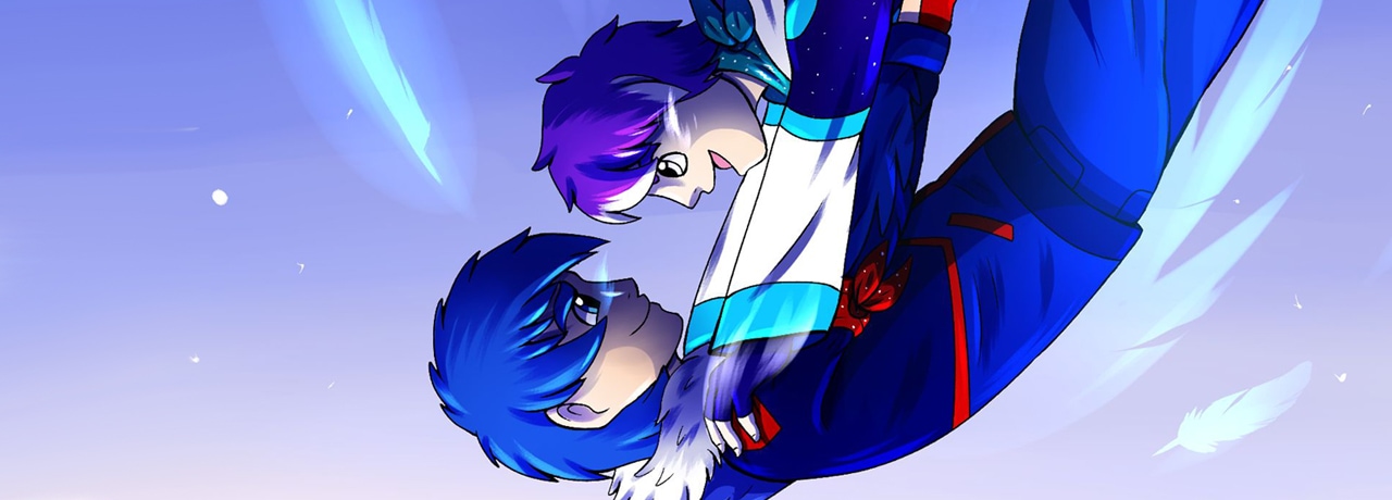
About the anatomy, I know it's far from perfect. Overall the whole chapter is, since it was a testing ground for the whole comic. And yeah, some faces can look kinda potatish. I am still learning in that department and I hope it will improve over the time.
When it comes to shading and colors. it was my intention to make things very contrasting, it was on purpose to make this chapter a contract betwen blue and red. That's why everything is so sharp. I understand it can be kinda a lot for people who may be more sensitive to colorsEverything being n dark may not really help that much,it's specific for this chapter. And i know some parts can look kinda messy. There are many things I did differently, but kinda lte for that now. So yeah, I know it's very flawed but at that time I tried my best, even though it doesn't look as well as it should. And I'll take everything you said into consederation for future pages.
With english, you are totally on point.
When it coems to the small version of the cover, it just didn't look right in the top. May be just mine weird opinion.
They are looking at each other, hm, interesting.
Thank you for the critique