Colors are nice but the title is unclear. Both with the font and with the word itself.
If we look at a classic example:

I can see by the art that is about a man who is super. A super man of some sort. Oh hey! Look at the title! And the title font looks like it's flying or moving fast. Like a super title.
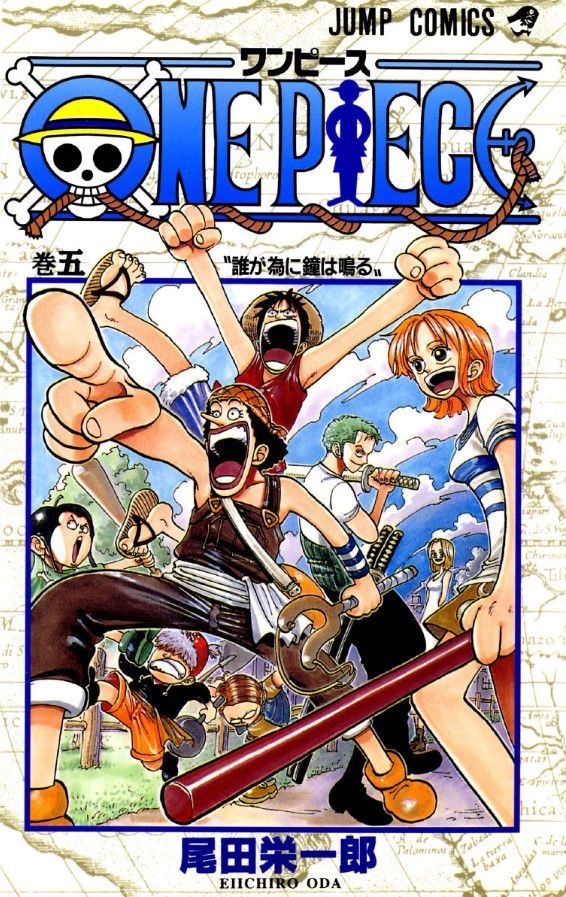
Even something less blatant like One Piece works in conjunction with the visuals and gives the idea. The jolly roger in the O on its own tells you pirates are involved even if the cover is just another Oda group shot among millions he's drawn.
Maybe emphasize the wings on the characters as well as in the title? It took me a while to pick up what they were. (Honestly I just thought it was rough motion lines but my eyes are growing old.)
I'm just not getting an idea of what you're trying to get me to read. As pointed out above, I too assumed it was yet another romance/ BL comic on the platform.


