1 / 23
Dec 2018

so I wanted to make a new cover for Mirror Monster6 and I thought it would be useful to make a logo for it, so I thought it would be cool to make a font for it. however, I feel like it's not enough, and I kind of need help with ideas for it. here's what I have so far for the font...


(also I know the lower case "z" is missing, it's just on a seperate sheet of paper)

  • created

    Dec '18
  • last reply

    Jan '19
  • 22

    replies

  • 3.2k

    views

  • 8

    users

  • 19

    likes

  • 4

    links

I really need at least one person to reply..... especially since this has to be done within a few days

I know no s*it about logo making, so here's a reply. :3

I think it is already good enough. Maybe make it bolder or something.

Hello there! If it's font inspiration you're looking for, I highly recommend the font library: https://fontlibrary.org/6

They've got a lot of really artsy/ imaginative fonts.

In terms of the font you posted, I like the fact that the lines extend from the tips of the letters. I also like the general pointiness, however I don't think you carry that over for every letter. The Q and the U look a little out of theme. They're still too round.

Honestly I like how it is for the most part. The letters i would take a second look at are the "U" because it looks a bit out of place and I also would take a look at the "S" because for me it seems unappealing.

I'll check out the website, thanks for sharing it with me. I just don't know how to make the q's and u's not-round, since the u's would probably just look like v's. you're right though

I don't have a lot of good logo tips (I just winged mine in 1 go lol) but this topic came up recently with some good commentary sprinkled throughout:

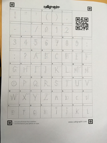
A side tip for your calligraphr font: if you use a drawing tablet, consider filling it out with that in whatever drawing program you use. I made one for my comic, but I found it to be aggrivating trying to get the letters to be the exact right size when I printed out the template and wrote it like that. You can kinda adjust it on the site when you go to generate the font but bleh. When I did it on the computer, I was able to A.) Ctrl+Z as necessary and B.) Use marquee and transform tools to whack the letters into the right sizes when I got one that looked good, but was too big or small relative to the others.

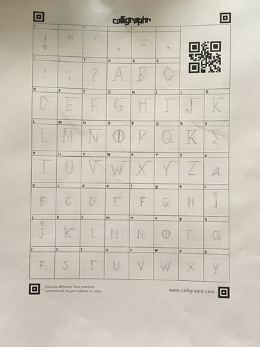
Don't have to do it that way, of course. But I remember rage quitting on the pen/paper version xD

Actually, I think you did a good job making the O not round. It's got those points cause it's an eye (which is clever btw.) Same thing for the D and P--they're pointy. Maybe just think of the Q and U as more like diamond or octagon style shapes? Like with the U, you can make the bottom look more like the 3 pointed part of a pentagon.

(This is the first time I've used geometry irl.)

oh yeah that's a good compromise! I didn't think about tracing when I did it ;u;

I feel like another issue is that most of the logos I've seen used those 3D type letters, and I'm not sure if just line letters would look good for it

Much improved! I like that the line at the top is wavy now. Makes it creepier.

I think this looks good, though it's a bit hard to tell when it's a sketch on paper. The only thing I would point out is that the swashes coming off the letters may mess up the spacing so you will likely have to manually adjust it when creating the logo. It would also not work with all caps, so I think it's good you made the lowercase letters small caps instead of actually lowercase.

sadly I thought of these things after lining them, and I thought the all caps would be fitting for it. but yeah, I may have messed up on the spacing...

Your font looks great @ghostieblu !! :slight_smile:
The chapter 6 comic cover looked good too! Not sure how much you wanted to change. I feel like your typefont was already pretty solid. It seems to communicate your tone quite well.
I came into this thinking you wanted to create an icon logo of some kind. Which, honestly, I don't even think you need :slight_smile:

well, I already made the font and I'll be stylizing it later. I just wanted to have something original... and not just taken from the internet