1 / 5
Nov 3

Hello fellow creators,

It's about time I had the main character change outfits in my comic - I've been drawing the same outfit for several years for her, not just from 2.5 years of regular comic updates, but also for a long while before that, through the concept phase.

So in the upcoming chapter, Veronica has the opportunity to change into a more 'town' outfit than her 'forest' outfit. It needn't be permanent, but before I draw all those pages, I'd like your input:

Veronica Currently:

Veronica Potential new outfit:
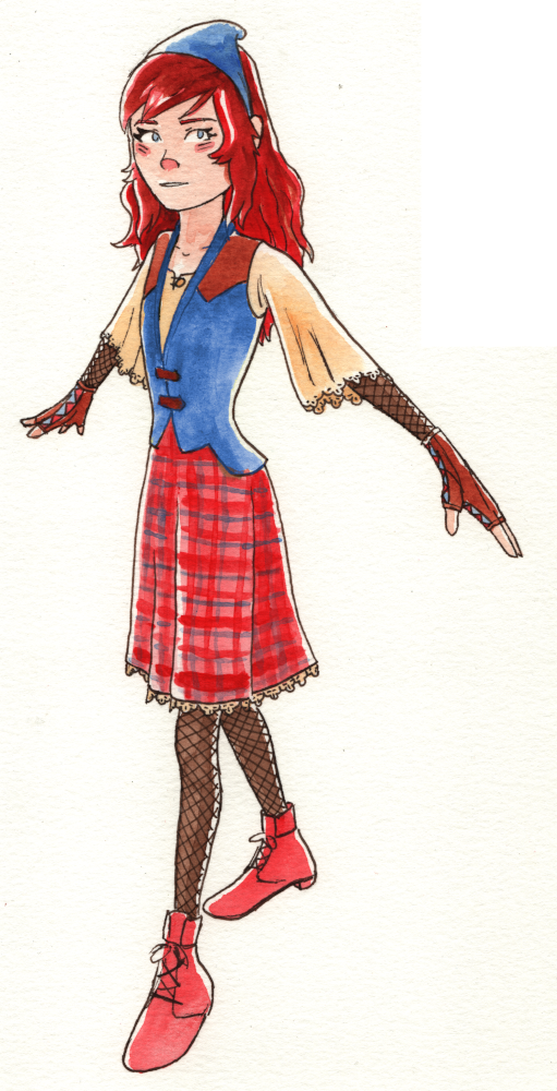
(Man, that's a change in style since 2022! Phew!)

What do you think? Any advice for me? What does the new design communicate to you?

Also, obligatory sub4sub if you're interested. I'll also comment4comment and like4like, let me know.

  • created

    24d
  • last reply

    24d
  • 4

    replies

  • 118

    views

  • 1

    user

  • 4

    likes

  • 1

    link

New design looks slightly flasher than current design because of yellows and reds that add emphasis to already red hair.

Those colors give first impression that the character is either confident, extroverted, wants attention, bubbly, easily angered, etc. Facial expression seems to contradict the traits I mentioned.

Blue and brown give the first impression that the character is calm, subdued, introverted, reserved, prefers to blend in the crowd. Facial expression balances that out though. Says "I'm confident"

It definitely feels like a 'town' outfit, with the more intricate details and patterns lending it a slight air of sophistication-- between the lacy sleeves/hem, fishnets, buttons, and the eye-catching plaid skirt, there's a lot more to look at as your eyes travel up and down the design. The bright, higher-contrast colors only add to this effect, with the new brown accents introducing some warmth to her look.

And despite all these changes, the new outfit keeps the character recognizable by giving her an almost identical overall shape: we still have the skintight sleeves and calves paired with the sleek bodice and flowing skirt. Only now the sleeves flow as well, and the arm shape is now interrupted at the wrists by more contemporary-looking gloves-- again, giving it an elegant, sophisticated feel. ^^ She definitely still looks active and adventurous, but in a more polished, grounded way, perfect for a special story event in a more urban location. :+1:

Thanks! I hadn't considered the contrast in facial expressions. It may surprise you that the paints for the colors are the same for both images, only the paper is different.