16 / 17
Jun 2024

If it could benefit our comics to get more views, then okay. I'll try to follow it up this week.

Well might as well update the Elsie cover since I’m working on Season Two at the moment.

Simple answer

NO. FUCKING. WAY.

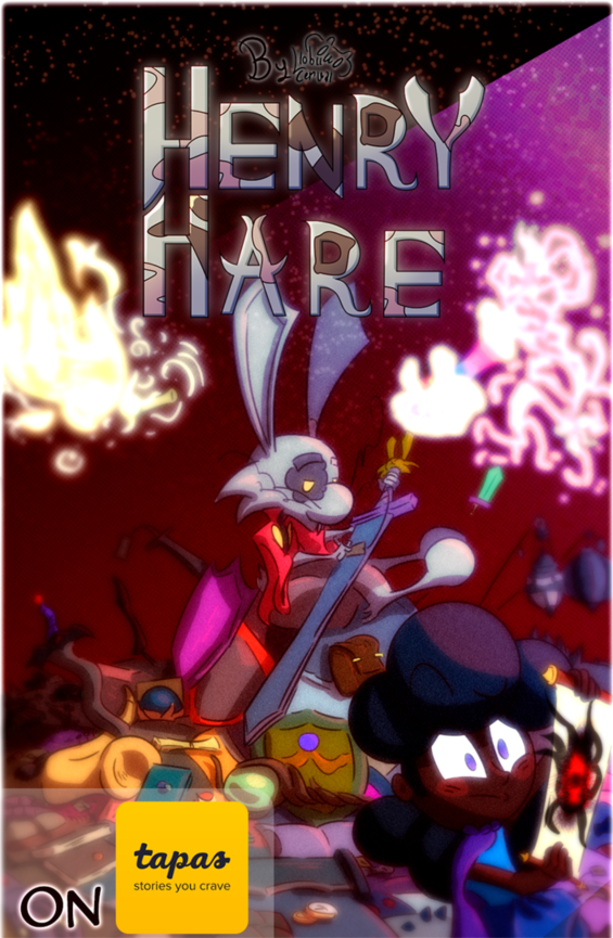
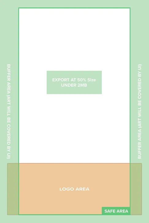
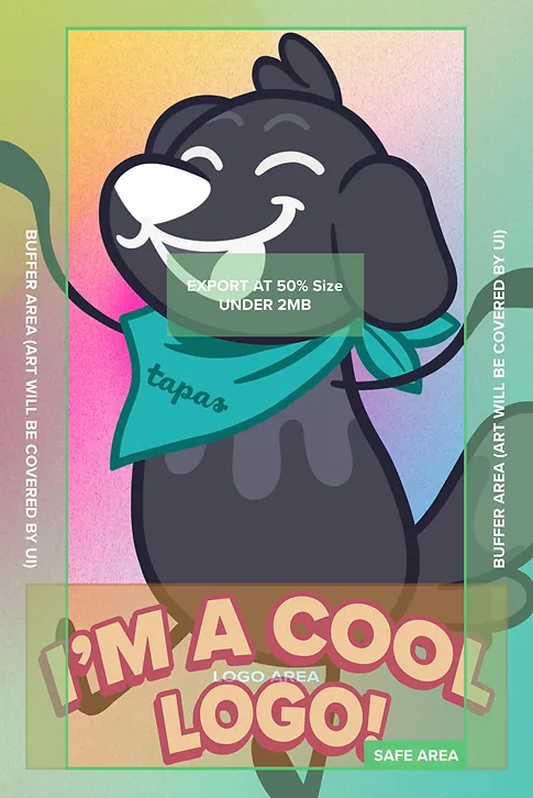
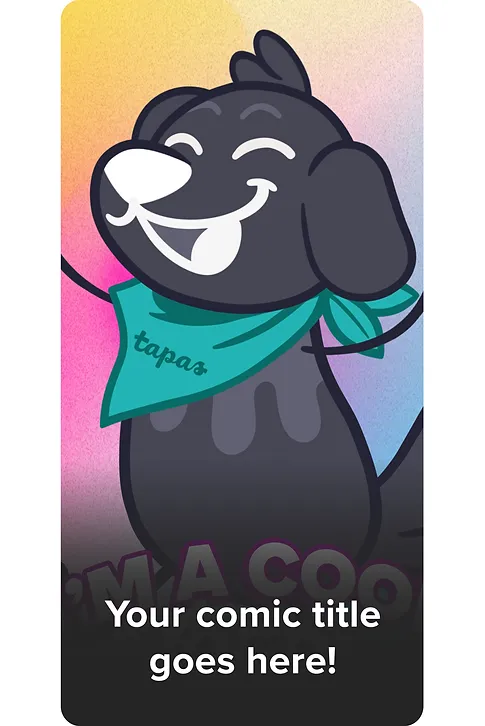
This new layout will not work with my present cover, which pisses me off because I only recently updated it. I’m really proud of it and knowing it’s now no longer suitable makes me mad.

I’m not doing jack shit. Will this kill my comic? Probably but then again, it has been dead for a while and I have been told that the existing tapas audience doesn’t like my comic so I guess this is a wake up call of some sort

Update: May have over reacted a bit. The changes arent too bad. Still, I dont know why they changed it to begin with smh

Can't download the template. Can it be a png or jpeg format?

Since I finally finished the Cover guidelines, how can I turn on this "Guides" folder, and also turn on the "Feature Space Preview" Layer?

Whu? B-B-But I just made one for my upcoming season :tired_face:

Ah, well. I can do another, maybe use it in an episode to signal changes. Got nothing else to do but update.

Uh, what's the point of the "cool logo" if tapas plasters their text over it? Or am I misreading something?

Oh, it is visible...Might try it anyways. No harm in it. Thanks!

I've got mixed feelings about this. On one hand, it might be a good way to get traffic coming to our works, but on the other hand, I feel like it might stifle with creative freedom. Does it really matter where we put our titles on our covers? Also, if we wanted to put our names on it, would we have to make adjustments to make sure it fits in the general area? That would mean that we would have to shrink down our names and that might make it harder for people to see who created series.

ok I feel like it should be clarify that the only changes affects the thumbnail of your cover, they'll crop out the "Buffer area", besides that, it's all recomendations, names and other important things are usually positioned in closer to the center of the cover anyway, like your characters, or key items relevant to the story.
when it comes to names, readers might not even notice it and just focus on the cover art. if they can't read it because it's cropped out or too small the name will apear on the bottom half of the thumbnail, that's why they recomend to put it there, is gonna be covered by the comic's name.