Woof, this took a lot longer than I thought, but better late than never! Here is some honest reaction/feedback. I’m an artist that reads a lot of comics but not a writer for whatever that’s worth.
Based on title, I assumed this is pitched at a snarky/comedy shounen audience. Having read it, I think that checks out… mostlyish. Looks like you got some feedback on your summary and it is much better than before. The “What if all the characters you created were alive?” doesn’t quite fit for me, because it implies alive in a normal world. Also not a huge fan of summaries that are a bunch of questions – one or two for hook, yes, but I think it pays to think about who will enjoy your comic and just tell them what they're getting into, so they can get into it.
New thumbnail is much much better than old thumbnail, but still not as good as it could be. I think it’s quite aesthetically pleasing actually but unfortunately a bit busy/low contrast/low saturation for getting attention among the other thumbnails.
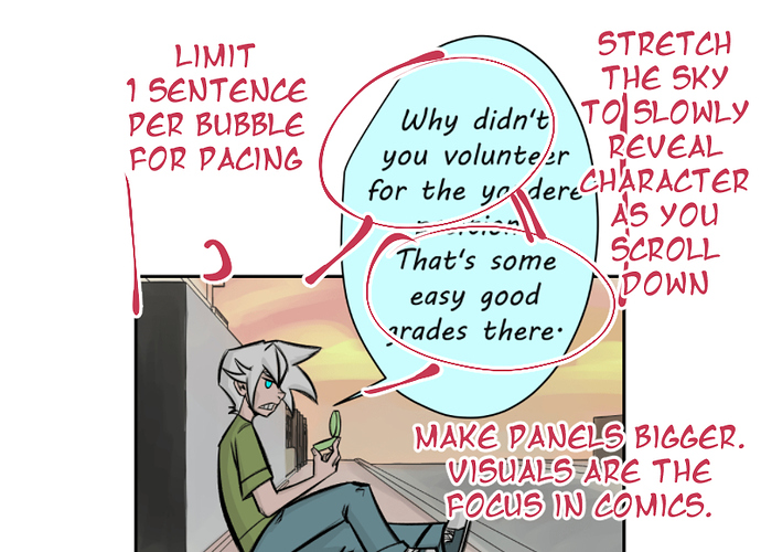
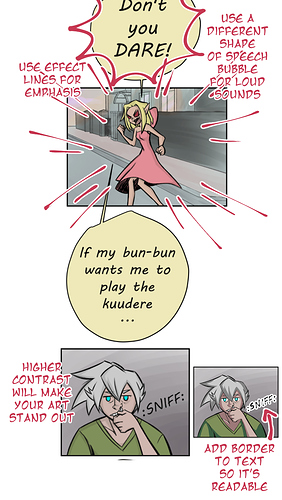
The font is too small to read on a phone at first – looks like you got feedback on this. I’m not a huge fan of the font itself – I don’t think it matches up with your art style but I stopped noticing that I didn’t like it pretty quickly. Initially I had to work following the order of speech bubbles but they became much more clear/less dense as the series went on.
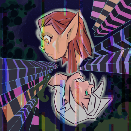
The art I really like – I’m into those chunky lines and stylized faces and your colors are nice once you added them. Lots of love for Jeremy in "Experiment 0" where he looks extra super cool. I’m also a fan of the cat! Looks fantastic :3. I think I like that the art keeps changing but retains underlying consistency, if that makes sense. Your environments are usually solid and match with your art, but there are some panels where you don’t have one but drew attention to it by making it a dark flat gray and adding just enough detail that it felt like there should be a bg but there wasn’t (I’m thinking particularly of the scene right before Kate/Marshmellow gets her letter). There’s some in #25 where characters are talking and it’s gray behind them – what you did in #26 looks way better.
I found I had a hard time connecting with your characters because there is so much going on world-wise. Meta-ness breaks immersion and I spent more time contemplating the “rules” or rulebreaking of your comic world than getting to know Kate and caring about what happens to her. At the end of reading, I still don’t feel like I know her very well – what she stands for or what I expect she might do in a given situation or even some unique quirky behavior/trait that could help me connect with her more. I got that she wanted to get into school and be a protagonist but it felt like she is a passive character once she’s there, which isn’t super engaging for me.
I came to like Jeremy the most but I couldn’t remember his name without checking. I think his combo of protectiveness but slightly a-hole behavior was endearing – I like those characters that give out unwanted nicknames but also watch out for people. His presence in the gutters with commentary was always welcome (and missed when he wasn’t there haha).
Second favorite character is the scratchy blanket guy – I enjoyed him being an arse.
I didn’t find the Dr. Gray arc super compelling and I think the comic picked up a lot once you got Kate into a room with the other students.
Overall, interesting premise and good art but the focus on clever/interesting ideas overwhelmed the characters for me.
Hope anything here is helpful!