I read the two chapters and there are some things that stood out to me. With the story telling, there is a lot of telling and not showing. I think starting out with a timeline can be pretty difficult to do. Not many people are reading webcomics for a history lesson. Starting out with some history isn't bad (I did it for my comic), but you do need to have something flashy and a bit more exciting in there.
Another example is the girl saying: "I may be stupid but not as much as your father, who married a woman that not only was a pauper but also came from the "Slum".
It's a mouthful and lot of back story in one sentence all at once. An example of what could have been done is her saying "Stupid. Just like your father." and giving more info about the mother and Slum later on somehow. Or even "Stupid. Just like your father and that woman from Slum."
There are the grammar mistakes as someone mentioned which does make some parts difficult to understand. Like:
They helped with their intelligence and strength for what they were called "Universal Race".
I don't really understand what this means... the humans are called the universal race? If so, this makes it more clear:
They helped with their intelligence and strength for which they were called the "Universal Race".
Or "for that they were called" or "which led them to be called" etc.
I really can't comment on the story otherwise since it's only two episodes so far so there isn't really much to comment on besides that.
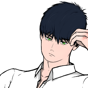
For the art, I think the coloring looks really good. I especially like how the hair is done and it really looks like hair. I also like how you do the lighting, especially in the boy's hair. I think what could most benefit the art is backgrounds! There aren't any backgrounds* in the first two episodes nor an establishing shot of where they are. I suppose that might happen when they walk out of the school and you can see what the environment looks like. Even so, in the classroom you'd be able to see other desks, other students, walls, doors, windows(?) etc. All the viewer has to go by is white space and long desks.
(*Okay, I looked back and there is one panel with a background. I think generally you should aim to have a decent to full background every few, maybe 2-4, panels).
I also really like the flow of panels, especially in the history lesson of episode 1. The white lines on the black background I think work really well.
Overall, from what I see so far I don't think this is bad at all but there are some tweaks that could be made which could make it more enticing to readers which would allow more views and subs to be gained.