i skimmed through the first episode and oh dear... i personally don't mind a history lesson but this one just drags on forever : ( like someone said, nothing cool and flashy going on. And the text size and flow is all over the place. Some places it's just small white text on black backgrounds which is harsh on the eyes.
I think a mere time-and-place is more than enough to start a comic with. Then introduce the world naturally after some interesting interaction or something. Or even someone lamenting their history that led them to this point?
.
.
Besides the lack of backgrounds, Please be mindful that turning on the Mature filter for your comic will make it not show up for app users on iOS devices at all. This is a recent change
I personally would only reserve the Mature filter for sexual content and graphic violence and gore. Both which aren't present in your work. It's only mild fantasy violence with some blood here and there.
.
.
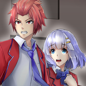
The title + thumbnail is your first impression, and the thumbnail for WT is very unattractive! He's way zoomed out and his arm is way bigger than his head. If you would just change it to a zoom of his face instead. It will help attract more attention.
.
.
Fantasy + Action are very competitive genres to be in. Many stories share the same tropes and it's hard to standout among the crowd. idk if you think your work can fit in other non-competitive genres, but having a hard time getting noticed has a lot to do with the genres you're in as well.
.
.
Lastly, you're just getting started! Have patience, and maybe cross-promote with other creators that have similar audience as you do.
Best of luck to you
[ EDIT ] I just noticed the summary and it's another wall of text : ( With typos too... one of which is the hero's name, of all things : ((( Keep it to like one or two sentences MAX! Walls of text are very off putting, especially to young readers.