123 / 457
Jul 2020

Oh that's awesome that you reference album covers! I definitely can see that coming out in the style, especially with the bold colors and lines!

Thank you!

I love the soft colors you use for your cover! It gives me a really sweet and cute vibe to the two characters!

I like the idea of title screens after the intro too! I did the same thing with my comic as well. I think it really helps set the reader into the story, kind of like how movie title cards can!

Aww thanks! haha my webtoon is basically just fluffy stuff, that's why I use all soft colors :laughing:

I hope all goes well with your webcomic :slight_smile:

This cover looks awesome! I love how you went for such a dynamic perspective, and your color palette is really good! I also like the logo you have for your title. It makes me want to really try and make a better logo for my comic.

And good luck with the update!

I really like your use of colors and the heavy line work you use! It sort of reminds me of the Scott Pilgrim comic art style. The first one is definitely eye catching with how you laid out the characters on a circle, making it pretty unique compared to other covers!

I love how you just go for it with a classic comic cover style! I feel like your main character is really on an epic mission!

Even though you aren't the happiest with this cover, you should definitely be proud of it! The character designs are really cute and your style makes me feel happy! I like it a lot!

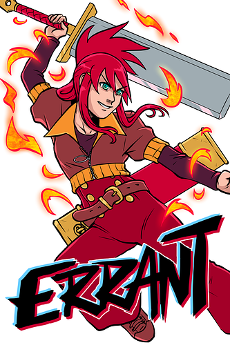
There have been three covers so far in Errant.

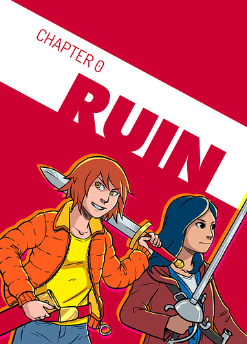
Chapter 0, which feels weird now because the early pages and cover don't quite match how the style ended up. But design-wise it did set the style rule for chapter covers.

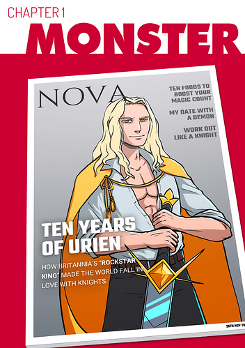
Chapter 1, where I knew what I wanted to make for the cover ages in advance. "The bad guy won and everything sucks because people don't even realise how angry they should be." Stupid sexy Urien! :eyebrows: The banal "lifestyle" article titles were the most fun thing to come up with here.

And of course, the main series cover. One of the biggest influences was the iconic fountain shots from the opening of Friends, where it's like "look at all these cool weirdos!"

BONUS: The scrapped series cover I drew, then decided I hated. UGH it's so awkwardly proportioned. :cry_02: