45 / 122
May 2021

Nice cover. The explanation truly tells a bit more of what its perceived by the composition of it!

In my case with the webseries I work for we change the Cover art depending on the phase of the series, always being new art that's even from inside the webcomic.


For example, this is the new cover art for "Scarlet Society", a webtoon by Addie French that we publish on Webtoons and Webcomics App. This is a panel from chapter 20 in which the protagonist, Deidre casts a spell.
I really liked it at the point of being both the cover and promotional art

.
.
.
This is also another cover that I've made for GetterKumaGo, for his novel "Centris"

I wanted to represent part of a scene in the Novel, with the protagonist of the story. As this character has not appeared yet I can't reveal much but I wanted to show the melancholy of the events that lead to what we see in the cover, I wanted it not only to look epic but to show the grief the character feels

You Will Fall For Me (BL) is basically about a bully who is entangled with his victim... It's a mixture of intimidation and discovery lol, as shown in the cover art..

Another one is about a leader of a super powerful group in a school, who is supposed to be the most feared and respected. But who woulda thunk that someone regular would have power over him!? The artwork shows his other side.

Alright, so mine was a process to figure out and I'll definitely update it as the story progresses and I get more experience. But at the moment, it's this:

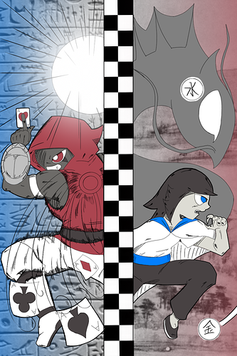
Our dual protagonists front and off-center. Both facing the directions they travel at the end of their respective prologues. Omari heading West while Xiaolian heads East. Behind them is where they're coming from. Behind Omari are Egyptian Hieroglyphs since he's coming from Egypt (with some treasure too), while Behind Xiaolian is a Chinese painting, coming from their homeland. The backgrounds also have the opposite gradient since the protagonists will end up meeting shortly after. In Omari's hands are playing cards with the Ace of Hearts in hand purely because I like it best and wanted to differentiate from the Ace of Spades which I would say is the most common card seen. Their poses are opposite as well with Omari turning his back to the audience while Xiaolian has theirs open.

Surrounding both protagonists are their unique abilities, their Summons (which are a universal ability where Passion, Personality or Potential manifest Power). Omari's Summon is invoking a wind at his back while Xiaolian's invoking her clan's heritage, the Wu Xing Dragons. Specifically the water dragon Shui Long boosted by Metal.

In the middle is a checkerboard pattern. This has a double meaning. Both are headed towards a city with a mile-high prize that features a checkerboard pattern at the center of the city. More importantly, it's symbolic of the importance and prevalence of games throughout the series. Many games are played on a checkerboard, so the black and white pattern invokes that. Also a subtlety on morality and decisions that may or may-not break things down into black-and-white.

In short, the cover is meant to give a general look into the series as a whole: The world-wide journey, the importance of games and the power awakening in our casts.

Oh I like this and seeing the explanations for the covers. For my new cover I requested one to be created as a way to show the main characters and give a feel visually for the story.

So breaking down my planning for this cover. It's about two individuals who become wrapped up in something that threatens to tear apart their whole world. So for the cover I wanted to have both protagonists shown but not just standing there but have some sort of motion that reflects some of what their personality might be. Axel who is in the red is more of the act before thinking and can be a little wild. While Ryo who is in the blue overcoat is the calm, collected and sometimes distant one that keeps to himself.

Another focus is this new ship which I have in the background since its one of the focuses throughout the story. Below the characters is an open books since the title, The Pirate's Chronicle focuses on them trying to find a legendary pirate book. Lastly, to add a bit of mystery to the overall picture I wanted to have a shadow included of who the antagonist is for this part of the series that I'm planning right now.

Overall when thinking of the cover, I thought of something to focus on a bit of the characters and what the overall plot with revolve around. The artist who created this cover for me (@faeriesandents) did an amazing job with it.

My novel is about two ghosts: one is the wailing, tragic type that sort of mopes around whatever it is haunting, and the other is an evil spirit whose soul has been corrupted. The cover shows how they come to rest, together, in peace. I wanted to show what we're working towards! 🖤

Here is my first BL comic!
About my cover art, there's not much to say, they are the main characters and that book he is holding is very important to the character

.
.
Little spoiler!:Feng Cheng (The one with brown hair) is on the front because the first volume I have planned is from his point of view


My cover shows the MC’s dilemma on where he is standing in the magical apocalypse his world is in. There is also a sense of emptiness in its world at the moment so there is virtually nothing I added. A friend also told me since cover is going to appear small, better not to crowd the image with more drawing/colors. To put everything in clarity. Plus, my laziness approved!

I want to participate :sob::sob: but if I explain I'll be spoiling Soo I'll just check out the comics here :grin:

For my cover I wanted to convey feelings of romance but also apprehension and little danger. So I have my main characters Ellery and Alexei gazing lovingly at each other but not quite touching. They are from warring countries (hence the swords) and end up in a situation where they have to work together. I also really wanted a 90s shoujo feel so floating rose petals and filigree are a must.


Oh thank you so much!! I really appreciate that! Sometimes I worry that my art style doesn't match the "mood" of the novel but...oh well :sweat_smile:

Also: My cover/explanation is pretty spoiler-y too, haha

mine showcases the magic system of the story. At the center is the MC, surrounded by his weapons(humans that can turn into weapons when their souls are released)

Here is the art by Timi Honkanen that was used to make the book cover for, "The Dagger of Darkness".

It is set in another realm during the erantinmundo era.

"In the beginning, in a world long forgotten by Man, there was a golden city in the sky. Like a Sun it shone upon all below, bringing forth light - even in the darkest of nights.
The people who called the city their home were the Elysian, a race of people who descended from the Seers and the First Folk".

The city is called Elysia (city of light). It is powered by ancient moths that collect and carry magic from other worlds - that magic is then taken to the 'hive' that is the heart of the city. Without it, the city would fall. The hive is the source to all Elysian technology.

Basically the cover is significant because the city and the moths play a major role in the story.

You can find the book cover art here:

I love how your main character looks like a modern, edgy Jonathan Joestar!


I'm the author of the comic, and this was drawn by the artist (@Inertia_Artist on Instagram) but I can still tell you the meaning behind the art here. the main character has this cheery, optimistic expression and pose contrasting with a very gloomy background, showing how the world he's in is a little grimmer than he realizes. and in a way, that represents the tone of the comic too.

Simple. It's okay to be yourself! Smile! Even if things doesn't go according to plan. But that is what makes life interesting.

If you wanna know how Izzy's life is doing? Check out Izzy!

(This is the series's first cover art. We'll be updating soon since more things are being developed as time and story progresses. But will life still be fun? Time may tell...)

New Episodes Every Wednesday.

16 days later

I like this! It's really cool to hear what the artist was thinking when they drew the cover art!

This is my current cover art (I have a new one for each chapter). It depicts Dio, the main character, standing with a gun in his hand...but his shadow is not his own, but rather that of the demon that possesses him. At first, I was going to just draw the demon standing/sitting next to him, but I thought just having a shadow that is very clearly not his own adds a more ominous atmosphere.


So this is just the Chapter 1 cover, I still need to make a proper series cover, but for now this is what I'm going with.

My idea behind it, initially, was just to showcase the main character, Piper, in her Ranger outfit, and that the story is space-themed, but it ended up being pretty great as a character piece: The previous Red Ranger's first appearance shows him tugging on his glove in a similar fashion, and works as a sort of 'signature look' for him. Piper has inherited his powers very suddenly and unexpectedly, and has no training whatsoever in the role, so she's striking a similar pose, but with far less certainty and confidence, wondering if she can fill the role that has been forced on her.

Heyo! This is the cover of my novel drawn by the fantastic sorible!

When I described the cover, I thought a lot about the Red String of Fate and its meaning when it comes to romances. If you don't know, the Red String of Fate refers to an invisible red string attached to our pinkies that links us to our soulmate. I wanted the cover to show the strings without showing any type of connection.

The other goal I had when creating this cover was to fool the audience. When you look at it, you may go "Oh! This is a reverse harem, these are the three guys, and I'll probably read this from the girl's POV!" On top of that, if you tend to consume a lot of media from the harem genre, it's easy to "guess" which one is the male lead, the second lead, and the tertiary member of the harem. The trick here is—

My boi with the black hair is actually the main narrator, and the cover's meant to fool you!

With the manga The World of Otome Games Is Tough For Mobs being the absolute closest—an amazing manga I might add—I can't think of a single story where a reverse harem is told from the POV of a harem member.

So if you love watching anime and dramas but the male lead just isn't the one you ship, stop on by for a cure to your Second Lead Syndrome!

This is my cover of my web comic Birds. If you noticed the title of my web comic, it's in English and Japanese, obviously revolving about Birds. The one on the right is Brad Bird, the shonen avian sacks of meat, wings, and a beak. The one on the right is another bird in upcoming chapters named Oliver. So basically I decided to make this a gag comic with action. I picked drawing birds, no one solely made a comic about birds :wink:

Hi, I just started on Tapas but have been writing Sprig (a web novel) for over 2 years. I actually made the cover artwork myself. Kaia, the main character, holds a small plant that glows in the darkness because she is representative of healing in a world of hatred. She also uses nature magic and can rapidly grow plants from the ground, which produces a green glow.

If you give it a read, feel free to let me know what you think! Thanks.