12 / 70
Sep 2022

Hi Stargazer31,

So the color pallete is very fitting for the theme. I also like how big and readable the font is.:slight_smile:

Two things to consider:

  1. What does you subject convey? Looking at the character, what's the story you want to put in your reader's mind so they continue reading?
  2. Your title stands a bit weak, mostly because of its very thin font, but also because it leaves a considerable space between itself and the character. You could try making it a bit thicker and taller, or bringing the character up.

Keep up the good work!

I like the atmosphere and the composition. One thing to consider is the title, mostly that it is straight in a slightly tilted ribbon. So you either straighten the ribbon, or tilt the title :slight_smile:

You could also try to see if a solid fill (not outlined) font would stand out better.

All the best!

The cover looks quite cool! Things to consider from a graphic design point of view:

  • The word Harbinger should probably be more prominent than the word Infinity. You could bring the letters closer together and have room to make them bigger. In contrast, you could make Infinity a bit smaller too.

  • The infinity symbol get a bit cramped and lost in the back. You could try to make it stand out, but you could also remove it. The title will be clearer (sometimes less is more :slight_smile: )

Also you could try bringing the planet and the robot a bit lower, you have some unused space over the artist names, and it will clear the title too.

Keep up the good work!

How exciting! I love your cover and style, your feedback would be invaluable.:coffee_love:

I started drawing this year, and design is really new as well. I’ve been trying to make my own covers, but I can’t tell what’s good or bad since I don’t know what I’m doing.

I think I need to move the title up more and I feel like something else is off as well. I have 2 versions, one with the bright yellow/purple light, and one without. IS IT TOO BRIGHT?? Ahhh, I am so indecisive !!!:cry_02:


12 Weeks is a comic that follows a dishwasher and a bartender. It’s a BL/drama/thriller/romance. Dishwasher (blonde) is fun and cute and bartender is an asshole.

Hey, beautiful art :slight_smile: I would go with the second version (less light) as they take the attention away from your main subject which is your characters!

I am not sure if the outlined font for the title adds something to the composition, you could try a solid fill one, but in any case try not to put it too close to the edges. Give it a little room to breathe :slight_smile:

Keep up the good work!

..I never thought about solid fill. I’ve always made my titles with outlines, I think it’s habit now or something. Solid fill will help a lot, because I have a novel that uses the same artwork and they look very similar. Both have outlined fonts :cry_02:

THANK YOU FOR THE FEEDBACK!! I’m currently using the darker one, so I feel special that you think it’s the better one :coffee_love: I’ll be sure to fix the title placement and maybe change the fill when I get the time. Thank you again for responding :coffee_love:

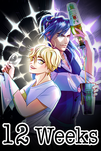
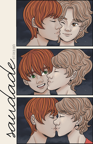
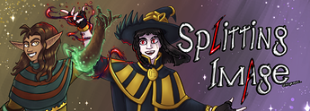
Well, I may be a little against the grain here cuz I'm already thinking of changing my cover, cuz I don't like it, but I don't know why I don't like it, so that's why I'm here. I want to know from an expert why it doesn't work, cuz I don't undestand xD My followers found it cute, but that's not enough, so yeah. My inspiration were those photos from photobooth that couples take together you know?

I know the title is totally wrong, I realized midway that I had no where to put it and I found a white space to put it xD so bad bad work therre. Also, I use this font for the title since the begining, but maybe that's not good? Should it be more bold? I don't know, I wanted something delicated, as the themes I talk about are.

Now about the comic, it's a BL/slice of life/drama about a boy that has depression and a boy that has problems at home, they kinda found home and hapiness in eachother in a way and the comic talk about the struggles with mental health in tennagers, but I wanted to focus the cover on the relationship of the boys other than the drama aspects.

Summary

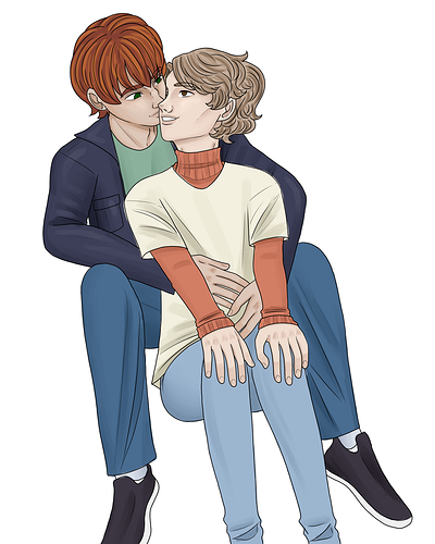
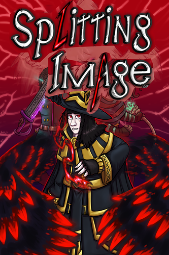
I'm thinking of making a new cover with a illustration like this one though, I don't know if i'll be this one or not, but if you can give me some tips on what to make better I'd be awesome too, but don't feel like you need to, as you offered just the feedback to the current one xD

Thank you so much for this thread! As the joke goes, illustrators AND comic artists seldom are graphic designers, so any help is welcome :')

This is from my comic Splitting Image! It's a fantasy adventure about an ex-villain that joins up with his ex-nemesis to uncover the secrets behind their conflict. The mood is a bit like a cartoon on the darker side but not too mature - with some comedic moments but mostly about adventure and dark revelations.

I'm going to redo it eventually because it doesn't fit the new logo(it used to be bent) and I don't want only the ex-villain on the front since he's not the only protagonist, but it's good to have feedback on what's already here to have a good idea of what to try next!

(for comparison, here's some newer art in the comic's banner, which features both protagonists better:)

Hey beautiful art :slight_smile: Let me start by saying that there is no right or wrong in design, there is what you want to achieve! For example, from your cover I get a sensitive and soft feeling. If that's what you're going for, you're on the right track :slight_smile:

From a composition point of view, one thing I would try would be to make the frames square. That would resemble the photobooth strip more, and you would have a complete square in the middle, the lower half on the top, and the upper half in the bottom. That will create a more interesting relation between the three frames.

It will also create a bit more space on the sides that you could use to make your title stand out a bit more.

It's a composition thing really! Try it out if you'd like and let me know how it went :slight_smile:

I LOVE IT! Great idea ahhh. I learned a lot from you (I read your advice for others too!). Thank you again :heart_01: I’ll change it to that and upload it later today!

Hey, it's always nice to share the knowledge :stuck_out_tongue:

As you already noted, the logo doesn't quite fit this composition. But one thing to have in mind is to mix it more dynamically in the composition. Something like this (very rough take!)

As it is now it hides the hat, but if you designed it to fit the composition you could adjust that. In general try to use your graphic design stuff as compositional elements, like the rest of your art. That's the part that illustrators miss, but it is not that hard :slight_smile:

One other thing to note is that the red letters in your title don't read very well when put on top of other colors. You may consider making them a brighter color, or even have them white. It's better to be readable that pretty :slight_smile:

Keep up the good work!

Thank you so much! Ooh, big logo. I'll absolutely keep that in mind! The logo ends up having the theme because it's like the magic effect seen below is "corrupting" the normal letters, but as you mentioned, it's probably better to plan around the whole composition, logo included, to not cause this conflict of contrast. Many thanks!

Here's my cover fo my web novel, The Cursed Paw. It's a horror/comedy/action series.
Here's the synopsis: Rumey buys a monkey's paw from a mysterious shop. He learns of the consequences that come from getting your wishes granted but decides to find ways around that. He decides to sell the wishes so someone else can deal with the consequences. Will he succeed? Will he fail brutally? Only one way to find out.

I haven't really invested into a actual book cover and have really just been using art created by the midjourney bot as a substitute for now. What font title you think would go well with these quickly made covers? I'm more of a writer/editor and don't really have an experienced eye for art. I'll probably invest in a more anime/manhwa style cover later on.

https://drive.google.com/drive/folders/1mDeUQw8Nl6R5CClC4_6Owi6VE6Qux8AS?usp=sharing1