57 / 70
Sep 2022

Cool artwork! I propose you bring you title up so it gets more prominent and rearrange your typography a bit. Something like this.

Keep up the good work!

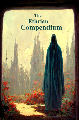
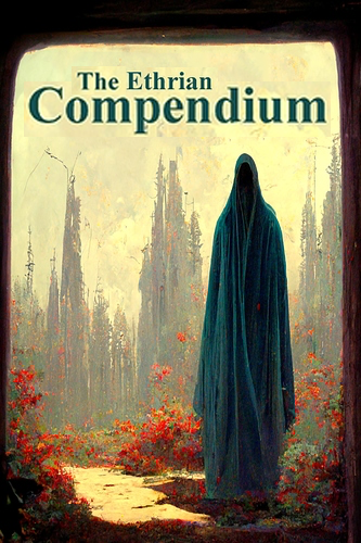
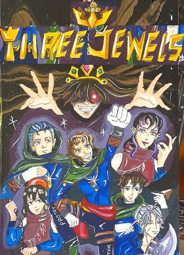
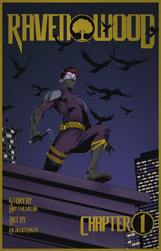
Hey, let me return the complement for the super cool cover art! One think you could consider is making the typography more dynamic. This will amplify the impact of the whole thing, making it more dramatic :slight_smile: Something like this.

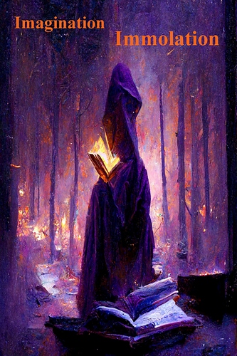
The power of composition of other elements is something that's overlooked not only in covers, but in framing as well. You can check it out in the Dimday Red comic I co-create. In it I work on the frame layout and the backgrounds. Let me know what you think!

Ah, excellent idea. I like the overlap, that does make it more dynamic and brings it together more. Thanks, seriously appreciate it!

Or if you have access to a program like Photoshop (or a free alternative) you could scan/take a photo of it, and move it around there :slight_smile: All the best in any case!

25 days later

Hey Senzu, sorry for the late reply, it;s been a while I checked this thread! I really like your cover, composition, typography and all! Good job! If I considered changing something, that would be the frame you have around it. It makes the title a little too crumbled and it doesn't let the rest of the artwork breath freely. And maybe consider making the Chapter 1 element less prominent.

1 month later

closed Nov 26, '22

This topic was automatically closed 30 days after the last reply. New replies are no longer allowed.