40 / 70
Sep 2022

I LOVE IT! Great idea ahhh. I learned a lot from you (I read your advice for others too!). Thank you again :heart_01: I’ll change it to that and upload it later today!

Hey, it's always nice to share the knowledge :stuck_out_tongue:

As you already noted, the logo doesn't quite fit this composition. But one thing to have in mind is to mix it more dynamically in the composition. Something like this (very rough take!)

As it is now it hides the hat, but if you designed it to fit the composition you could adjust that. In general try to use your graphic design stuff as compositional elements, like the rest of your art. That's the part that illustrators miss, but it is not that hard :slight_smile:

One other thing to note is that the red letters in your title don't read very well when put on top of other colors. You may consider making them a brighter color, or even have them white. It's better to be readable that pretty :slight_smile:

Keep up the good work!

Thank you so much! Ooh, big logo. I'll absolutely keep that in mind! The logo ends up having the theme because it's like the magic effect seen below is "corrupting" the normal letters, but as you mentioned, it's probably better to plan around the whole composition, logo included, to not cause this conflict of contrast. Many thanks!

Here's my cover fo my web novel, The Cursed Paw. It's a horror/comedy/action series.
Here's the synopsis: Rumey buys a monkey's paw from a mysterious shop. He learns of the consequences that come from getting your wishes granted but decides to find ways around that. He decides to sell the wishes so someone else can deal with the consequences. Will he succeed? Will he fail brutally? Only one way to find out.

I haven't really invested into a actual book cover and have really just been using art created by the midjourney bot as a substitute for now. What font title you think would go well with these quickly made covers? I'm more of a writer/editor and don't really have an experienced eye for art. I'll probably invest in a more anime/manhwa style cover later on.

https://drive.google.com/drive/folders/1mDeUQw8Nl6R5CClC4_6Owi6VE6Qux8AS?usp=sharing1

Just hopping back in to tell you that you're amazing, I used your advice for the novel cover too and I've gotten a bunch of compliments on it

:blusht::heart_03:

If you wouldn't mind having a look at mine, I'd like to hear your thoughts.

Godchain is about the war between a kingdom and the empire that conquered it with a focus on the younger prince from the kingdom and later, his role in the greater geopolitical events in the setting and the mysteries surrounding the nature of gods and magic.

hi, sorry for the delay, i didn't had time to modify the cover before, so hi again xD

First of all, thanks <3 I'm happy you got those things from the cover! That's exacly what I was going for xD

About the cover..; Something like this you mean? I couldn't make it perfectly square without losing much of the drawing :frowning: haha so I did what I could. I'll be honest and say I didn't quite undestand the part of rearranging the squares hehe :eyes: so I just changed them to (almost) squares and put more focus on the title.

I’m down for some constructive feedback, if you’re still offering! I have two covers I finished recently, one for a graphic novel and the other for a graphic memoir.

Here’s the cover for the graphic novel:

It’s about the six characters shown after they stumble across a magical painting in each of their home worlds. When they touch the painting, they’re transported to an art museum at the center of the universe, where they all meet for the first time and then go on adventures across different worlds using the paintings in the museum as portals. Its target demographic is teens and young adults, and though it starts out as a comedy, as the story progresses it begins to deal with some pretty dark themes.

Then there’s the cover for my graphic memoir:

It’s basically just a documentation of my life to this point as a mentally ill individual, as well as how I started on the road to recovery and how much better I’m doing now than I was in the past. Also deals with dark themes, but will have some lighthearted/comedic elements to it as well. I’m mostly just trying to be honest yet also entertaining with this project.

Looking forward to what you have to say!!

It looks much better, although you could make some adjustments to make the logo a bit bigger. This is a very rough example.

It is ok if the logo overlaps the image a little in some places.

Oh, thank you! That's really good to know. I was worried that the logo overlapping the rest would make it look bad. Your advice has been very helpful. I really appreciate it! :smile:

This looks definitely better! I was thinking something like this (very rough edit):

Don't be afraid to cut off stuff in covers. The feeling stays the same, but you have a more dynamic result :slight_smile:

I like this! What I would do is bring the hand over the letters, and make them a bit smaller to give them some space from the sides. Well done!

A serif font will look better with this kind of illustrations. You can also consider braking up the words, making one bigger and the other smaller with more spacing between the letters.

I like the Twenty Names cover, I don't think I would change something (except maybe the shadow effect).

I would give the Turn it Up cover a bit more depth by bringing the characters closer to the edges, and making the middle one even bigger.

Cool stuff!

ooooh, i see. that totally looks way cooler! I'm gonna try something like that! Thank you so much! :heart:

I was thinking something more like this

The title looks good big, but not so close to the edges.

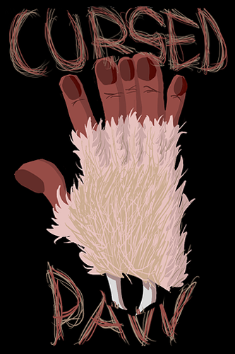
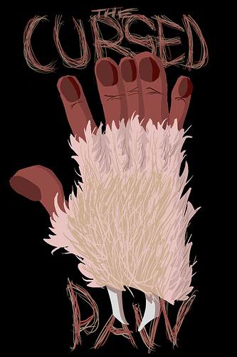
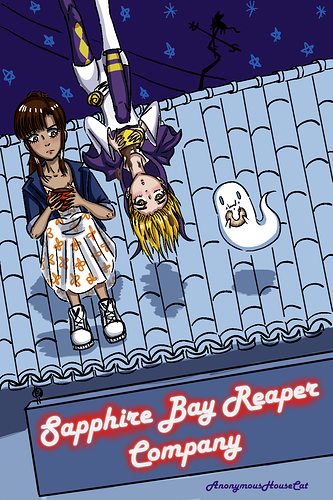
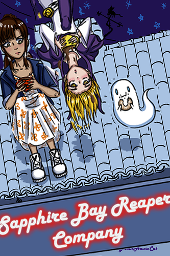
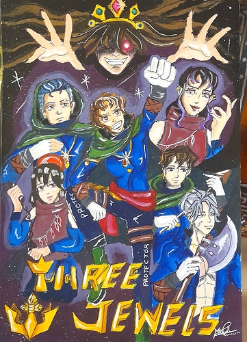
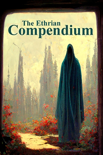
Thanks so much for doing this! This has been my cover for about a year now, and some things I'm already aware of are the resolution isn't as great as I'd like, and the anatomy could use some work. The story is about a 30-something woman who is trying to run an independent grim reaper business (The Sapphire Bay Reaper Company) in a bad economy with limited funding. Meanwhile, her worst employee (gold hair) finds, and tries to help a lost girl (brown hair) who appears dead but insists otherwise.

Your art and compositions look cool! But your logo is lost in the mayhem :slight_smile: You could consider making it bigger, even if that means it will occupy the top forth of your page.

Cool design! I would make things a little more prominent like so.

Don't be afraid to take things a bit off the edges, most of the times you will get a much more dynamic outcome!

Keep up the good work!

I like the addition of the word The, but the word Paw is crushed under the paw! You could also try something like this