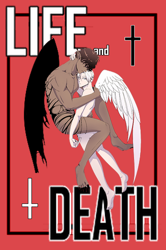
Hey, let me return the complement for the super cool cover art! One think you could consider is making the typography more dynamic. This will amplify the impact of the whole thing, making it more dramatic  Something like this.

The power of composition of other elements is something that's overlooked not only in covers, but in framing as well. You can check it out in the Dimday Red comic I co-create. In it I work on the frame layout and the backgrounds. Let me know what you think!