Hello, @leopoldleo! Welcome to Tapas, and I hope you enjoy your stay here.
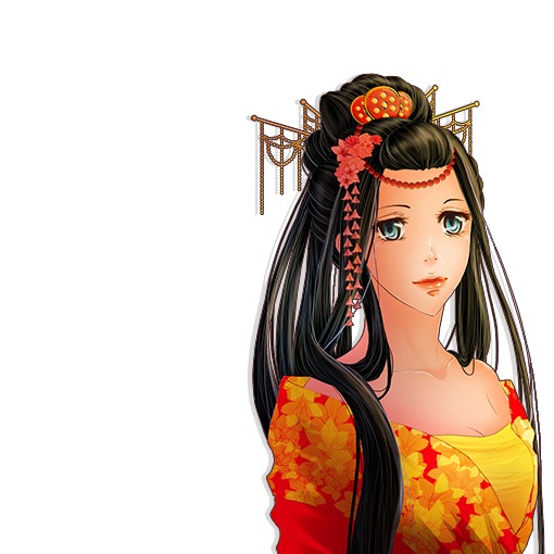
Allow me to join everyone praising your artwork. I love the colours you use and the softness of the look. Attention to detail is lovely - that blueberry tart looks ready to eat. I can't really criticize anything about the way the comic looks. Also, at this point, there's really no way of knowing what happens next storywise. There's magic, and hints of a far-reaching plot, but it's safe to say that this early your art will be enough to draw people in. 
You should invest a bit more time in the language side of things. As others have pointed out, there were bits of dialogue that felt awkward or not particularly in the spirit of the English language, as well as a few errors here and there. As for the word balloons, you should position your text in the middle of the balloon and leave enough breathing space on the side - otherwise, it looks crowded. Mind you, this is an issue that I struggle with as well, but my balloons are hand drawn so I don't have much room for correction. Digitally, you can easily make it work.
My biggest turn off was the font.  There's a reason Comic Sans has gained an unrivalled infamy on the internet. Looking at your comic, the dopey, amateurish feel of the font distracts from the beauty and sophistication of your art. Consider using a different font: there are plenty of resources online, like dafont, where you can find free downloadable fonts.
Overall, you're off to a good start. The only quibbles I found were on the technical side and can be fixed without much effort. Keep working on your art and story and you should be fine. Best of luck with your comic in the future!
Here are my two series on Tapas. If you'd like, feel free to take a look.