I'm back after literal MONTHS. I'm sorry and there's only my procrastinating ass to blame 
So today I'll tackle @Hexigate 's fantasy comic, Aegis. It's going to be an art-heavy review of sorts.
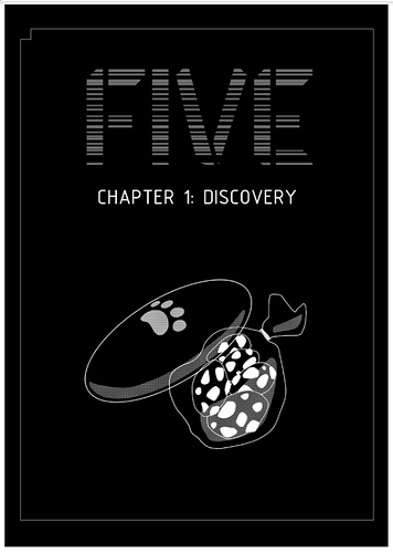
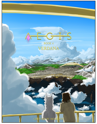
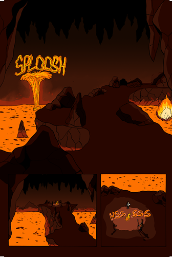
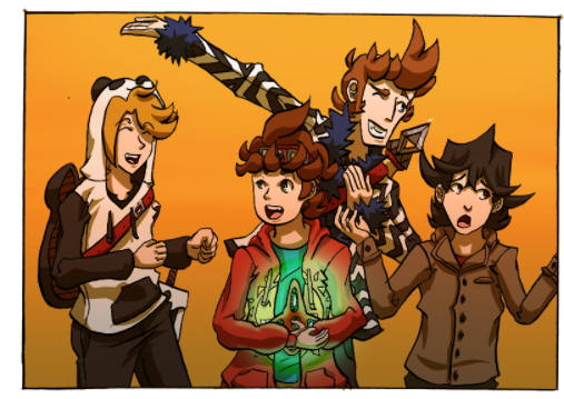
I'll start with showing off this recent badass cover art.
Since Aegis has been produced since 2015 (I'm literally praying I'll make it that long with my own lol), we're going to mainly focus on the last 6 months or so of updates.
First off, I love your disclaimer. (For those just reading the review, Aegis' first page has a note saying it was crafted over years, so there's a lot of improvement to see from first to last page). It made me personally just want to read it because I wanted to see the changes (in fact it made me check your latest update at the time and there was a definite upgrade in storytelling/art quality).
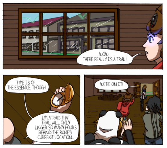
Right from the beginning, your pacing is excellent and the time you take to show the world is hard to find from most comics. I love it. Even as I know your art improves over time, I'm already invested in how well the dialogue is presented and written, and the pacing of it all. Like seriously, you clearly put so much thought into secondary actions characters do as they talk. One point early on, our main character Sam, a detective, talks to a bartender, and the bartender is serving and setting up drinks as he talks. I just see a lot of comics neglecting they can have their characters do unrelated things as they talk to create more interest in the scene, so well done.
The sore spot in the very beginning is the art but it does improve greatly, so we'll be getting in-depth with it.
Since I last checked in a couple months ago I'm slapped in the face with how the quality has improved, lol. It's like everything I wanted to post, you telepathically knew and worked on. Namely controlling your sketchy lines (they feel so confident and clean and mesh very well with your half-painterly approach. See what I wrote almost 4 months ago below:
"You have to learn to control your hairy lines. what saves your art is your confidence in shading. It really makes those pages jump out at me with your confidence in lighting scenes. I really think you need more gutters in between panels. Especially where panels are very dark, it starts being difficult to tell them apart. If you read some other webcomics a popular choice is a basic white background for all panels, but maybe for you a dark color/tone would suit it best."
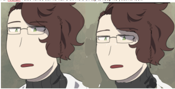
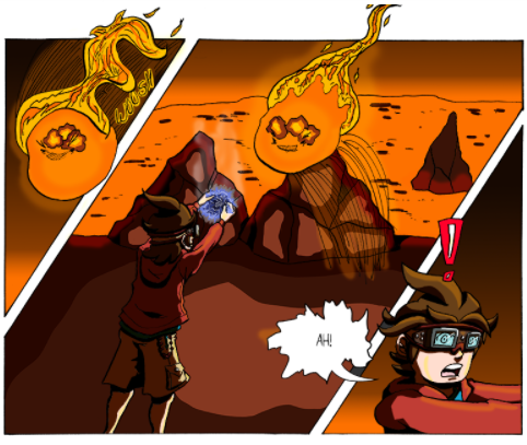
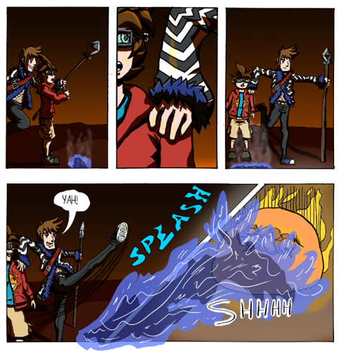
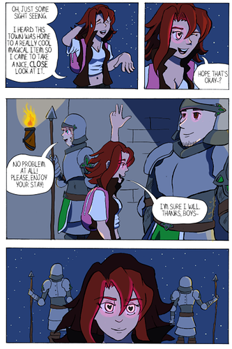
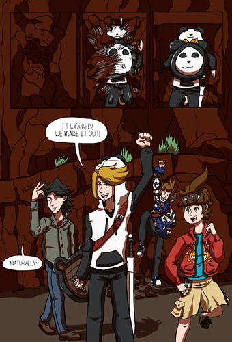
Both issues are resolved now. Lineart feels clean and confident and the use of gutters helps the panels breathe. So... you beat me to it @Hexigate  Below is an example for readers:
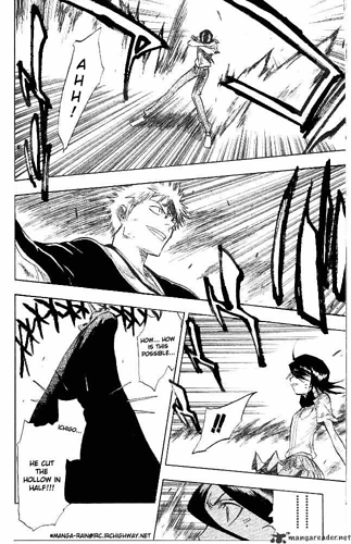
Compare this:

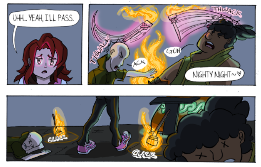
To this:
Your panels have this overall professional finish to them now which looks great.
I'm randomly throwing this in, but you mentioned something in one of your updates that caught my eye:
"Art-wise, I'm stressing over my lack of development (as always). I need to learn to refine details in light and dark, I need to look into light scattering and reflected light, I need to differentiate flat and curved surfaces, I need to study hair and textures, I need to continue on anatomy, I need to understand body movement, and for goodness' sake I need to innovate with my cinematography. I wish I had someone to help me with all of this, I could be advancing so much faster if I'm classically trained. College won't let me take art courses and I don't have the funds to sign onto a studio; I'm having a hard time teaching myself..." (late 2018)
I'm a college art grad and I'm here to say... art school doesn't do a lot for you unless you REALLY put in the effort. Grading is pretty subjective. It's insanely expensive. But I'll say the biggest improvement for me came in my life drawing/painting classes. And there are so many free resources online, it might be overwhelming, but the way I've seen you improve shows you do pay attention to references, lighting, composition. Maybe you can add more structure to your study schedule by following some youtube channels that do online courses. There are many youtube channels that encourage daily studies. One of my favs is croquis cafe (nsfw warning, lots of nudies lol). They used to post weekly I think, 30 min long videos to practice alongside. So even if you can fit 20-30 min of targeted practice into your life, you'll see a wicked big improvement.
(LINK ABOVE HAS NUDE MODELS YOU'VE BEEN WARNED, lol)
But I feel you. There's nothing like taking a class and feeling the pressure to do your best. You could try starting something on the forums where a group of artists do specific studies weekly. Anything to make studying a responsibility, where you'll feel held accountable.
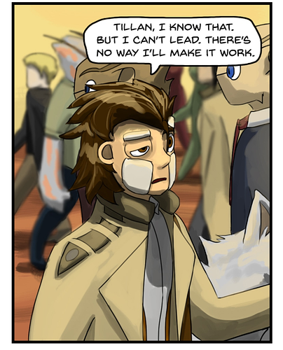
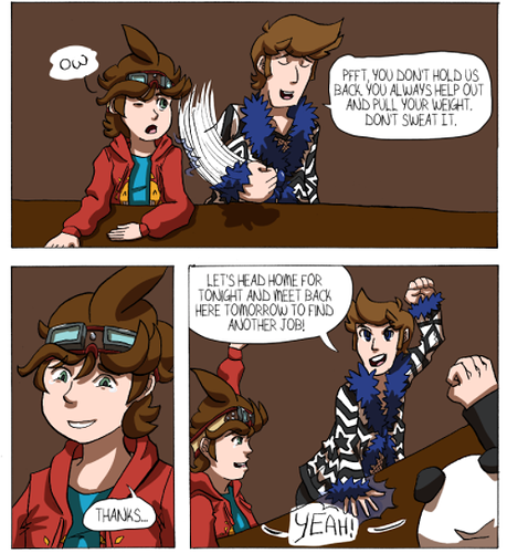
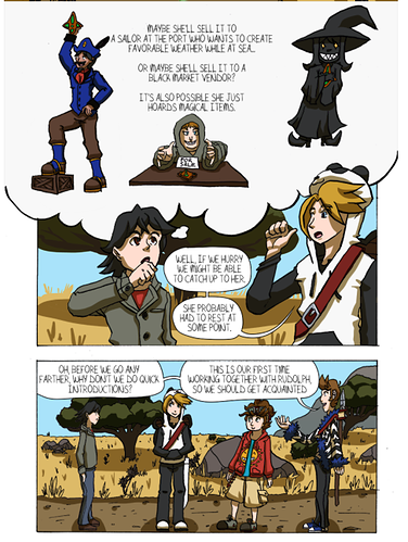
And I mentioned it earlier, but your storytelling skills feel like second-nature to you. And how you compose your panels is really well done. You only use rectangular/square panels from what I've seen but that doesn't take away ANYTHING from your storytelling. You take the time to establish the environment. You place characters in front of each other, or blur certain parts of a panel to bring in focus to one particular area. You've got all that down, I just wanted to say.
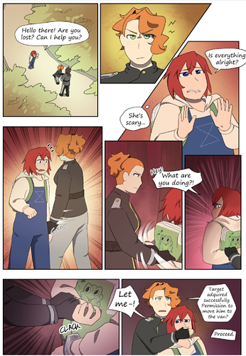
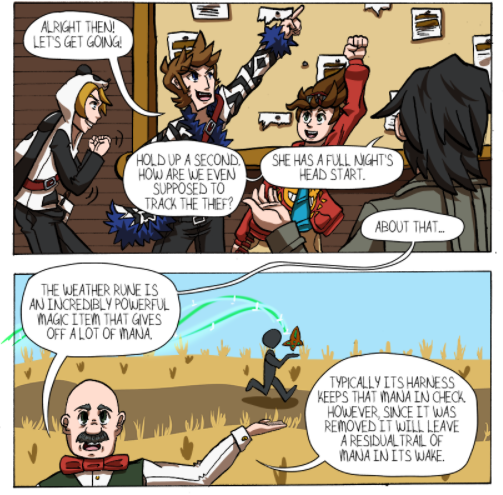
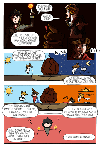
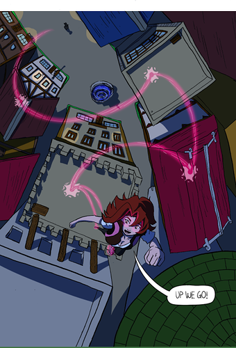
Here's an example of his attention to detail in panelling:
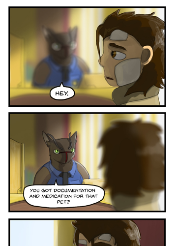
There are many more examples, but to go off on a tangent, many webcomics reuse panels or parts of panels to either build drama, create a comedic scene, or add buffer to the update's length. It's obvious to me when the artist didn't have time/didn't want to create more panels and reused the same one 2,3,4 times and that can end up looking lazy. It can be hard to make it look natural. But in this scene each panel has its own purpose. The blur guides our focus to what's important. And the subtle change of expression in the last two panels makes the reused scene feel perfectly in place.
OK ANOTHER TANGENT: Your comic never feels rushed. I think that's mostly a good thing. The only way it takes away from the story is how slow the story progresses. BUT since I read 4 years' worth of work in like 2 hours, the pacing feels deliberate. Slow, but easy to digest. You don't info dump often and instead world-build over time, through snippets of dialogue.
Studies:
I'd say your main focus of improvement will be in human anatomy, and faces.
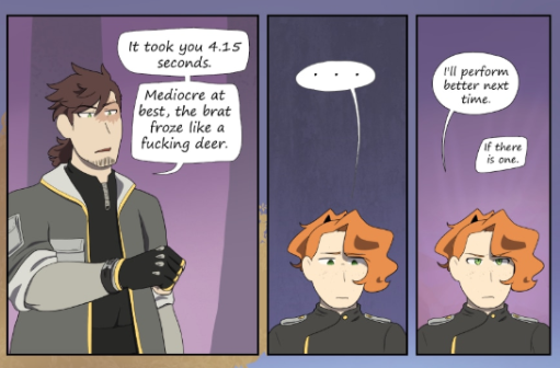
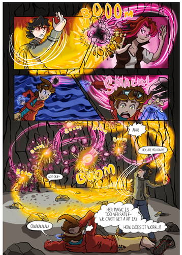
You do wonderfully already in conveying particular expressions very subtly. Here were a couple I really liked:
And I love how expressive you've made Sam. His personality shines through in his sorta laid-back personality, but he's still rational, brave, and level-headed. And he LOOKS it. Another:
(btw I loved the shading/lighting in these scenes.)
You just need some work on the forms themselves and start understanding faces on a deeper level than symbols. I'd recommend studying real faces as well as redrawing faces/styles you like from comics/other artists. People say not to draw from other anime/comics at first and that's another debate. But if you only ever study realism there won't be an easy way to connect to your own style, which comes about organically without you realizing it (AND while taking in new media). So personally, I loved to do studies from my favorite online artists. "Oh, I like how they draw eyes, but I like how this person draws hands...." That kind of studying will get you closer to your own stylization, rather than just doing real-life studies only (and it's more fun lol).
So I'd say look for your own inspiration in comics and media and do studies of those. Life studies of course always help but I think to streamline your improvement you should study media that inspires you and showcases the style you want to create.
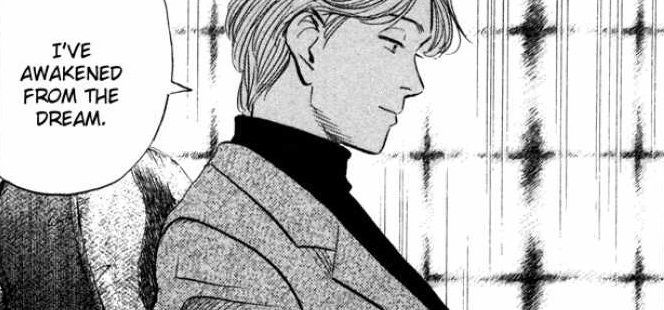
I don't know your own inspirations your comic takes a very mature tone from its pacing to the dialogue, and the content itself. This is a random pull but I feel you have a similar vibe to Naoki Urasawa's Monster (it's a highly narrative pacing with sudden moments of tension and action). Urasawa is an absolute art beast there's a lovely simple sylization to his art you might be interested in. I feel like the way he stylizes faces could be good to study too (it's pretty "anime" so no worries if it ain't your thing):
Scenes that break suspension of disbelief:
This I think is one of your weakest sequences in Aegis and I bring it up because it broke my suspension of disbelief big time.
And for those not familiar with the term, it means to not let certain things about a story/world affect your ability to enjoy the content. For example, I know magic isn't real but Harry Potter builds up a seemingly plausible world and explanation for how magic is hidden from most non-magic people. Never is there a point I'm brought out of (say, the first) film because I'm able to accept that world as "true".
For art I might explain this phenomenon a little differently; it's probably more visual. If a story requires all the characters to be horseback riders but the artist doesn't ever draw horses, but draws everything else competently, their horses are going to stick out like a sore thumb and you'll be noticing their arts' weak spots rather than staying hooked to the story.
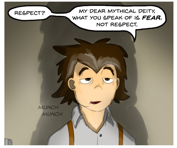
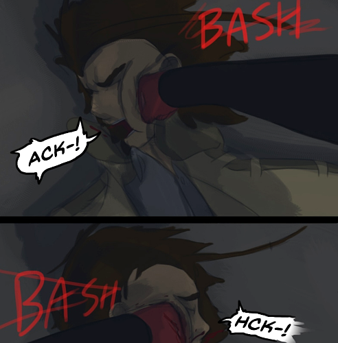
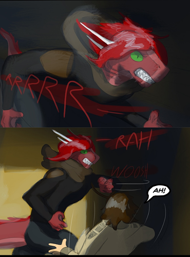
In this scene the main character gets beaten to a literal bloody pulp, but it ends up looking like a gag strip. I still personally felt emotional weight because you have written Sam so relatably and well. But what makes the disconnect even bigger is your attention to detail in the blood, the bruising, and the overall dark and realistic colors and atmosphere. It doesn't mesh at all.
...Looking over the first panel now, I think the first time he's punched is pretty well executed. But what also kind of throws me off is the static camera angle that doesn't work for the intensity of the scene.
Your comic has a pretty mature narrative, and I feel it's really important you try to show that through the way you draw your human characters. Because as it stands now, your mature storytelling style with your art style rub up against each other noticeably.
Studying from Art Styles:
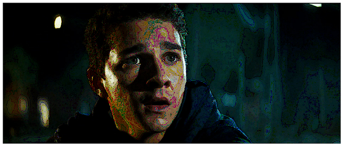
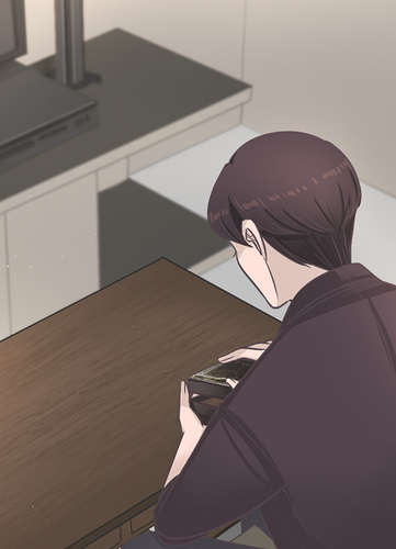
You already set up really great atmospheres and lighting in the backgrounds. Only thing I'd say for those is careful of your darker panels. For example, if you look at that strip where Sam gets beaten up, I actually upped the contrast and brightness. That whole scene in the comic was really dark, made it hard to see what was going on. (I'm pretty sure that whole scene is way older than 6 months but I just wanted to mention)
Bumping up the contrast like this screenshot:
even though this scene is clearly nighttime, there's plenty of contrast so i know exactly the expression/what's going on. (fwiw it's just that warehouse scene with Sam chasing down Verdana that stuck out to me. Other dark scenes I recall you handled well)
Sam:
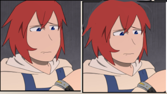
Below I drew over Sam's face in a panel to show a way to add more real structure to his face. This might not be the way you want to do it, but it would help elevate the way he's viewed in the comic itself. I was thinking about it, and he feels so much like a 2D character in a world that really FEELS 3D. The anthro characters have form and shapes, the world itself is carefully designed and shaded, but Sam's whole presence feels pasted into the world like a paper figure.
Here I just added more structure to his jaw, a little more form to the eye, a defined nose, lifted his hairline (feels like I'm a plastic surgeon lol) and a stylized ear. Even without touching the hair (that I personally think you should study and add real structure to as well) he's gone from symbols to a person that's grounded in the world that surrounds him.
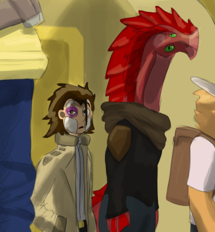
Not only does Sam's face stand out, but his whole body, down to his hands and hair, should be more carefully drawn after some studies. He often looks quite blocky:
And this scene is REALLY interesting to me. Immediately I can tell the forms of Verdana very well, and the way you lay her tail to the side is just beautiful. Sam looks like a potato! Sure he's got a baggy detective coat, but his sleeves are tubes, his weight isn't shifted to the right or left to give him a more relaxed pose. Again you use symbols of what a coat is, symbols of eyes, and hair, ect to describe Sam. And it just makes him look like a cutout compared to everyone else. (And I get this is a far shot, but up close he still feels flat)
--
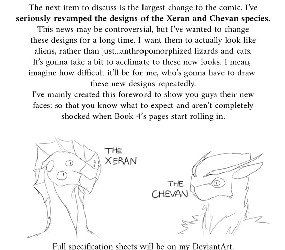
Redesigns:
In recent updates you mention changing how you portray two races of aliens, wanting to give them an upgrade to the mainly anthro style you were drawing before.
This is how the character Verdana looked before:
And how she looks now:
I don't think redesigns like this break a comic but I do have to say its jarring going into the new pages. First we were introduced to aliens that were very furry (which... honestly worked for me. They're distinctly different from humans so I didn't mind it). I like your new designs, but one issue I have with them is it's hard to tell their emotions. That being said we haven't had Verdana being super emotional since we've seen her new design.
So while your previous anthro designs were pretty standard for anthro, there was so much expressiveness and emotion in their faces. These new designs feel pretty devoid, I guess pretty "alien", but maybe if you can push their emotions more that'd be good!
Random Thought:
⦁ While the main character Sam is my favorite, he feels like an old-school Columbo-esque detective, and he's the one guy that doesn't really fit in with the fantasy setting. every other character is anthro or if they're human, have some special garb or fantasy attire. I feel like if you changed up his outfit to give him more of that feeling he'd fit into the world better. Just changing up his stereotypical detective coat/badge with different silhouettes would help. These decisions in his design further make him feel like a "symbol" of a detective, not a real-looking character.
I'll say this lastly, from my own experience. Drawing a comic makes you better at making a comic. It won't make you better at art (maybe somewhat but not unless you're pulling up references and actively learning through them. If you're drawing in a void (no reference, just straight drawing), the art won't change as noticeably. Working on a comic will improve your output speed, maybe pacing and storytelling if you're reading others' comics and reading up on comic-making. But it won't make your art better. So for you personally I'd just start up a sketchbook of studies, focusing on human anatomy. While also studying artists you personally enjoy. Once you get that going you just start gradually introducing what you learn into your characters just like you did with the backgrounds/lighting/lineart. Your own improvement is apparent and you know how to apply new concepts you've learned to your comic. I would just love to see that level of care and attention into the human characters, as complex and daunting as it may seem. 
And just like you improved on lineart/shading/ect... Don't feel pressured to completely study everything on the human body. It can start with just a feature on the face, or many you want to do a handful of coat studies to better understand how fabric lays on a person wearing it. And slowly implement what you've learned over time. I didn't feel I could give a lot of specific instruction on what to study because you need to study everything that goes into drawing people. So do it at your own pace, and pick and choose what you'll study for 30min/an hour. And things will start to come together. You are a talented storyteller and I don't think I needed to tell you what I recommend you do, maybe you just needed to hear it from an outside source, as we all do.
Thanks again @Hexigate for being patient with my procrastinating ass I wish you luck with continuing Aegis and I'll be waiting for more!
@Rhonder You're up next. I promise not to dip for 10 more years, and thank you for your continued patience!!