1 / 10
May 2018

I’m curious as to how you guys use Screentone for your comics. What do you guys think is the best way?

Do you use a lot of screentones or just one or two?
Do you download screentones from the internet, or do you use screentones that come with programs like MediBang or Clip Paint Studio?
Do you paint it gray and apply a half tone effect?
Do you use a lot of plain dots or ones with the grainy patterns and stuff?

Also here’s a link to my webcomic if you want to critique my use of it: http://crimeandcars.smackjeeves.com/comics/2614756/episode-2-page-1/351

  • created

    May '18
  • last reply

    May '18
  • 9

    replies

  • 8.3k

    views

  • 4

    users

  • 4

    likes

  • 2

    links

hey, I'm happy to help you with this since I draw b&w with screentones since forever.

I normally use about 3-5 different tones (must have one for general shadows of characters/things, other tone variants are for "colors" of things"... since it's b&w you must have a few tones to make it less flat i guess.

I have both and they are quite the package with tones and materials you can use and customize, you can download some for example, blood stains or smokes or explosion tones in case you need them for our specific scene :slight_smile: the more you have in your library the better

just my personal thought, half tone will save you a lot of troubles and ink since it's all black and you can avoid uneven color distribution like when you color it with solid color.

plain dots are usually for flat surface with no texture (at least it implies so), and grainy one is, for example, for textured surface like clothing etc :smile: you can totally reference some manga to learn how to use them effectively
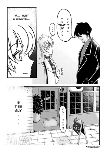
my work example

and your comic is interesting btw... very distinct style and i think you can use tone that way too if you're aiming for a simplistic look.

Aww thank you so much :blush:

And your comic Kijin looks awesome as hell!!!!

Screentone on digital comic nowaday is just an aesthetic style, easy to use, hard to master.
It is just a replacement of colour in your comic, so if you want to be a master at it, you have to be good at colouring.

1 to 5, 3 is balance.

Clip Studio Paint is the king right now. You don't need to download screentone on the internet and worry about DPI and size at all.

it's depend on what you want & what you're trying to show how the colour, highlight and light source displayed.

You can refer to the way I use sceentone in my comic.
Some of my lastest pages I didn't even use any screentone.

I use 50 line 20% & 40% on every page. I sometimes also use 10% and I will use the white 50 line 20% or 40%. I also occasionally use a 50 line gradient. I use the 50 line because I found it less likely to have a moire pattern.

I use the tones from CSP, but before I had CSP, I used some I downloaded. If you look around, you will find some. They are good to use in Photoshop.

Heavens no. I work in monochrome so there isn't any grey.

I also do use the grainy (sand) patterns sometimes. Also cloud tones and other tones here and there as needed.

Cute bear tone! Also you can see the moire pattern from before I started using the 50 line tones. I tried so many ways to get rid of the pattern but it just wouldn't work.