thank you a lot for the sub, and even more for the feedback 
Tbf people also only ever read title of threads and never the actual OP which drives me completely mad 
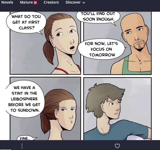
I read yours too and this was definitely something I noticed (read it without checking the other feedback first). I was even a little more confused because on the cover the vending machine was in space, so I was wondering if we were kind of time/space shifting in an area around a magical vending machine.
I don't think you need to draw a background on every panel, but you could use a very desaturated/just a few sketch lines to suggest that the characters a not in a void or grab pieces from the establishing bg you already drew? You can fade/desaturate/blur them so they don't compete with your characters. I really loved the lighting you added that illuminated the sidewalk a bit that you did in some of the panels.
Though that was somewhat confusing, I think the choice to use the 4 long horizontal panels on every page gave me the most trouble. There's pacing, flow and focus that I think would greatly improve your comic if you opened up that structure. As it is it will feel like everything is happening at the same speed and the reader needs to do the mental work to understand if you are showing us moment to moment or a slower sequence, for example. Plus you will be restricted in how you can crop which I think exacerbated the feeling of a void.
Whew, as the focus of the thread is the criticism part I feel like this was tilted very negative so I've just got to say your artwork - lines, anatomy, expressions - looks really great! I absolutely love the environment you drew behind the vending machine and think you should find sneaky ways to keep using it. And the pets... Omg so cute!

I find that the negative parts of criticism are extrememly helpful and sometimes people are shy about giving them. Have at it!
Thank you!! and thank you for the tips on the "void" issue! I'll try to figure out how to do the fading backgrounds. when I do I'll add them in and reupload them.  and YES the four panel standard page was a terrible decision
  I decided to do only four because I felt overwhelmed learning everything at once.
I really like your art style and compositions! 
Don't take these opinions to heart as it's just my personal taste! I think a white background would be much better than the beige and maybe do different shapes for the speech bubbles, if not maybe make them a little bit smaller? In my opinion they felt a bit out of place. As for the ribbon Abirami mentioned, that part confused me a little as the ribbon wasn't shown at all.
I only read up to episode 6. I'll keep reading after I get some sleep. 
Alright so I tried to read a bit into it but you jump around a bit too much in pacing. You start off with a prologue to lead into things then jump to a situation where one person is kind of a jerk without seeming cause at all. Then you jump to another scene which immediately jumps to either a flashback or lore dump. I got whiplash from all of this! lolIt made it very difficult to follow any of the characters very much and made it more difficult to care about them as people. My other issue more just comes from practice and that's the anatomy. You have a good start but it's distracting for me personally. btw I did look at later pages as well to not bring this up and have it not be relevant anymore lol There's definitely already improvement but I still find it personally too stiff and a bit distracting.
I liked the color scheme and tone that you were setting so far though and it DID make me curious what was going to happen moving forward. All the best moving forward!
Thanks so so much for the feedback!! Can I ask if you were reading on phone or computer? And don't feel obligated to keep reading if you're busy since you already gave some nice feedback to fafasmcmelt <3.
I wouldn't go so far as "terrible decision"!! Especially as you said there's sooo much to learn it absolutely makes sense to focus and take it a few steps at a time!
I read on the PC which could be the reason to why I feel white would be better
No I actually like your comic so I'll keep reading it. 
yeah, I still struggle with anatomy and composition and so on, so adding more panels would definitely make me...
This!
I've gone and changed your topic name @thecrystalrook and I suggest you clarify this is a thread for critiques and constructive criticism in your opening post as well.
The initial wording could too easily cause misunderstandings and invite trolls. You already had to clarify your intention to others so it's best if you edit your first post with those clarifications. Quite often people will read the first post and jump to reply without reading any other responses.
Thanks!
Regarding anatomy, yep, I still have work I'm starting from nothing (those are the first humans I ever drew seriously) and I'm learning as I draw, not much time to do anatomy studies unfortunately... I should try to find time...
The comment on pacing is super interesting to me. I was a bit aware there MAY be an issue but no one ever said anything so I wasn't sure if I was imagining it or not. That's exactly why these threads are useful whether some like it or not! It is a voluntary thing to give a non-linear and somewhat random structure to my comic, but it should not be difficult to follow, so this is a very good info to get, that it is indeed difficult to follow. I think it gets worse in later chapters too, so certainly something I have to work on, Thanks again.
Now Runner. The things I liked less are rather at the beginning, so I suppose it's less relevant but I'll still tell you.
First, I feel you need a page or at least a panel before the very first panel. Maybe an environment/exposition panel. I was surprised it was starting so abruptly with a relatively small panel with text, so I scrolled up trying to find the first page before realizing that was it. It is understandable, but a bit abrupt.
Also, I tend to really not like action panels with completely empty backgrounds. I know it is to keep the focus on the character but I feel it looks unfinished. Just a shadow or a blurry simple environmental object would be enough. But, I saw you started changing that later on so maybe not an issue at all.
Last things that seems to remain, but I guess it is an artistic choice so... the 3/4 faces with the face drawn entirely like if it was front facing (or if it was almost front facing) are a bit disturbing to me. It's super common in comics - especially manga- so maybe not an issue for most but as the topic is what I don't like.. I don't like that 
I very much enjoyed the aggressive fauna. I was super surprised by the land bobbit because I have a land bobbit too. The ultimate animal horror as far as I'm concerned 

But now it looks like it's any critique. Which mean again, people will be shy, as usual.. And not say anything negative. If they are not asked SPECIFICALLY people won't give negative comments. Which is understandable, so that is it exactly the point of such threads.
I got the majority of the useful critique I ever got from such threads. It's a shame to change them into another thread where people will be too shy to say anything.
No one forces people to post! It is not 'share a random comic and complain about it', it is 'share YOUR comic'.
Maybe a reminder to post only if we are sure to be ready to hear anything, but why making it another 'any type of critique' thread when all the point of the thread is to encourage people to say what they are usually unable to say because they don't know if it is appropriate?
edit: with the new title I would not even have clicked on it. And I would have missed an interesting comment that will help me improve my comic. So disappointing.
It's up to @thecrystalrook to decide what to do with their topic.
They can certainly add this part to their opening post.
I just went with diamondpowder's title suggestion of "Share your comic + Critique the comic above you" for damage control because the topic was flagged when I logged on. And I see someone else has changed it.
Titles can only impart so much information.
Come on guys, that's common sense!
Who would post their stuff to recieve negative criticism if they're not open to it?
Honestly this is the first time I see a thread like this, and this is useful feedback. It was useful to me, and to everyone who posted by the looks of it.
I understand your difficult position; but it is extremely sad that you have to do damage control because people flag topics just because if they don't want to participate in it, the topics should not exist to begin with.
There has been no issues between people actually posting their comics on the thread, everything is going alright, we already got interesting comments.
I'd like the flaggers to accept that everyone does not function the same way. Please let people who like this kind of thread interact and just don't participate.
edit: new title (how to improve...) is a great compromise in my opinion! Good!
I agree, I just think OP should have been much clearer from the get-go to avoid such problems.
I saw the flag, agreed that the title could be interpreted in the wrong way, read through the responses, and quickly picked something.
And yep, the new title works for me. Thank you to whoever changed it while I was busy!
Just reading the headlines is a common shortcut in the modern human's mind.....
That's why i try to make my threads/posts clear to avoid such confusions......
Anyway, constructive criticism is always a good way to improve, so this thread seems to be a good idea.
Glad they chose a clearer name for this topic.
I agree on the first page. Initially there wasn't even text lol That was me going back to try and on ramp readers better with what I already had about a year later xD Initially it was supposed to be a silent sort of propaganda reel designed in a way to give the impression but vague enough for people to draw their own conclusions as well. The text helps but it's definitely still not perfect  I also agree with the action scenes to an extent. There should have at least been more speed lines or something to give depth rather than just leaving it blank. It's something I keep working on improving at with backgrounds in general. Chapter 1 is a real testing ground for me in that and is forcing me to do better, especially with some pages that haven't released yet.
I'm not sure what you mean by the 3/4 face drawn like it was front facing. I looked through and I can't really find an instance of that at all. The face is divided into planes and my ability to do so wasn't as good as it is in later pages but I either don't see where I'm drawing a face at a different angle as though it's straight on or I don't understand what you're saying when you say that. Could you elaborate?
And yeah that was kind of the reason for the land bobbit lol Hoping to improve my monster design in the future too but that's still a weak point of mine.
So The Purple Ribbon!
(I will answer the way the topic was going when you posted your comic. Which mean, what I don't like personally. I am not qualified to tell you how to improve it )
First problem is an artistic choice I don't like in any comic: I really dislike scroll format. Nothing to do with your comic.
A more specific issue I had is Abirami. Although there is nothing wrong with him per se, I find his looks very out of place. Not actually his features, but the way he is drawn. Elissa is drawn in a style that is more personal in my opinion, and when Abirami arrives, I see an average manga guy arrives, almost like a character drawn by someone else, and less personal, more basic. The very modern basic glasses do not help.
I understand he is a merchant and maybe not from around, so he may have to look different, but in my opinion he looks different stylistically, not ethnically.
This being said, I forgot about it quick and it is a bit nitpicking because I had to find something to say.
Because otherwise I love the story so far. There are a lot of my favorite themes. I mean, I am writing a family drama about merchants traveling to buy fabrics, in a setting with Phoenician and Roman (between others...) influences, so... yep, just my cup of tea. I love the colours too. I subscribed
The girl's face in the bottom is the clearest example I could find. The one on the top has it a little bit too (I feel the eye is too close to the ear), but I would not have noticed if there were not the bottom one. I guess the bottom one is on purpose as it looks like unrealistic features for a humorous effect. I don't know if it's actually a problem. I have poor suspension of disbelief and dislikes unrealistic features coming randomly (chibis too..) so it may just be me.