Thank you for the feedback!!
I added a version without the crazy lighting to the original post haha, I wasn't sure if I liked the intensity of it so I made both 
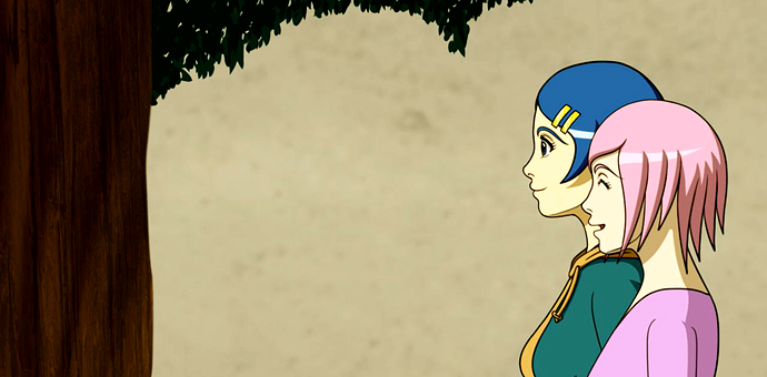
As for your drawing, I really love the way your characters look! Their proportions look great though I personally would move their eyes a bit more back and add more depth to the eye sockets, but it doesn't look wrong in the way you do it.
I also love the tree you drew, but it's very dark which makes it look a bit.. flat, in my opinion. Though I'm not sure if it might be so dark because it's supposed to be in the foreground. If that's the case, I'd try to overlap it a bit with the characters so you can see that it's supposed to be before them. In general I would add more things in the background too to create more depth in the piece, but I assume you've chosen not to for stylistic reasons which is totally okay!