20 / 47
Feb 2023

There's a trending thread showing your worst work. It has been interesting watching authors post what they consider their worst work is.

I like art and I love seeing progress so now show everyone your best work and tell me the reason you consider it your best work.

:smiley:

  • created

    Feb '23
  • last reply

    Mar '23
  • 46

    replies

  • 1.9k

    views

  • 35

    users

  • 250

    likes

  • 3

    links

As of right now, I'd have to say this one. I took a chance on the perspective and it really paid off. The characters' poses are readable, their personalities shine through, and their colors work well together while still standing out against the background. There's a few runners up, but this is definitely the one I'm most impressed with.
2

Looks great I agree the colors do work well together and I can see their personalities. Looks like a fun trio.

Thank you! It took a little work to figure out what the background color should be. And I'm glad they look fun! :smile: It's not often that I get to draw my astronaut characters out of uniform, so this was a fun exercise!

I end up not liking or finding problems with a lot of my stuff after like a month, so I don't have many favorites. I still really enjoy this spread though. It's my first double-page spread for this run of Nocturne.

Okay, for me it's this one:


It's from 2019 so it's definitely not my newest ones, and I think I managed to improve since then, especially with perspective and composition, but somehow this one stays my favourite. I think that's because while my other art my be better when it comes to technical skills, this one is the clearest about the direction I want to go with my drawings. It is my 'I GOT THIS' drawing haha cx I still go back to it when I feel like I'm lost and not making any progress.
Sooo what I like about it is the story-telling aspect! I think it's interesting, I managed to show my characters and their personalities as I wantetd them to be, I like the colours, and basically I'm proud of myself here hahah cx

From 2021 and still kicking ^^
Honestly, this was such a breakthrough picture in everything (poses, angle, colors, motion) I can't get over it and I know I actually became better after drawing it.

This was my beta cover for my comic (very exclusive, I know), I say this is my best work because it is what became the foundation of the art style I wanted to take my comic in, not the comic in itself but the professional feel of it, i.e. cover, promotional art and chapter artworks. After making this beta cover I learned a lot and have been improving since. I still look back to this drawing as a form of inspiration for myself especially when I feel like my work has become a bit dull to me. There's just so much memories that I have with this drawing. : )

Also, I made this back in Dec. 2019.

At this moment in time I think this one is my favorite. Jo and Leah hold a very special place in my heart, someday PoF's plot will reach their backstory and make someone (me) cry, but for now I just enjoy them being excessively cute and general couple goals.

(don't let Jo's short hair and preferred he/him pronouns confuse you, big lesbian energy going on right here)

I've always loved the way you do renders! Plus if I remember correctly, I think you do it all traditionally? Do you scan it in and then do edits to it or does it scan accurately get all the colors? Everything is so vibrant!

It is all traditional! I draw it with pencils, ink the linework with Micron pens, color it all with marker (and sometimes small hints of colored pencil or white gel pen), and then I go over my linework again to clean up the lines.

Then I scan it, and color correct in Photoshop. Some images scan better than others. This one needed very little retouching. Others (especially anything with a lot of yellow) scan poorly and get washed out. Very light colors can sometimes get lost entirely, so I need to be mindful of how I color things so they survive scanning. There is a limit to what I can put BACK in Photoshop.

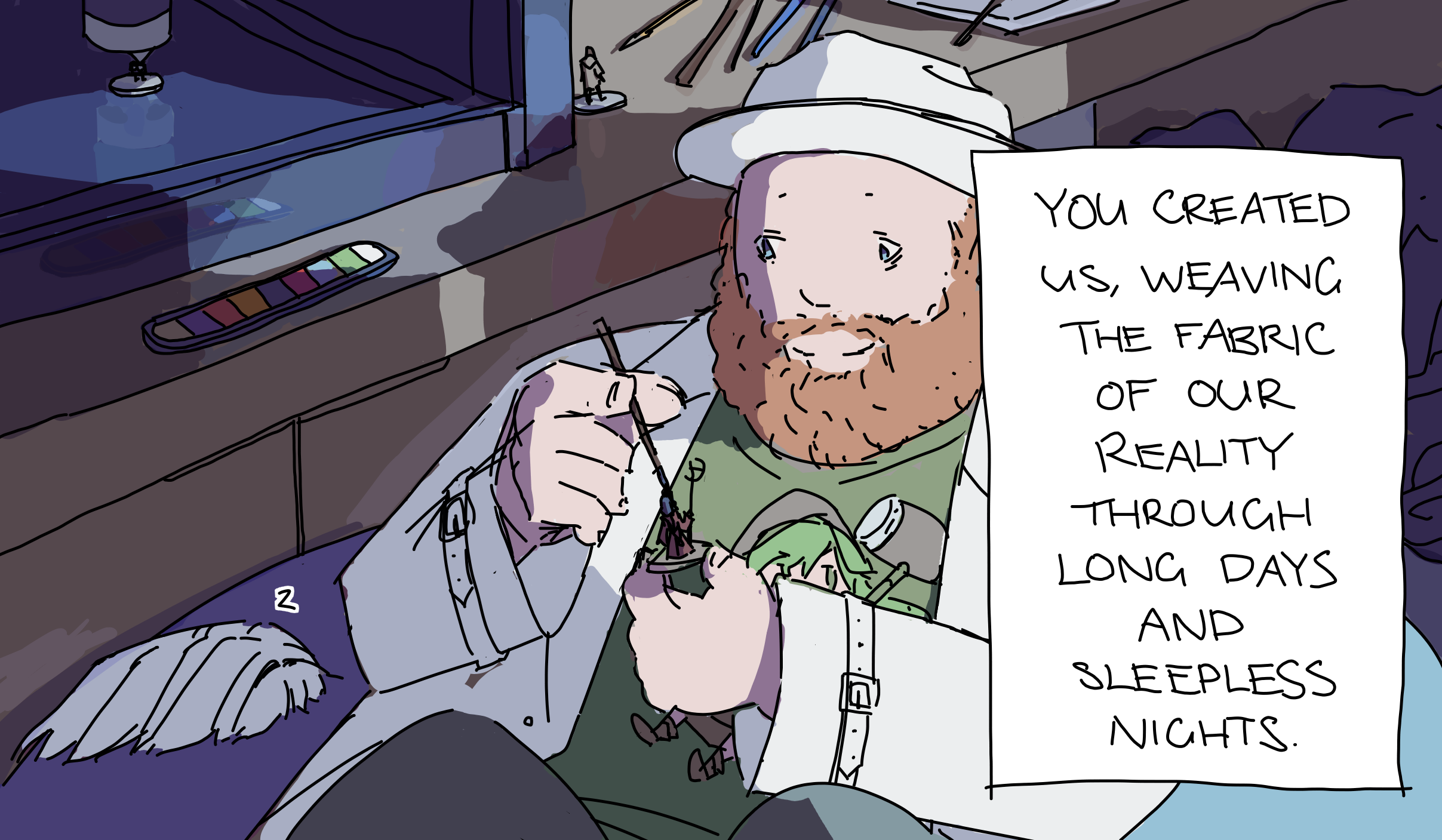
Shit this is a hard one....if I was going by which drawings I liked then I'd be here all day. I don't think I've had a moment where I looked at what I was drawing felt that it wasn't good enough. And if there was a portion which I felt looked off or wasn't good enough, usually the whole would make up for that and that little quirk wouldn't bother me as much. That and I dont think my greatest work is soon to come. So in order to make this work, Im going to focus on a drawing which at no point during the creation I felt unsure about or thought looked off. One which I knew what I was doing throughout the whole thing and was confident all of the way. And thinking back to my previous drawings, I've narrowed it down to 2 (technically 4 but I cant show 2 of them here)

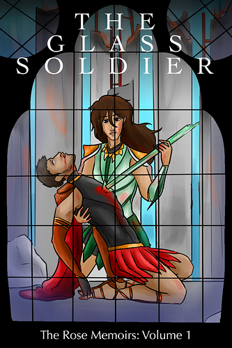
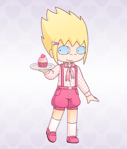
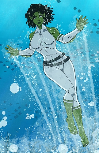
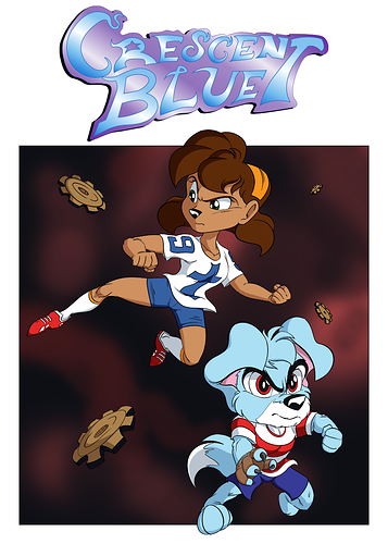
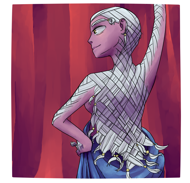
Starting with this promo art/concept art/potential new cover. Im really happy with how this turned out specifically for how Sarah's drawn (character near the top). I've always felt like the way I've drawn her has been inconsistent (I do have a ref sheet of her but its old and leaves too much room for interpretation) and this one was where I truly nailed down her design. Which Im using this one has a heavy reference for the new ref sheet Im currently making for her.


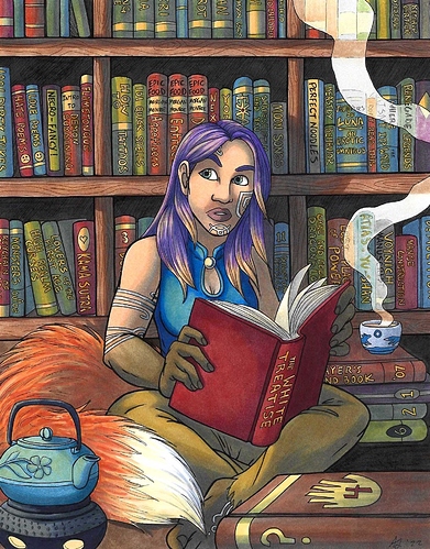
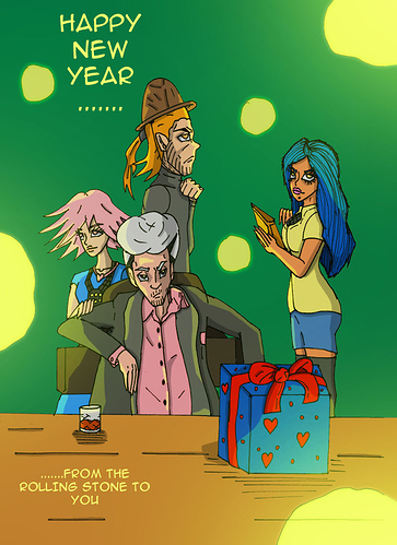
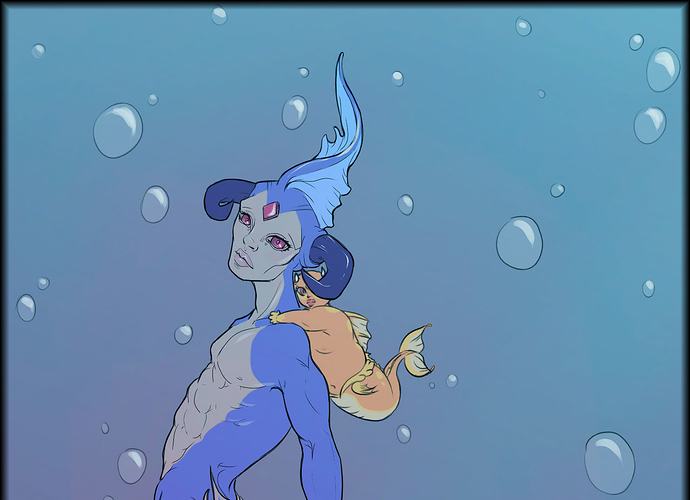
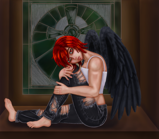
Next up is my entry for the banner contest Tapas held earlier this year. I'm proud of how this turned out from the proportions to the design to the coloring and even the background which I feel like I lucked out on. Painting has never been a strong point and there are times where imagination doesn't translate well to reality but in this case it did! Im thinking I could use this as new banner for my comic with how good it turned out!

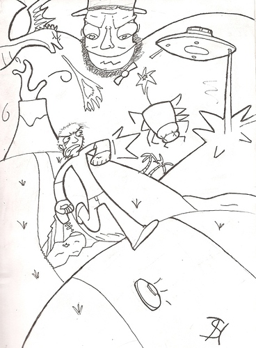
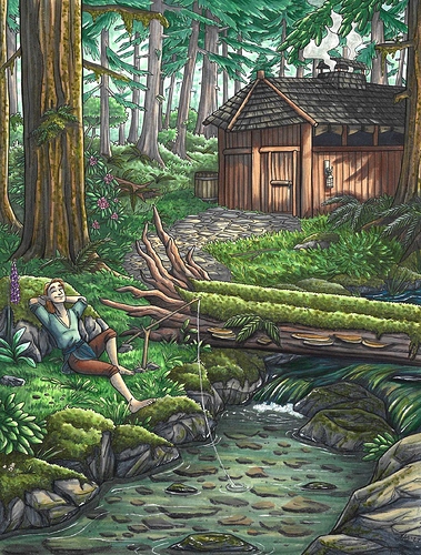
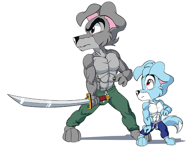
Now I was going include 3 (basically my top 5) but the more I thought about it, I think this would be better as a runner up, a drawing of my comic's mc Scamp training with his father Ken. I am happy with how it turned out, dont get me wrong, but it does loose some points for not having anything in terms of a background, which is the case with most of my drawings. Its still good though:

tbh if I had it my way, I could go on but Im trying to restrain myself :cry_01:

I love how you put shadows on the eye. Most don't do this and it makes them look more three dimensional.

Hmm ... hard to choose between Candidate A and Candidate B:

Candidate A

Idk, I just felt I really nailed the crowd atmosphere :stuck_out_tongue: It's my banner in a lot of places, but mostly because I can carve a better horizontal shot from it than Candidate B XD

Candidate B

I like the reflections, and the vibes :smiley:

Though there's also Candidate C (from mid 2019), which wouldn't qualify for 'best work' imo, but still gives the others a run for their money in terms of 'drawing I like the most':

Candidate C

JUST LOOKITIT :smiley: I was excited to try drawing that woven back hair for a long time :stuck_out_tongue: Also, it's part of a series of character drawings1 that kickstarted my learning of 'painterly' styles and colour theory :stuck_out_tongue:

I won't post my best, because I really have no idea what that is. But I will post a couple 'milestone moment' pieces.

For this one (about three or four years old), the arm was way too short, but I really really liked the design. It's a reimagining of Gyrados, with a baby Magikarp.

And this was after painstaking work on practicing drawing women, because I suck at 'em. friend's DnD character.

And this was my first attempt with copic markers (I also added some prisma pencil).

It's been a little over a year since I drew this now, and I definitely see some flaws (for example, I don't like the background and I struggled with her hair) but I really pushed myself on this piece and I think it shows the upper limits of my semi-realistic digital art. I also tried a technique for painting realistic skin that I saw in an art magazine, and think I did decently for a first attempt.