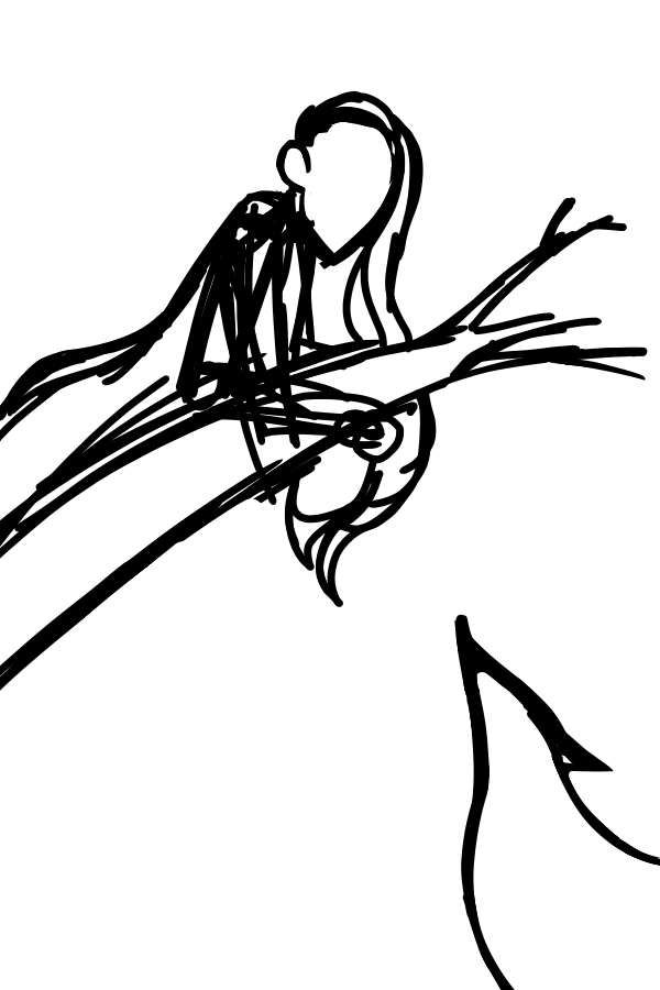
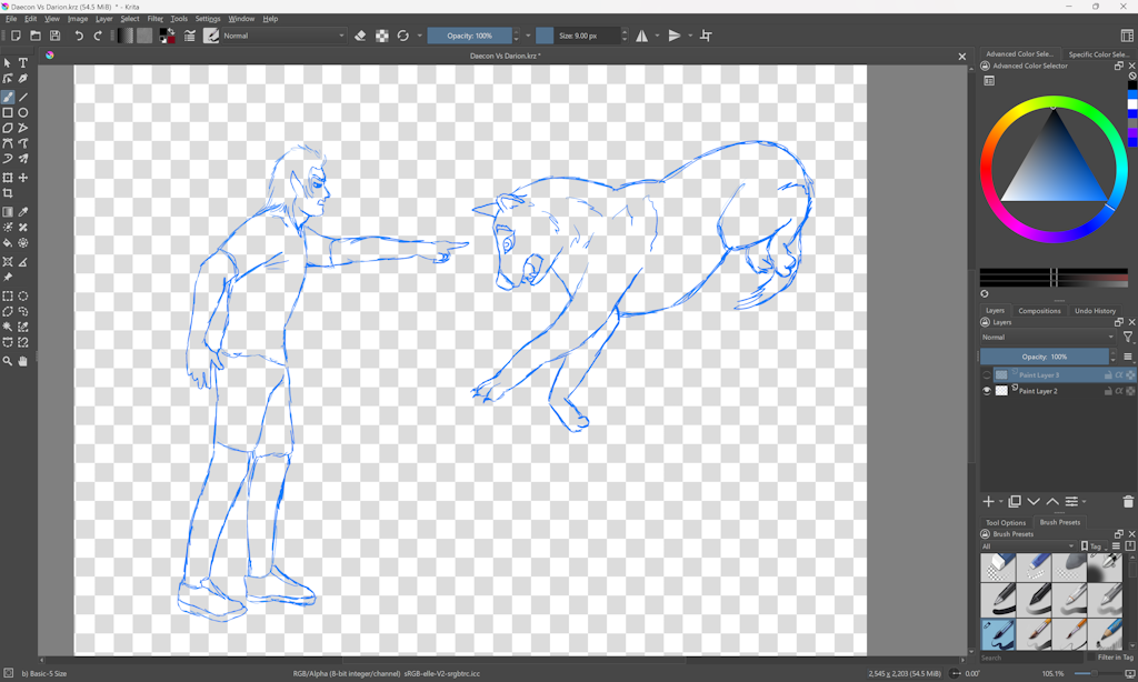
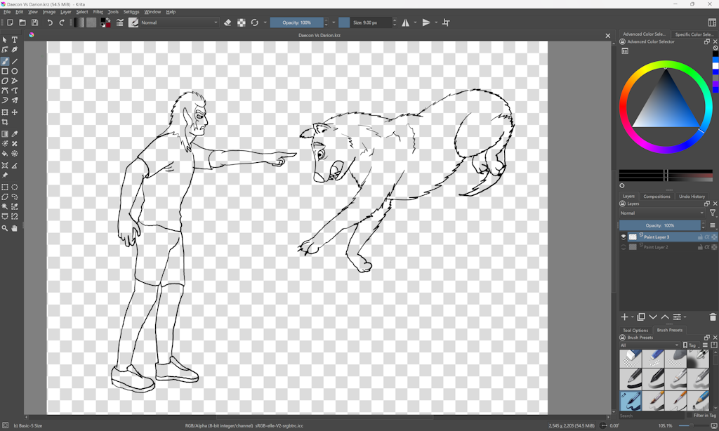
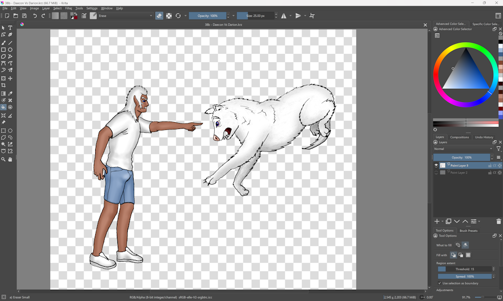
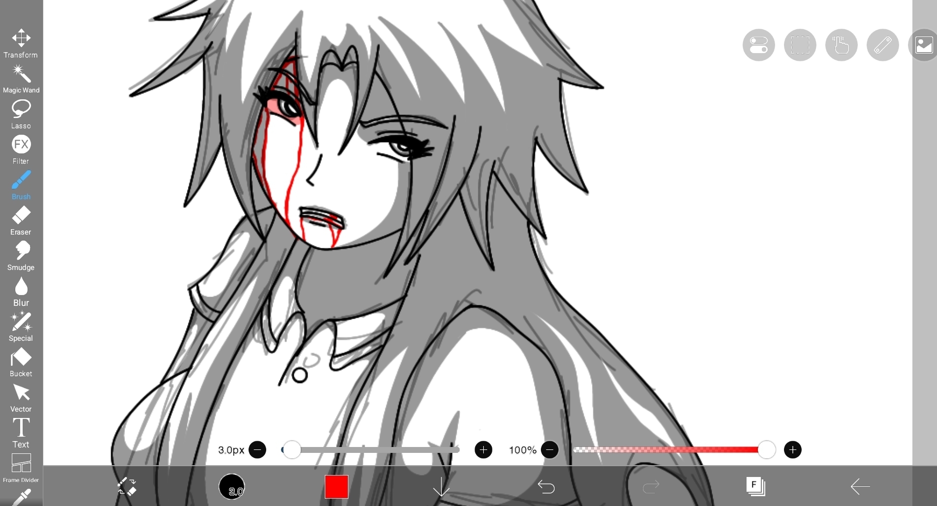
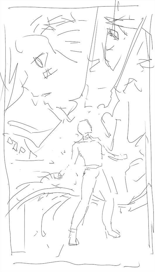
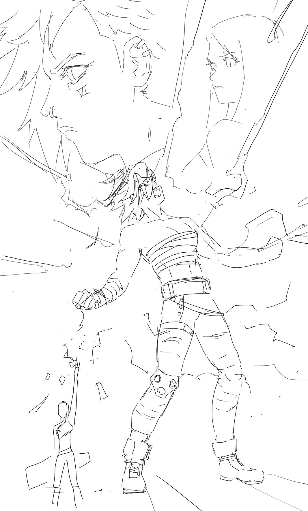
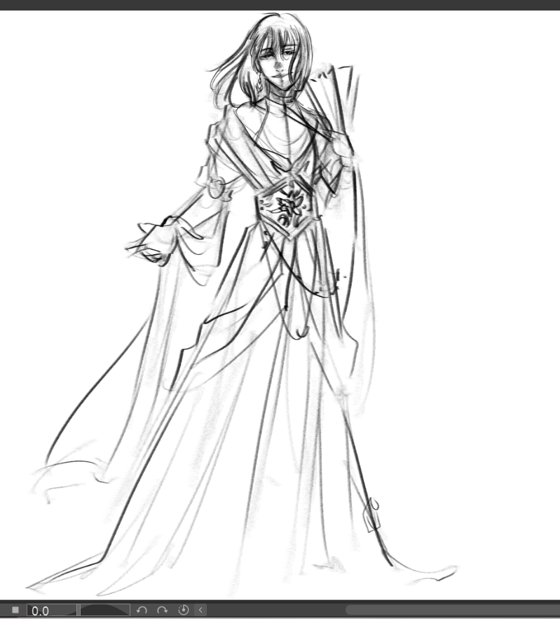
I'll do rough pencils in blue, to establish what I want to do as well as make sure the [rendition of the] pose is to my liking...I'll then do a second stage of pencils in red- cementing the look, but still staying loose enough because I don't care to do "detail" detail coz it takes energy away from me when inking...
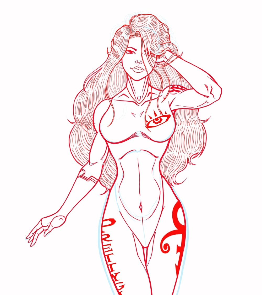
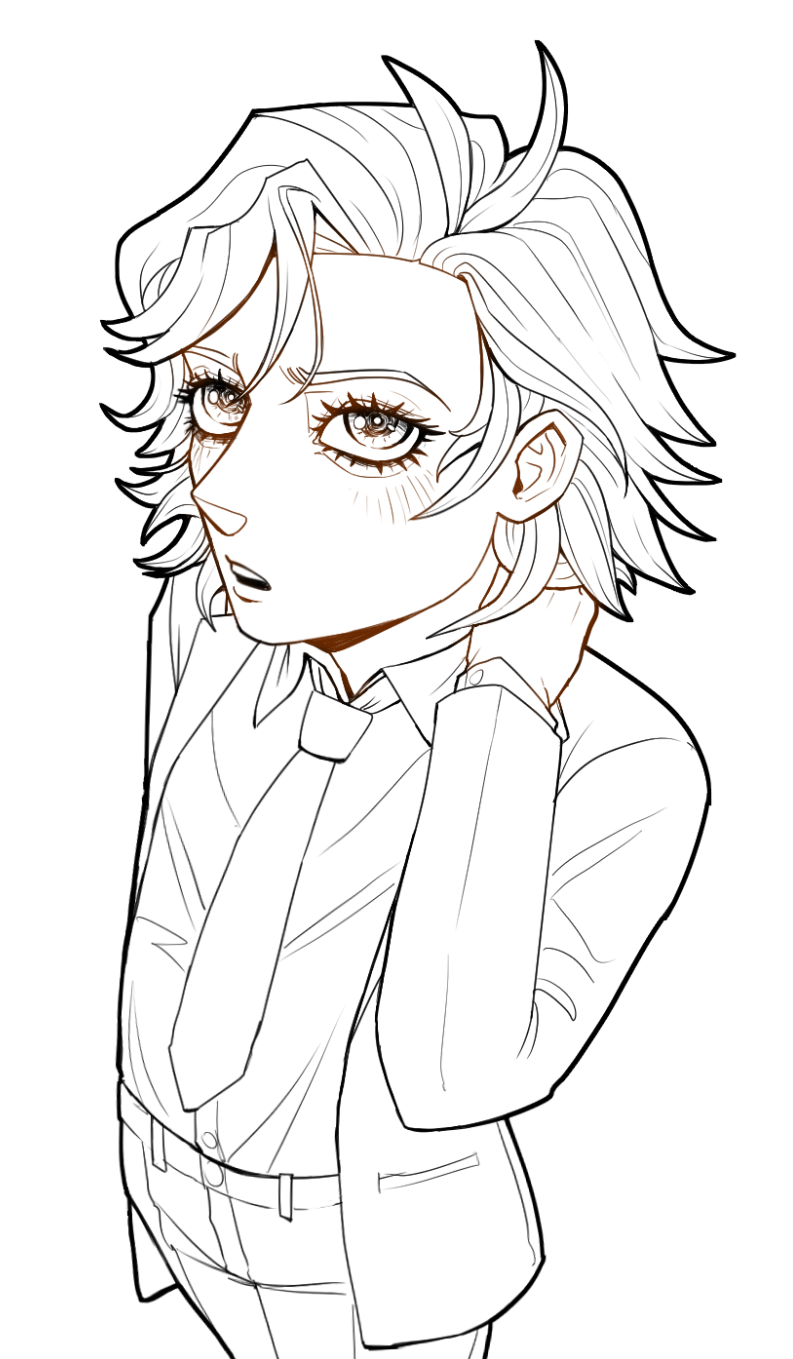
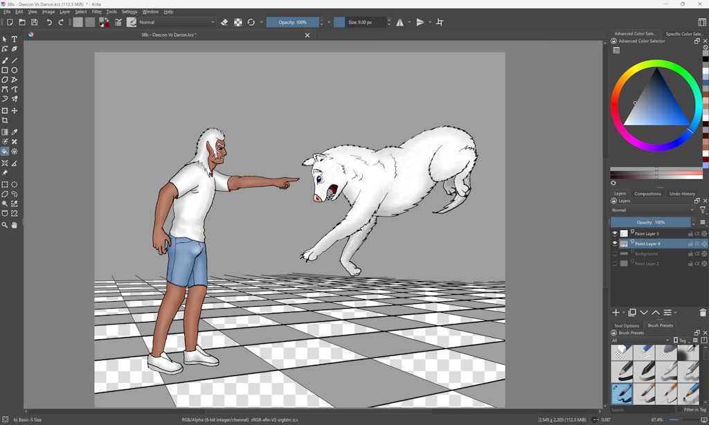
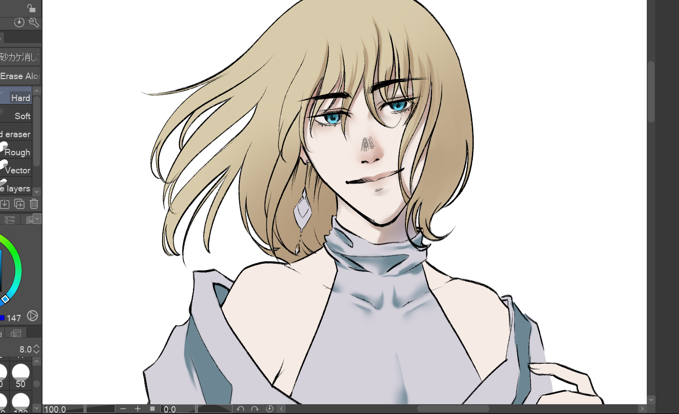
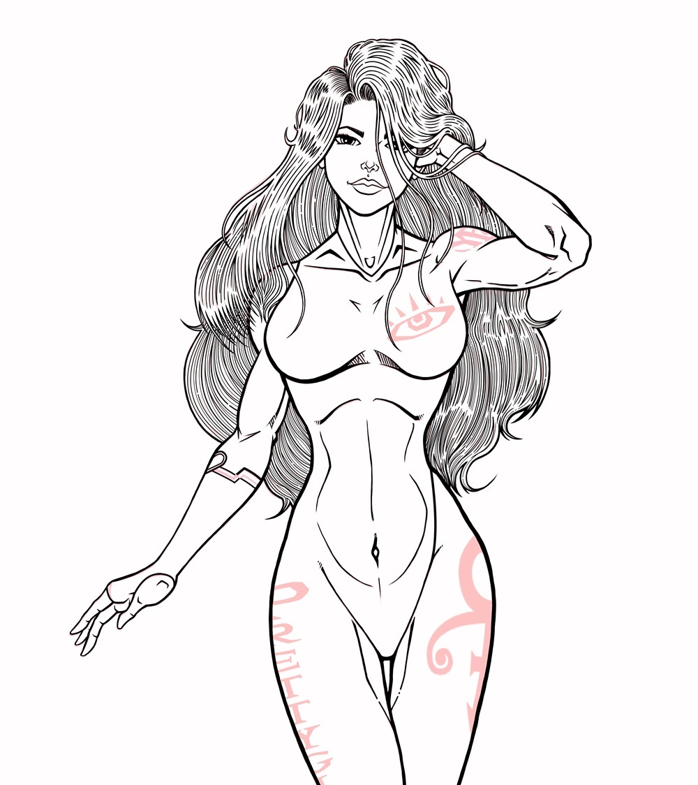
Once that's done, I go to inks- inks are definitely detail and I put a lot of my energy into the process...in the case of this piece, a lot of the logo stuffs were imported in and I had already converted them to color- which is the reason why they're not spotted in the inks...
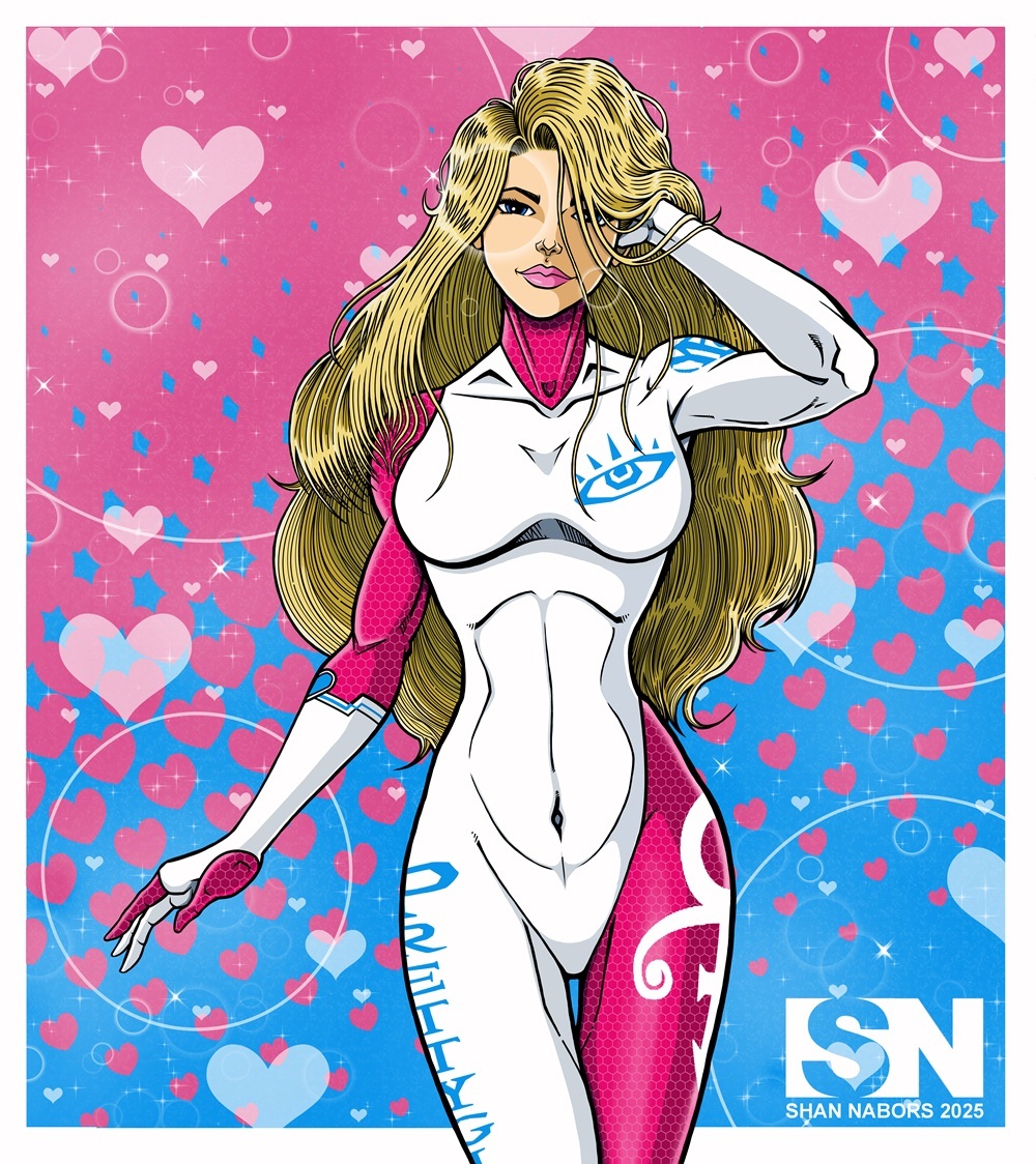
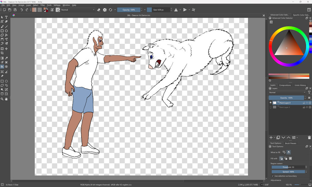
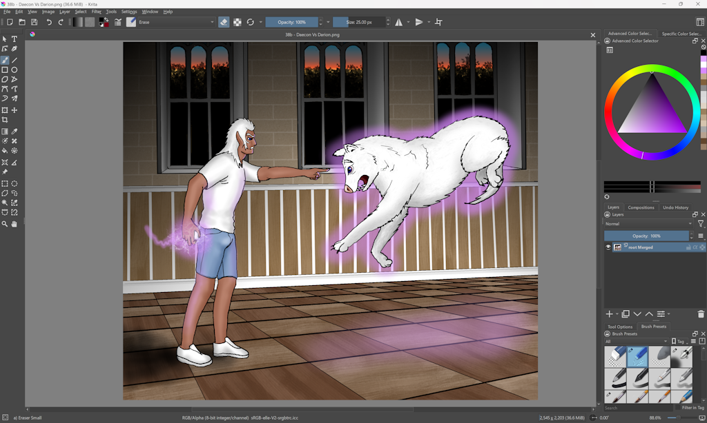
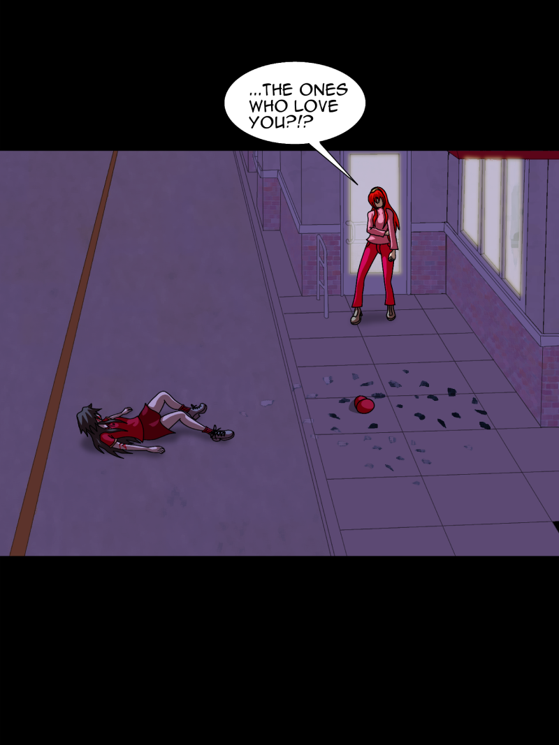
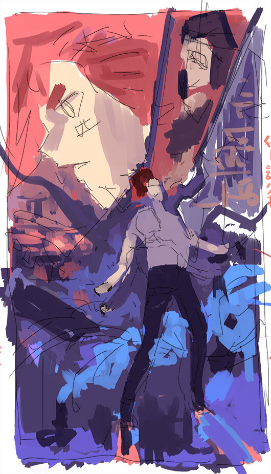
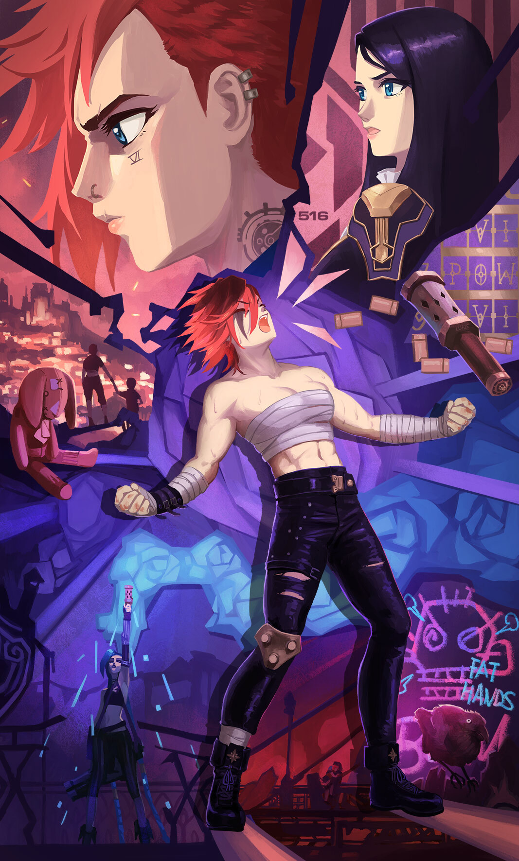
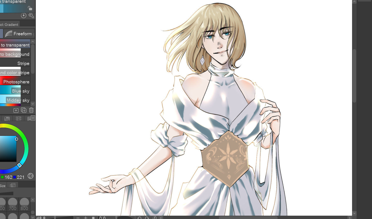
Then I move to the colors stage, where not only do I color, but I'll figure out which direction I'm bringing my light source from, and other effects:
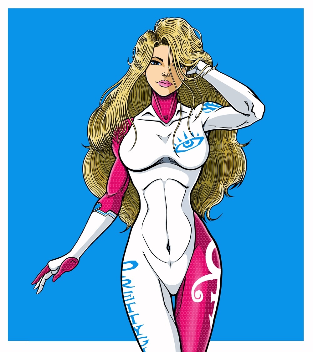
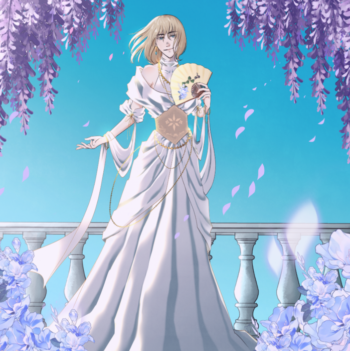
Lastly, I'll concentrate on the background color elements- in my OC pieces like these, I try to keep the background colors & scheme simple...I always use a grainy like texture layer to allow the figure to "pop" out; with this piece, I used the grainy texture layers and other effects layers to dial down the vivid blue and pink layers...it also adds the desired "mood" that I wanted the piece to invoke.