24 / 81
Sep 2020

You guys sure did put in a lot more thought than me.

My head was empty when drawing this, doesn't mean there's no symbolism here! First of all the land is bathed in red which I did for cool lighting but it certainly gives the whole thing an ominous feeling. There's something bad about this scene, something wrong. There is also a barren tree and rocky hills. The world is barren and lifeless. Anna is very close to the viewer, I wanted her to feel intimidating. But only half of her is visible, she only allows a part of herself to be seen. This is pretty accurate to the characters untrusting nature. There is also a cats eye looking over the land but it's also looking down at Anna. This is the gemstone symbolizing the royal family and is featured on Anna's sword and The Tiger Kingdoms crown. Her royal lineage/status hangs over her head, watching her, judging her.

Anyway that's what I think is going on! I make a new one of these every chapter so I could talk about the other ones cause it's very fun to talk about them but I don't wanna spam this thread ha ha. Anyway if you wanna see the other ones heres a link! https://tapas.io/series/The-Tiger-Queen/info


I honestly have no idea. I was originally just working on a portrait of one of my characters from the comic then I just decided to slap the title on it, and wa-la.

The resoning behind mine is to show the importance of the tree in the story as well as the main protaganist. She up on a hill overlooking what lies below, but what's in the valley below changes a few times so it's better to not show what state it's in. As the story goes along I'll be adding more characters to it as they become more important in the story. It's mainly her story, but even though she feels alone in it, she isn't, so she shouldn't have to stand alone either.


plus the second version im still fixing up a bit

I kind of explained my cover in another thread, I’ll share here too. So I was inspired by the Transformers comic collections I used to have

I liked the idea of featuring one character for each arc. My novel spans years, so it’s a great way to introduce new characters, update uniforms, etc. Each arc will be released every 6~ months as I’ll be alternating releases with another series. I think it’ll be cool to see the characters grow

This is my cover!
I used some violet / purple vibes because is considered the color of the magic: the main character is a young mage!
The two protagonists are traveling and are in a city (The story talks about a year's long journey) and I wanted to show the relationsheep between them: Bertie, the boy, is a powerfulk mage but uses his magic to "play" with Hana, who's a child grown up in a military academy and is very disciplined girl. She watches the magic with true wonder;During their journey Bertie helps hana to rediscover her childwood and Hana helps him to become more responsable.
Hope You like it! ^ _ ^
(Sorry for my bad english, I'm Italian)

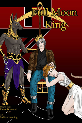
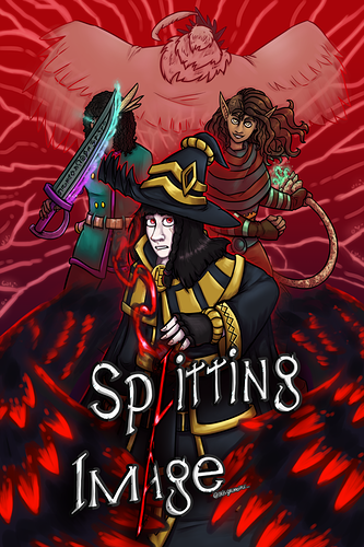
This cover I use as an introduction of the characters as well as hint about the series and chapters within.

There's Banusi (Anubis). It shows his signature weapon, purple color (a color hint of background if you know what purple means in history), his lucky earring (important to the story later on), the scar on his arm (part of his backstory as well as a few other scars hidden here), and cuffs in his hand that are about his back story and about what happens in the first book.

There's Dawn she's shown here without her skin condition (cosmetic spell she's been self conscious about it her whole life at the start of the series is only a few months into accepting it and showing it, so kinda a hint at backstory), shows her ears and tail (werecat), her outfit is meant to show a form of purity/enslavement due to her backstory, and her position is meant to hint at her role in a prophecy/love story.

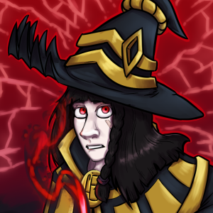
Then there's Silver. He's shackled to a throne with a dented crown since he is the Full Moon King everyone wants to control and is shackled to a prophecy he doesn't want anything to do with. He is hiding his blind eye (backstory reason), is wearing clothes that used to be nice, but have worn down over time (hint and more of his back story), and is shown with his albino look (backstory reasons for white skin and hair).

The logo in the back is the logo that will be on the side spine if it makes it to print. The dark colors help with the overall mood of the series.

pretty straightforwards. that's Vainglory. though I suppose I could expand upon her look here

  • for those of you unfamiliar with D&D, Vainglory's a tiefling. that means she has devilish blood somewhere in her distant ancestry. she doesn't like to talk about it.
  • as a tiefling, Vainglory has a barbed tail. while she's wearing her bespoke plate armor, her tail is tucked behind her right leg
  • Vainglory very much fancies herself a hero, and her religion (she's a cleric) celebrates heroism by incorporating capes into their standard fashion. Vainglory's furred cape is an important part of her look
  • speaking of her religion, her armor incorporates quite a bit of it. the colors - gold, red, and blue - are its standard colors, and the symbols on her besagews (underarm caps) are a pair of lips and a somewhat strangely-shaped blue moon, which are both standard symbols of the religion
  • Vainglory keeps her hair short so enemies have a harder time grabbing it. she is, after all, a combat cleric first and foremost (a War Cleric if you're familiar with D&D)
  • that weapon is her unnamed war pick, a +2 magic weapon that is extremely difficult to use for anyone but her. most creatures that try to pick it up will simply drop it. she's been using it for six or seven years now and has it tattooed in various places
  • speaking of - Vainglory has over 50 unique, consistent tattoos. yes, I draw them all every time. no, none of them are visible on the cover

It's actually a page from one of the episodes of my manga. It shows the 3 main characters up that point as well as the planet they're currently on, with a transportation station in orbit

Ooo I really like your cover! Cute cat-boy. ^^

I just decided to re-do the cover for my webcomic/comic "Scion of Loki". I wanted to give potential readers a little more insight on what they can expect from the story as it progresses. On the left is Rune, a mysterious, eccentric sorcerer. On the right, is the "hero" of the story, Brok, a Viking. They'll eventually team-up and fight side by side. I decided to have an aurora borealis in the background since the "cursed island" that they live on is probably floating somewhere close to Scandinavia. https://tapas.io/episode/18869541

I'm not very good at translating my "artistic decisions" into words, but I'll do my best.

  1. The protagonist on the top (Apollo). He's surrounded by bottles and empty cans, along with a cooler sitting next to him, indicating that he is/has been drinking. A bonfire behind him showing that he's possibly at a beachside party or some kind. He is looking up at the moon in this vast night sky, possibly longing for something else that is far out of his reach. The waves showing a little rockiness in his life.

  2. The second protagonist at the bottom (Julian). They're in a fetal position, surrounded by blackness, heavy handedly showing they're in a dark cold place. Eyes the same colors as theirs staring in entertainment, possibly indicating their own mind playing tricks on them, and causing feelings of insecurity and paranoia. The blood symbolizing injury, maybe physical or mental. If you look closely you can see hands coming out of the darkness touching and pulling at them inappropriately, mental trauma from unwanted physical contact. Their posture and eyes being closed shows they're trying to protect themselves from their surroundings. Their lack of attire shows their vulnerability, with their small, boney frame showing fragility.

  3. Character positioning. Apollo being on the top, looking away while Julian is on the bottom facing forward shows Apollo turning a blind eye to what is happening under the surface throughout the story.

  4. The colors and setting. The nighttime setting with the overall darker color pallet shows a feeling of sadness and emptiness. Apollo himself showing to not be happy by turning away from the warm fire to stare into the cool night.

Overall I wanted to give readers an idea that this will be a serious character driven story, with a heavy tone and drama. Even though the themes of trauma and mental illness aren't obvious in the cover I hope readers get a bit of an idea from the cover.

My comic's cover is this ^^

  1. The colors are like that because I wanted to give it a little magical feeling :smile:
  2. The character is Elizabeth (my main character) and she is serious because she's doing a complicated spell :joy:
  3. The title is with that font because the story is set in medieval times ^^

.


The original version i had crazy ideas for it
1. The shadowy silhouette characters in the background are the main characters of the series but you don't know what they look until you read the series.
2. the moon looming over the title of the series giving you the impression that you're not on earth anymore.

Although nowadays this cover became really outdated. And even though it's my current banner of the series I still cringe at and I'm still blaming on replacing it.


At the moment this is serving as my current cover for now until I finish with my new but that will have to wait until I got some extra time. Dx college is barraging my time more than anything. And I reused one of the drawings I did back inktober of last year and just slapped on the title and my name on it. But it also stands out because:
1. the mc is walking through the rain setting up the tone of the journey he's gonna go throughout the story.
2. Wearing a black cloak and wielding a claymore sword on his sword shows what he has become.
3. i like it when a character is walking through the rain.

But that is my take on this I would love to hear your guy's thoughts about the original cover and the current cover. And which one you like more.

A lot of creative covers here

  1. The first two characters to appear, Spring and Winter, stand back to back, showing off their tattoos that represent their significant season.

  2. I tried to make the background cloudy looking to represent their weather powers.

  3. The gray cloud represents Spring showers while the white cloud represents Winter snow.

  1. The protagonist is behind a window because she's been homebound for so many years.

  2. Blue and yellow. I adopted the colors of A Starry Night. Color scheme is mainly blue because story is more on the muted side.

  3. Protagonist had hands over mouth. Docile for most of her life and only now given fully the chance to break out.

Second cover I'm considering

  1. Protagonist sits on a broken mirror. Mirror is the self-image

  2. Protagonist holds a wilted lily to her lips (pardon my skills). Lily is usually a symbol of purity.

  3. Not really discussed in-story, but her wardrobe is a bit excess on modesty, since either the bodice or the scarf can be worn because both served the function of modesty and she's wearing both. Her sleeves are closed when sleeves can be let loose.

  4. Slight outline of a birdcage behind her. Referencing her fiance's story of a bird.

  5. Bittersweet flowers and Chrysanthemums on the edges.

  6. She's holding a plume in her right hand and there are ink stains below. Referencing her advantage in knowing three languages. The object is also connected to one of the first things she does in the story.

The series is mainly about the characters trying to live their lives as the world around them burns down and tries to suck them into the drama, so I thought it would be a good idea to have the two main-main characters just doing normal teenagers thigs, like getting ready for school!
And I really like manga, so I commissioned it to be black and white!

Ohh this sounds like a lot of fun!!

Here's mine! So far the only one I got.

The overall design was inspired by classic (shounen) anime posters, featuring the main characters and their partners. Since this is a story about characters, I wanted to feature them very prominently, of course with Toby in the middle, since he's kind of the protagonist.

But in the end, it's about a whole lot of characters and their different stories.
The first that is featured is Toby's story, and the next will be either of the four featured behind him.

Check it out <3

Ooh, I love this prompt! I'll just use the Tapas cover, the main cover has some spoilery symbolism I don't want to explain.

  1. The composition: I studied this from similar stories and fantasy comics in general. Showing important characters, but only a few of them, to indicate action but also drama with their placement and expressions. The whole thing creates a bent diamond with everything making your eyes travel between each one.
  2. The characters: Elise being Mike Wazowski'd is deliberate. She's already a shy person with secrets, and disappeared in the timeskip, but the sword points to Dark Lord Nycticorax far in the back; confronting the villain might give answers.
    Nycticorax is the only one with their back to the viewer, cape-wings spread wide and almost blending with the background - partially, a source of everyone's problems, but also with another objective. Veriesin is the most normal one, making a generic action pose, and also looking at the viewer dead on, because she's the one with most confidence in this shot.
    And finally, Mortimer, at the bottom and partially covered by his black magic and the logo, but with a glow that partially obscures everyone else. He looks at the reader with fear, both having something to hide but being unreasonably wary of the audience that he can't see. The magic he's using is nothing like the spells behind him, and it appears to even caress his face as it dissipates. And finally, Mort's black magic wings, a defensive spell that he'll use a lot in the comic, showing that he's willing to put this "evil" magic to use, but it might act unexpectedly.
  3. The colors: Red is the thematic color of the whole comic, fading into dark purple with light pink highlights like the black magic effects. It gives urgency, anxiety, but also passion. Everyone in the cover has something they want to get done, and as soon as they can, even as the red starts to engulf them. As extra, Mortimer is the only one who doesn't have a layer of transparent red, so it's clear that he's the main protagonist.
  4. The backdrop:It's an abstract gradient background, with veins that look like cracks descending down. Another theme of the comic is mirrors, adding into the anxious feel of the picture - it's an image that's splitting, or something that's overwhelmingly all around them, all pointing at Mortimer even as it passes through the rest, though this is more visible in the thumbnail.

I designed it like this to promote the future of the comic more. My art style was changing and so was how I was approaching the story so I didn't think the Chapter 0 title page was quite as representative anymore. I'm actually coming out with new ones soon for Chapter 1 to even further update the aesthetic and feel of it. They're also going to be available as wallpapers on my patreon, like this first one :slight_smile: This one is actually my current computer wallpaper

I usually hate doing covers, because I can never really figure out what would catch people's eye, but I'm actually pretty happy with how this turned out.

Even though the novel is more fantasy than horror, I was going for mysterious and blood-curling.

Luric is the MC and that's him with his back to us. I was hoping the cape + capelet would indicate the Victorian era-like worldbuilding, but the action itself takes place mostly in a small rundown mountain town.

As for that behemoth - well, that's a spoiler :slight_smile: