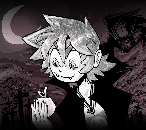
And here's the new one I just whipped up.
I decided to use my old toon style again.
I turned the shadow into a more defined figure of its own, imposing on the central subject, Graham. The protagonist is now more clearly the one who's Grim, while the shadow is the Vampire. A prop from the story, a scythe staff that's missing a blade, is aligned with an enlarged crescent moon that forms an optical illusion of a blade.
The soft pink tone has been relegated to the hoodie on Grim, as it's the most reader-adjacent object on the poster, creating an impression of depth through variation in saturation.
And the background objects, the crosses, are now taller and more imposing as well, creating a warped space that's perfect for a good scare.
Finally, the overall tone was kept pretty friendly to make sure people know what to expect from a PG-13 story.