
Where can we suggest features for the site? I'd love if we could reorder our episodes. I've just written a new first chapter but I can't see a way to add it to the front as a new episode. If I copy and paste it into the first episode the comments won't be relevant anymore.
Thank you but unfortunately, it is enabled.
(For another series, not the one my account is linked to)
All it does is reverse the order of the list instead of starting you on the most recent episode. Maybe that's the way the behaviour is supposed to be but it's not helpful in anyway way with a lot of episodes. New readers (or anyone who comes across it as a link) would have to scroll for awhile to reach the newest episode.
Again, not ideal for Comic strips.
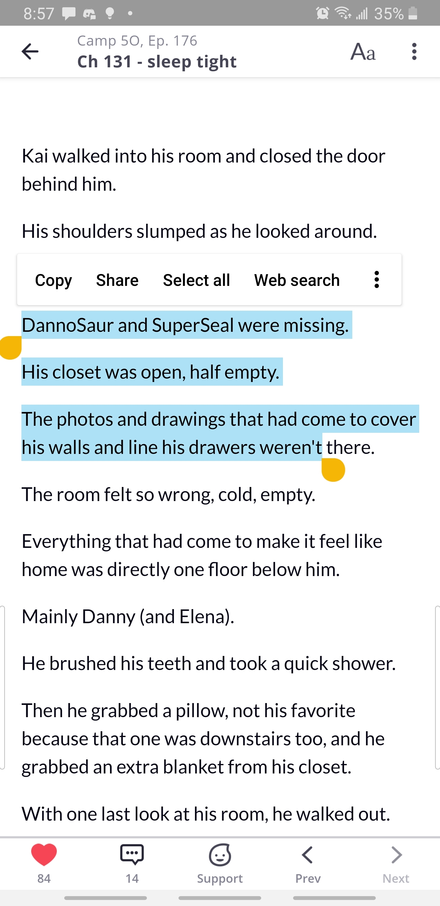
Hello! I know some updates were made to the app as well as the site (for android at least) and I recently realized that with this new update readers can now copy and past from the story! Im not sure if that's been mentioned or not yet!
This wasn't allowed before (I remember because I would always need to keep scrolling back and forth when quoting something from the story in a comment) and just wanted to let yall know in case you werent aware! I attached a photo of me doing it with my story but I can select any text from any story!
Also, two more things about the tapas app update (not as big a deal as the copy paste thing but something I also feel is worth mentioning)
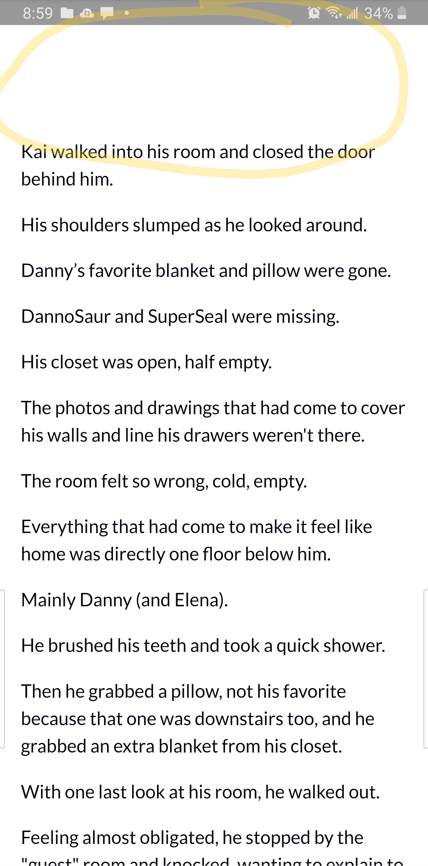
Now theres always this huge chunk of blank space at the top of every chapter, and it's not a big deal but it just kinda looks weird 
And before the update I feel like a reader would be able to click on the creators profile pic or name at the bottom of the chapter and it used to take you to the creators page and show you their other work, but now pressing it just toggles the top and bottom bar. This was usually how I would go the creators page and check out their other works, and it's a habit to press it when reading stories and comics. It took me a second to realize that now the only way to do that was to press the three buttons on top and then click the go to creator button. Again, not that big of a deal, but it does feel a bit more cumbersome and it might make readers not go through the extra steps.

So, last two arent that urgent, about 90% of my reader base have let me know they use the mobile app to read, so that's why I'm just being hyper aware of what its like to use the app and nitpicking it from the stance of a reader. The first one I feel like might be a security thing and in the past copy and pasting want an option and while it does make quoting a line from the story easier, I think most writers might appreciate that getting looked into!
My phone is a samsung galaxy s9, android version 10 (amd I'm still not sure what the software version is  but I sent that screenshot of my phone details in the topic about the italics appearing big on the app!)
It's also still set up that if you start reading a comic, but only read like 10 episodes. So you bookmark it so you can read it later. If that series updates before you start reading again, clicking on it in your dashboard drop down takes you to the newest release instead of where you left off 
Do you know if the team is looking into improving the general search feature? I was just looking at BL or Fantasy comics yesterday and after scrolling for a bit, the list just.. stopped. I'm sure there's more BL comics than like 100 or 200 on this site. Specifically in the Fresh section. Since there doesn't seem to be another way to just freely browse (free to read/fresh) without it inevitably ending.
20 days later
@ratique Hello Tapas Team!! Thanks for your tireless update efforts, especially recently!
There are a few features I'd really like to see as a reader and have heard people talking about so I thought I'd mention them here as a wishlist:
Filtered Search: I use it SO much to discover new series on other sites, and I'm really missing using it on Tapas. It adds so much visibility to smaller series! For reference, I mean something like @violin's http://tapasfans.com/4 (with genres/tags etc) but directly on the Tapas site.
I noticed the mobile site and website have Genre Trending as a list option, but Trending isn't there on the app, only Popular/Fresh/Binge/Wait for Free are. I'd love to see Trending there too since it's the fastest moving list, so it adds a lot of visibility for everyone.
This is more of maybe a bug fix? The front page trending lists are very frequently the same few titles, which usually have completed status, and I've noticed that this list mirrors Trending > All Genres>Free to Read. For some reason, Trending>All Genres>All is easier to climb when Premium titles are included? As in a title will be ranked higher when competing against just free titles than it will when premium titles are included. It seems counter-intuitive.
This one is definitely a bug, but for the last 2 weeks or so, I can't comment on a chapter when using the mobile site. Only the app works.
Someone just reminded me of this one so I'm adding it! We'd love sorting for our reading/subbed to lists
Thanks for taking the time to look at my list! Keep up the good work 
Jay
Awesome thank you for the feedback! Very helpful.
I'll make some reports to the dev team and see what they say!
Regarding 1., the team is currently working on an improved search system, although a way to filter is currently not planned as far as I'm aware. (More traffic for violin!! ;D). Let's wait for the updates as they may improve the search enough to make filters not as necessary anymore.
Regarding 4., that's definitely a bug and the team is aware and is working on fixing it. The apps work fine, so use those for now when on mobile until that issue is fixed.
I want to ask, if mobile app will support other mobile OS, like Ubuntu Touch, /e/, LineageOS, Sailfish OS, or new HarmonyOS (Huawei). I would like to have same functionalities with other devices...
btw. idea about desktop app?
Is there any chance that the devs can implement manual chapter bookmarking of some sort? The site royalroad.com does it like this: The most recent chapter you have read is your auto-bookmark, but if you click an older chapter the option pops up to set your bookmark to there instead. That would save a lot of headaches for readers I think when it comes to keeping up with the last-read chapter. I know it's been quite hard for me to keep up with all the stories I follow sometimes due to accidentally clicking on the newest chapter of the story and losing my place.
Just found this. And I found that it is so cool
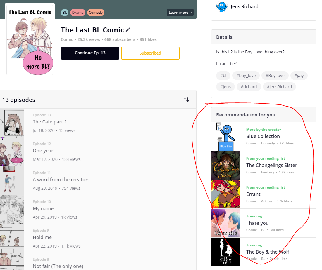
Recommendantion for you
It makes so much sense to have the different feeding options, and not just trending.
Thank you.
Question is, can this feed also be shown when you have scrolled all the way down on a series last episode? That will give the reader some options when there is no more to read.
May
I LOVE the changes to the site.
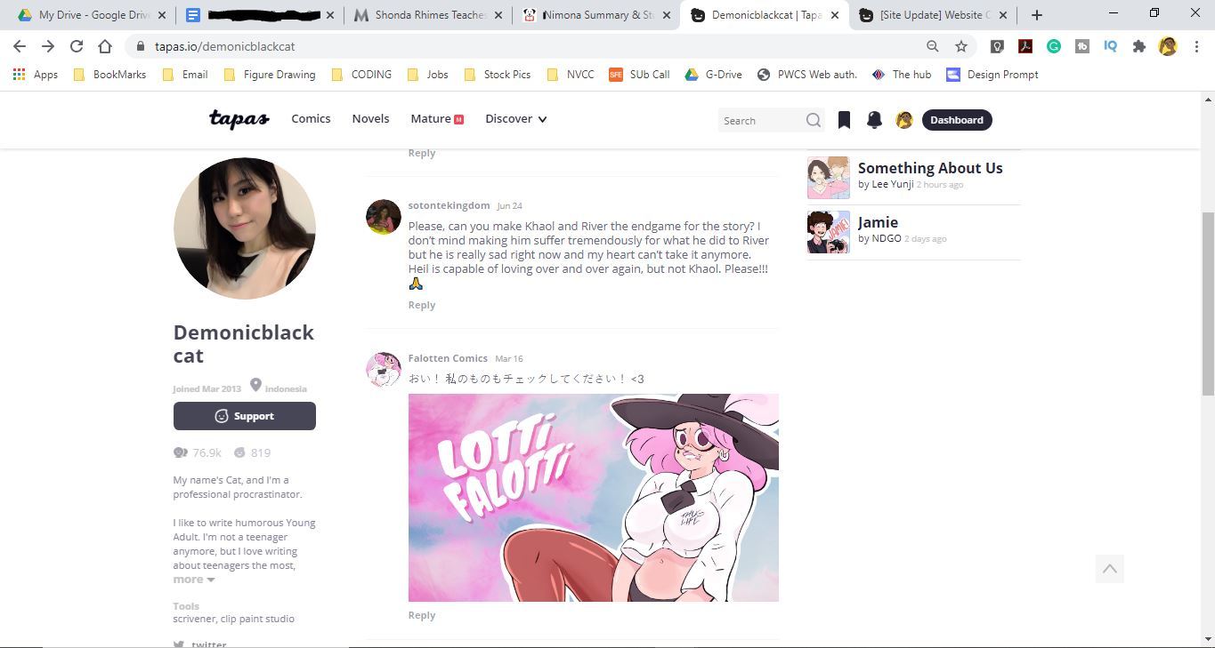
Will there be changes to the creator's profile page in the future?. It is difficult to access creators' social media on that sidebar when the creator has a long bio. I zoom out my browser in order to read the full bio and access links. In the sample below I am zoomed out at 80% and still can't access all the links. There used to be a scroll bar, what happened to it?
Is that something you all might be looking into next?
@ratique most times I try to open a link from the forum via the app, this happens. It doesn't load with time too, nothing is clickable. Android phone here.
One day I do hope to be able to place images in my novel, I have my chapter/arc covers waiting eagerly... XD
It is a nice feature that readers gets recommendations.
But is there a way to control that? Because some series is better than others to be listed
I would like to set an options on witch series to be in the spotlight more than others
2 months later
I'm not sure if you're still taking feedback in this thread (or where else to submit it), but: I would like to request that something similar to how Webtoons handles the header be implemented. That is: as you read or click on the comic, the header/footer will retract until the end of the episode or you bring it back by moving your cursor to the top or bottom of the webpage.
As it stands, I feel that the large black bars simply take up far too much space when reading on Tapas. I know fullscreen is an option but it takes away the browser menu too, and that becomes inconvenient as I'll usually check other stuff or put on different songs as I read too. A middle-ground between the two would be beneficial in my opinion.
Are there any plans for this in the near future? To clarify, I mean the two bars at the top and bottom of a comic episode. The one with the search bar and comic/novel sections, and the bottom one with the list and like button and everything else.
Hey I was thinking about it and something I would love to see implemented, and there may be a reason it is not done this way, but a "completed/read" section would be really useful.
A lot of times, when someone subscribes to a series, once they have finished reading the comic or novel (and it is completed already) they unsubscribe. This can negatively impact the writer/ artists. I think that a great idea would be to ad a "completed" or "read" section to the subscriptions as a sub category.
It could even go as far as to have a "To be Read" "Currently Reading" and "Completed/Read" Section to better organize the reader's "library".
It would not only help out the reader, but also the author.
I haven't posted here in a very long time but I'm looking to return to Tapas with a new series.
And I'm so flabbergasted over the change with the comment section???
As a creator who made it a point to answer every single comment and engage in lively discussions with my readers (and loved to see my readers discussing together), I'm wondering how to do that in such a tiny space. Could it be possible to expand the comment section?
Because it's so tight as it is now, it would be difficult to read longer comments like:
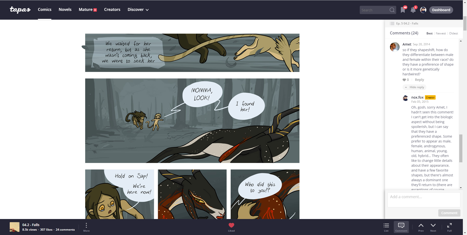
I know I'm a chatterbox, but it's great to be a chatterbox! I love when readers also are chatterboxes, and when discussions unfold. Talking about unfolding, now you have to click to display replies and I'd rather there were an option to show all replies by default.
I loved Tapas because it was great for community, and what's great for community is great for creators. So keep encouraging community and talking! That's what keeps readers engaged on the longer term!
Hello, @noxfox if it's problem, You can just write this code to console (press ctrl+shift+i, click on console):
document.querySelector("#comment-section").style.width = "800px";
while You are in comment section.
btw. You can rewrite that number to any anything, if You choose 1920, it will expand to fullscreen.
it will expand place for comment, it will little broke website, but don't worry, after refreshing (ctrl+F5), it will get to normal.
I'm working on few browser extensions, and I think, I can look on it, so it's easier for users.
I know it's not good solution, but I hope it will be enoguht to time, when Tapas will change it, or to time, when I create browser extension for better UI/UX for Tapas.