This made me laugh so much:
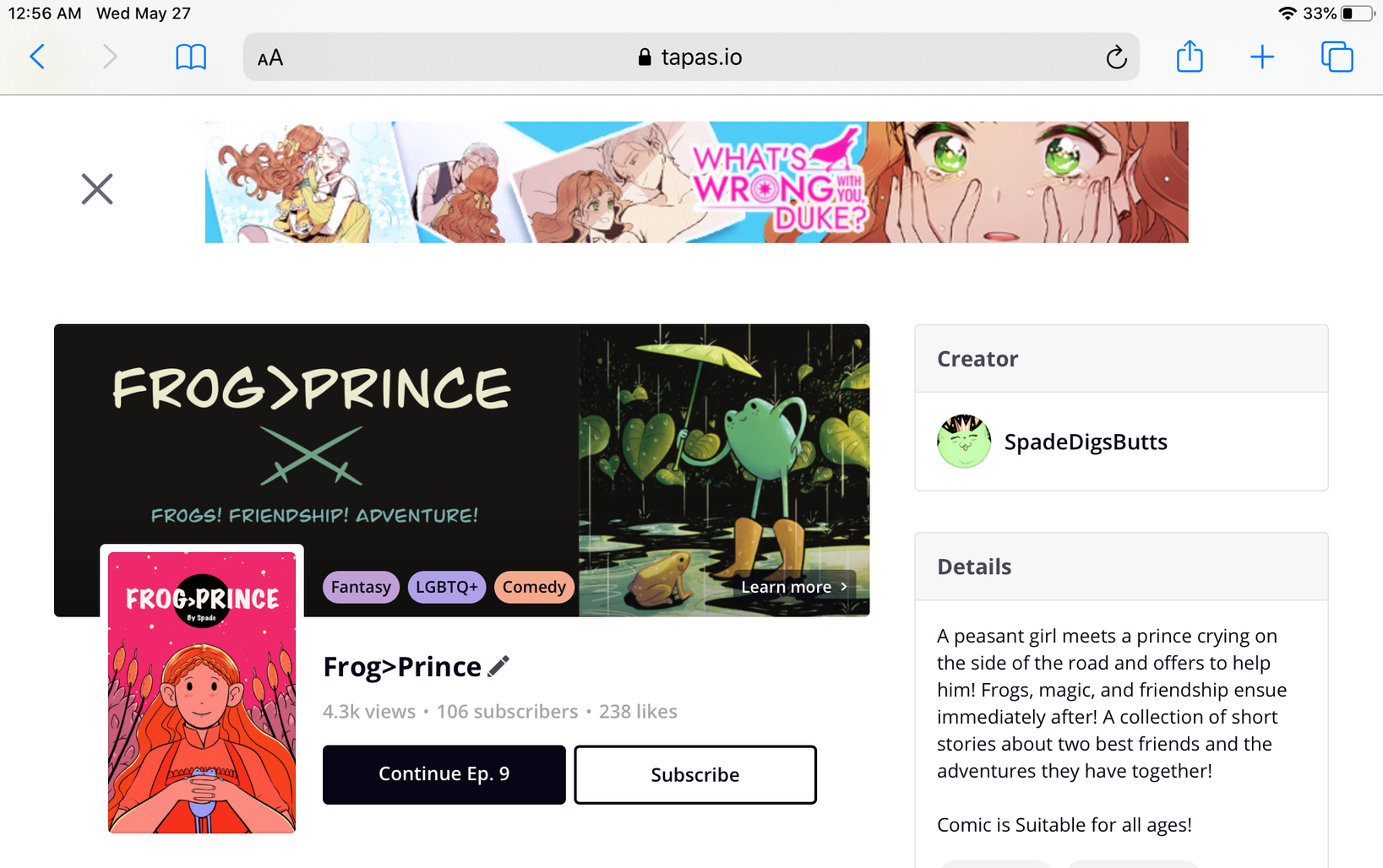
That's... not my comic's name  And the same happens with other comics that have scheduled episodes, all of them mention "I wish for a boyfriend" as the title.
@LOSTMAN sounds like you are the person to ping for this 
This made me laugh so much:
That's... not my comic's name And the same happens with other comics that have scheduled episodes, all of them mention "I wish for a boyfriend" as the title.
@LOSTMAN sounds like you are the person to ping for this
While I am happy about infinite scrolling returning: I'd like to request that the auto-hide feature of menus similarly be implemented again. I know full-screen is a thing, but I'd prefer it if the menus also disappeared if you clicked on it like before, or would hide themselves when scrolling. As it stands, it makes the website rather cluttered when reading on my laptop.
This however does bear emphasis: I do appreciate auto-scrolling returning. As that and the community here gave Tapas a leg up over other websites for me.
Aye, I concur on this. I like it better when they are at the bottom. It is less cramped compared to sidebar.
Thank you!
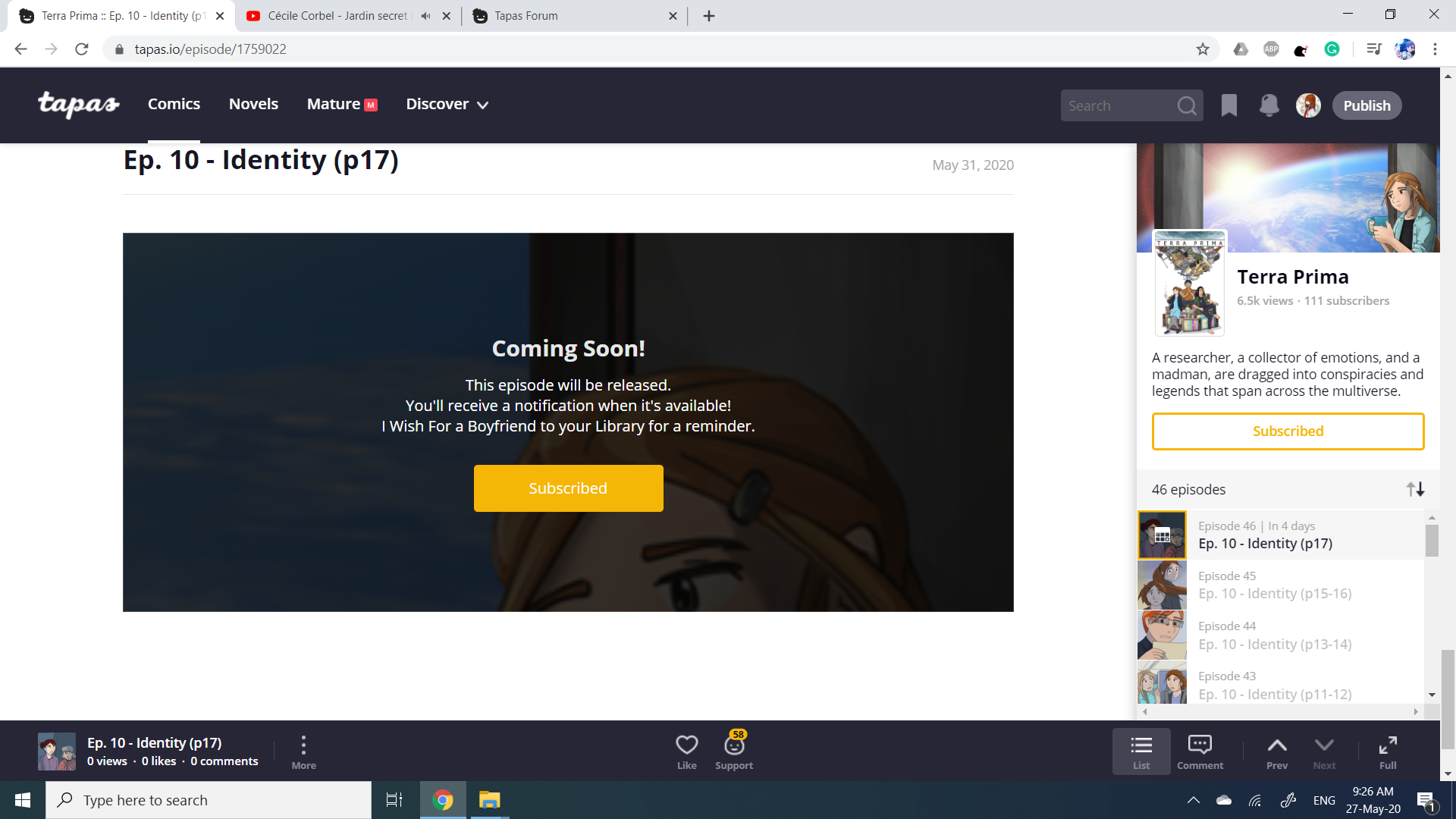
And since I have your attention, is it intended that when you go to a series that has a scheduled episode, it goes to the page that is scheduled (with the "coming soon" message) instead of the last published page? It's a bit useless to be shown that message instead of an actual page to read.
Thank you very much for the updates. They represent a huge improvement in navigation and bring us closer to the original Tapas we all knew and loved.
This is frankly the worst change I've seen made, hands down. It's cluttered, the comments are shoved into a tiny sidebar for no discernable reason... Honestly, my first thought on checking my comic was that the site layout broke.
It honestly seems like this change was made solely to put as much information as possible on a single page without any regard for how it would be laid out. The site is vertical, that's been a recurring theme. There have even been points where it's been made explicitly clear that Tapas has a "mobile-first" design philosophy, so vertical just makes sense. Adding in a horizontal element like this sidebar and shifting everything horizontally isn't just unnecessary, it's off-brand.
This looks neat? At first I was surprised to see the navigation on the right, but putting the comments also in there makes sense. I think I will get used to this fast. Thank you so much for your hard work!  (I'm reading from my PC.)
(The old design was probably fine for the App version(?) - although I haven't seen it myself - but... is it possible to have a different design for PCs and for mobile phones...?)
Anyway, on my PC it looks great. Thank you so much.
Edit: There's also fullscreen!? Thank you very much!
Really good update. Need to get used to it, but the return of the banners & endless scroll has got me happy again.
ALSO the number of webcomics updated at the top instead of just a red button? THANK YOU SO MUCH!! 
Great update! Very much needed.
I can see all my series but one who is now reporting a 400 bad request error and cannot be shared on social media. I will wait for the end to update to see if the glitch disappears
Just saw the rollout! Lots of good changes. Banners are baaaack, and a giant subscribe button (much appreciated) and I LOVE that infinite scrolling is included with full screen mode. Its a perfect function for binge reading, whether or not you have a scroll comic or a book format comic that updates one page at a time. Very nice.
I'm bummed the navigation bar is still there though, and static now. I disliked it when it was animated too. I started adding bumper images to the end of my updates to fix that little distraction (since it would pop up when you're not even done with the page), but now its always there xD sigh. I just don't think they're necessary, especially with the episode list back on the side now and with infinite scrolling back. A lot of the buttons on the bottom bar would look fine on the side bar I think, the "likes" button, the button to switch from list to comments (that would make more sense placed there) and the social media sharing buttons. Anything to just to get that bottom bar out of there.
Either way, everyone will likely read in full screen mode, which is fine because that looks great. Otherwise, the regular layout feels a bit claustrophobic right now. There's just not much space for the actual comic page.
On the mobile web
The up and down arrows for reading next is good.
The custom ad banner is back.
When going to comments, you get to a comment section page and can go back to see the page that the comments belong to. This is good and something I miss in the app.
The subscribe button is still hidden under a popup menu under the 3 dots.
When going to a series it asks if I want to read from where I left. This is good.
Good work Team Tapas.
Something that just happened:
My s/o managed to like my upcoming page that is not yet released. So I think people can like the preview of the next page in a webcomic right now (at least on desktop)? 

I saw this on the phone right before going to sleep and couldn't comment;; It's going to take a while to get used to and the bar at the bottom is strangely catching my eye a lot, but it's feels so much better than the previous update already!
Also, the alerts are now red, they're way easier to notice in the white background! And the arrow keys still work to switch episodes nicely, can't recall if that was in the previous update or was added now.