23 / 24
Sep 2024

Hi Bree! Wow, never thought Id get to critique an influencer's creations!

Lets start with the critique:

So from what I can tell, this book is a light-hearted comedy with horror/paranormal elements.

I think the pink color was a good choice, especially for a story of an influencer, but beyond that, I find it a bit lacking.

A cover needs to do three things:

  • inform the reader of the title and author

  • create interest

  • and give a little hint of the "vibes" the book has.

Right now, the book is doing a good job of the first one, but not so much the other things.

so what can you do?

Add symbols

using copyright free images from pexels or a free vector site, you could add images that represent your story. Maybe things like phones, ringlights, planchettes (from an ouija board), makeup, etc.

Vary your text

This one's a bit harder because I know you're a bit limited by what you can do in canva. But try to limit your cover to two fonts, and choose ones that really scream "influencer" and "spooky."

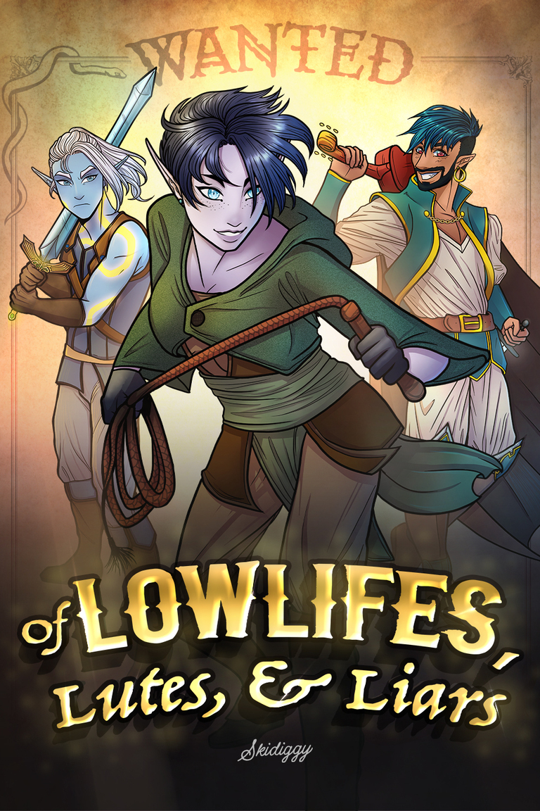
Heres a cover of mine that I think fits this idea:

The title is in a comic-esq font, and the author name is also whimsical. I also made the "E" in rowan lane get "kicked" by the villain to add extra comedy and to hint at the meta elements.

That's all I have to say. I hope its helpful!

Hi there, thanks for sharing.

  • To start, every cover should have a title, an image, and an author name. You're missing the author name here.

  • I don't love the font, it's a bit basic, but the "dress" part especially I feel should be emphasized by being bigger or a different font.

  • There's a lot of empty space, and because it's white it blends into the background of the screen. try a darker color and if you can't get a different image, try adding a border around it.

  • Why is "dress" emphasized? it's a bit confusing, unless the dress has story significance. Instead of dress being in the splatter i would put "red" there. so like "Damsel in the RED Dress"

hope this helps!

Hello!! I've been eyeballing your book, nice to see another competetor in the Tapas AF Tourney here!

First, I love this cover! its so moody with tons of movement, great lighting, great art, great composition! The negatives are few and far between.

My only comment would be that in terms of art, the silver-haired man has a very similar face shape to the brunet. Now, they have really distinct hair styles, clothes, eyecolor, etc, so its not major, but I think its always better to make each character as distinct as possible.

One other small thing: add an author title! on Tapas, its not as important, but the more you grow as an author the more people will try to find your books or connect you to your books through your author name. You never know when someone will take a screen shot complementing the cover, and their friend will try to find it using your author name.

Try it. google "Antemortem book" and you'll see a bunch of random books. "Antemortem vapid ink" on the other hand, takes me to your profile page.

Anyway, Good luck with the contest (but not too much luck, heheh >:3c)

To start with positives, I like a lot of your compositions. Especially "The Lonely Lighthouse" and "Last train out." The images work together with the title to create interest and keep the eye moving.

I also like your artstyle. On Tapas, Anime is king so I think you're on the right track. But I also appreciate that its not cookiecutter like a lot of other stories.

Onto the places you could improve:

1.) Many of your characters look the same. Same-face syndrome is hard to beat, lets not pretend its not a very common issue among artists esp in anime. While you practice varying your faces, though, you can distinguish characters with symbols and items that relate to them. This is also good character design because while characters on books aren't quite like in animation, you can still inform the reader about what kind of characters they are.For example, the man in "The Silver Sorcerer" has a plain sword. That's not bad, but the sword details could inform me a little about who he is.

2.) the way you draw hair is very interesting and I like it at times, but others it's distracting with how you can tell it's in an awkward position. "The adventures of Astaine" is a good example. The ponytail probably shouldn't be that high in the air when the other person's hair isn't quite as moved.

3.) you have a sketchy line quality that makes your covers look less professional. Be confident in your lines, try varying the thickness. If you suffer from shakey lines, you can try line quality exercises.

That's all I have to say. I know it was a lot of crit, but please don't feel discouraged. The best way to get hella good is have someone point out all the issues to address.

good luck!

I accidentally sent a someone elses critique to you, my bad!

Let's get into this lovely work. Here are the positives:

  • not too overdone

  • elegant color pallet that lets the words pop

  • unique art that stands out from the crowd

Areas for improvement:

  • messy line art

  • on the art, there could be a stronger sense of where the light is coming from

  • the cover is nice, but doesn't give many clues of what the story is about. Is it a romance? is Charles the MC? Perhaps think of a title or some imagery that could hint a little more at that.

  • not a fan of the patttern meshing into the character. You want to make it clear he's the focal point. Try making the outside lines thicker so he pops more.

Hi, thank you for taking the time to provide feedback! I'm glad you liked cover compositions for The Lonely Lighthouse and The Last Train Out.

Some of these covers were drawn many months ago, and I changed my art style a bit after getting some critiques from other artists in the forums (the more recent covers are The Silver Sorcerer, Space Opera Elemental, and The Further Adventures of Leiyu and Thallios).

1) Hehe, it's true my characters tend to have same-face syndrome, although some of the characters actually are the same people (it's the same two characters on the covers of Grand Epic Elemental, Space Opera Elemental, and The Further Adventures of Leiyu and Thallios - the stories are all part of a series and/or AU).

For the "sword" that the main character wields The Silver Sorcerer cover, it's based on a qama dagger (here's an example reference: https://i.pinimg.com/originals/72/a7/db/72a7db61420c10ed0cfda1c761b70c76.jpg). It's not meant to be super fancy, although I've seen some images online that have more intricate engravings. Since the dagger is pretty small on the cover, it would be hard to add more detail unless I redraw the entire cover so the MC is larger. Thanks for the feedback anyway, I'll keep that in mind if I do a second version of the cover.

2) Thanks! I don't really like this cover as much as some of the other ones. It looked better in the sketching stage, but after doing the line art and coloring, it looks rather flat (besides the ponytail being oddly placed, it also looks too much like a solid chunk, I think I need to separate the strands more so it looks more flowy). Also, the colors aren't as vivid for this cover (although that's hard to change since that's how the characters dress in the novel - so the only thing that can change is the background and maybe I could add more shadows).

3) This is a pretty common feedback I receive when I ask for art critiques. I think it's more of an issue when I do digital art (I'm more used to drawing with pencil and paper) I have tried drawing with thicker lines on a larger canvas (i.e. A4 size) and exporting it at 50% size, which makes the lines look less messy.

Thank you again for the feedback!

Thank you so much for your feedback! Funny thing is, this is the first cover where I don't bother to put my name on it, lol. And good luck to you too! :hype_01:

Hi there! Thanks for showing off your art!

lets start with positives:

  • Title pops

  • unique/interesting graphic

  • good colorscheme

  • unique font

Areas for improvement:

  • Needs stronger shading

  • clothing could better, especially in regards to fit, texuture, and wrinkles

  • anatomy is off. The foot i noticed is colored blue.

  • No author name

  • the title is formatted strangely, like the letters are inconsistent in shape and color. reminds me of AI. If thats the case, remove it and add something else.

Hope this helps!

Hey there! Thanks for showing off your art.

I find your submission especially interesting.

"Blackpill" I know is related to incels, so I looked at your books pfp and realized thats exactly on point.

The only issue is, I can't tell if you're in support of the blackpill movement, or satirizing/analyzing/dissecting it from your cover or description.

In that case, this would be a good time for a subscript. Remove the "written an illustrated" portion and JUST use one author name. Above it in a smaller italic, write a small short sentence that gives the reader an idea of what your stance is. like "She's an Incel's worst nightmare: A working woman!" or "An action-packed adventure following (number) boyfriend-free girls!"

Moving onto art crit, you need some work on your anatomy, shading, and line thickness. Try experimenting with varying the thickness. Chapter 2 is your best one by far. I would re-do the first one, becuase while i can tell its a silloutte, I dont love the floating eyes that look a bit off.

Like I said earlier, you should also remove the author part and JUST have an author name. Choose one, you can specifiy in the description you also illustrate and go by a different name.

Hope this helps!