@marcoalexandroparra I love you color choices! So fun and hilarious! I really like his facial expression! It's gold! XD
Here's the latest from Whetstone2:
@marcoalexandroparra I love you color choices! So fun and hilarious! I really like his facial expression! It's gold! XD
Here's the latest from Whetstone2:
@jessicasurline THa's a very intense page. And I love the use of dynamic backgrounds and tilted panels as I feel this enhances the intensity. Your characters look solid and there's nothing to add there but nice work. Also, you make drawing cloth look easy. I'm might go study your stuff a bit so I can figure it out.
I'll admit that I'm torn on the method of your coloring. I'm not sure I have the vocabulary to describe it, but it feels a bit "grainy". Zoomed out, I don't even think about it. But when I get closer it catches my eyes. I say torn because on the one hand, it lends itself to a non-traditional style and is probably very subjective.
I'll add in that her expressions are remarkably well done. Another thing I might look at your stuff to copy. =)
The latest page of Voidchild!
Oh man, this has such a cool layout, that's the first thing that hits me about this page! Solid, tight focus on the characters with an increasingly grim sense of foreboding going on. I really admire the angles, too, totally effective segways with the dialogue (that last line against the transference is incredible!). This simplified value scale pushes the mood even further and amps up the blue glow of the character's eyes in the second panel excellently! You've got a terrific sense of establishment and pacing, yo. All respect to your work here!
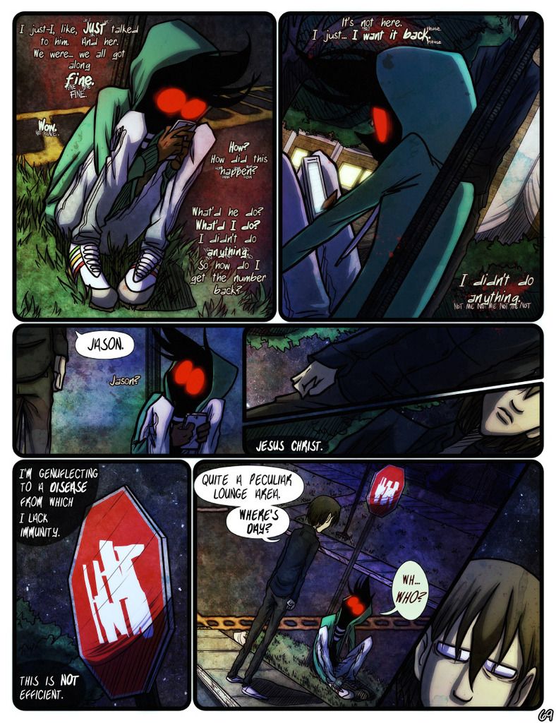
I would like to share my most recent page from There's No Such Thing as Jason -- I.T.1~ Just as Jason curls up at the base of a stop sign in self-existential woe, the owner of the very number he's lost shows up. What luck, right? X]
I've commented on a few of your pages by now but I never get tired of getting the chance to! As usual, it's such a treat to look at and your style still makes me melt. I think of all the pages I've gotten the chance to comment on in this thread, this one is my favorite. It's such cool and unique lighting and I really, really love the mysteriousness of Jason. I'm definitely intrigued! I'd say keep up the awesome work but I already know you will! Can't wait to see more!
Here's the latest City of Blank page, which happens to also be the last page of chapter 3! Onward to chapter 4!
@Riko Okay, I gush over your pages whenever I happen upon them-- giving you crit here and there in regards to how you execute your art--- I'm not gonna do that (but the page is good!) Instead, I am going to gush over the shoes. OMG-- I love the shoes! I have this thing about well drawn shoes! I love the form and line work on men's dress shoes and boots... so your page is border line shoe porn for me! Love the page ![]()
The last page for chapter 1. Going on hiatus for a bit!
The Pale 1.303
 1
1wow, I must say that is a pretty good page, u have good balance of the light and shadows, nothing much to add, u even have a bird in it,
and now im looking at the page 1 xD aaand suscribed... :v
my latest page is from my comic Roc Vs, this part im doing is like a regular comic, but the normal drawings are simpler but with animations in the middle...

LOL that guy has no respect for art...
Today's Juvies1 for ya!
Sorry, for some reason it's not letting me upload the image here.
@Kaos_Comics Your art is always very clean and crisp. It reminds me a lot of "Garfield"-type comic styles. The fact that it is so crisp makes it very easy to get pulled into one of the pages. As for the humor, well it seems appropriately juvenile and what I'd expect from a comic with the name "Juvies". ![]()
In yesterdays Voidchild (I couldn't upload either), someone finally mentions the name of the comic!
 1
1You just keep getting better and better with every update. The shading is great here, and you've really made the lack of much color a stronger and stronger aesthetic as the comic continues. The paneling is very effect here, and you've used a nice variety of perspectives, which gives the sense of movement. Since there's not much literal movement in this page, it works to evoke the emotional stirrings rather nicely, if that was your intent. Your lettering is also getting stronger. The last bubble in panel three gets a little messy at the bottom when the text breaks away from its diamond shape, but that's a super minor thing. I really enjoy seeing you continually push yourself ... and it helps that you're building a very compelling story with a very compelling protagonist. Great work.

This week, instead of sharing Atonement, I'd like to share what was a rather tricky page from I, Necromancer! So that's what I've done above. : )
Really like the dark mood of the comic. It really sets the tone for your story.
Here's the latest page from my comic.

@GFalconDX I really like your coloring/shading and making use of the panel layout (the over/under style) makes the page more dynamic yet stil symmetric. Big compliments on your hands. I hate drawing hands! But you've made it look easy. Not sure what's going on in the page exactly. It looks like she's about to drop something onto a street from high above, but I'm not sure. Either way, well done. =)
In today's Voidchild, Mary gets an offer she can't refuse or I guess has to think about or something.

@TheVoidchildProject Hmmm Never trust a "Suit" who can't tuck his shirt in... I like the selective colouring in your comics. I think i've said it before. It has this Sin City vibe to it.
Another Juvies for today
@Kaos_Comics great stuff. I like the overall flow and the color scheme, definitely fitting 
My latest at https://tapastic.com/series/My-Imaginary-Pals is a tribute to those who have fallen. Happy Memorial Day

@myimaginarypals Tastefully done in a respectful tone.
Here's the latest from Whetstone:
@jessicasurline As usual, your pages convey alot of emotion and atmosphere. There's something in every panel for me to enjoy. The detailed devatstation and dread of the top panel (arousing my curiosity). How you cut off the panel just below eye-height on in the second (the panel makes me want to take a deep breath and breathe out). The resignation of panel 3 and the ice cold demeanor (or mentoring of sorts?) in the final panel. When every panel feels like it packs a punch like this I can't help but liking it. The only thing I'll add is that for my own personal taste, I find the coloring a bit grainy. There's nothing wrong with the colors themselves (in fact I really like the strong contrast), I just prefer alternative coloring styles.
Incidentally, this page makes me want to play Overwatch for some reason......
In today's Voidchild1, we finally start to creep out of that dank old cave system.

This is a great thread. So much great stuff here that I probably wouldn't have found otherwise. Voidchild (above) is an example. Looking back through the pages, I think the creator has really hit the tone perfectly with parts 3 and 4. The spare use of colors for the eyes and other small elements works very well to draw attention without detracting from the overall feel of being in supernatural Victorian England. I really enjoyed this comic. Very nice indeed!
In contrast to Voidchild's darkness (which I love), the most recent page of Symphorians1 is a bright, sunny fall morning at Buffalo Coast University, where our intrepid Professor Holmes is noticeably absent from his teaching duties. Cheers all!
@Symphorians lovely artwork, I found the teacher character interesting, I have a principal that looks a little like her they both have that( strict and don't mess look)
and the new page of Talesfromswipecity1
@aronthemason Cool. Good job. Goood goood job! No, really, it's very original.
And some panels from the latest page of my sci-fi comic HOME:


I'm already a subscriber. Your illustration is extremely polished and vibrant. Your vertical scroll technique is extremely good -- coming from someone who doesn't tend to like vertical scroll. Your use of animation is extremely effective. Your story is super immersive.
In short, you have the start of one hell of a comic on your hands, and it's very evident to me how much preparation and time you've put into this project. You're doing something different and ambitious, and I like seeing that. Very excited to see your work continue.
And here's the newest page from my own little space opera mystery -- ATONEMENT1. This is the first page that I did the lettering for -- I'll be doing the lettering from here on out.