
This is my main characters design so far and im not sure if what i should i improve with - thanks

im sorry theyre so big (◡△◡✿)
*also for Takara's age im most likely changing it to 13 instead just in case anyone would reply about that
Hi! so i've been playing around with how i color hair and I was hoping to get some opinions. If you think theres anything i could change to make it look more visually appealing if you think it doesn't.

I guess whats really bothering me is that near the middle and towards the end, the hair just seems to feel like its gotten flat. :\
This depends on what style you're aiming for coloring wise, but often times its not a good idea to shade/draw every individual strand of hair. Drawing every individual strand can make hair lose its appearance of volume, and as a result make it appear flat in a drawing. It's easily remedied by treating the hair in clumps! If you group the strands into shapes, you can easily show the volume of the hair and avoid making it look flat. I'm not exactly sure how to word it so I hope you don't mind that I drew over your drawing ^^;
however! if you did want to keep drawing the hair as your example, you could try to shade/push the contrast. in your example, i'd push the shading in the hair that goes behind her shoulder, like so!
10 days later
Hello again! I'm experimenting with art styles for my main manga/comic and I'd like your opinions on the change.
It's an action story with a good chunk of slice of life parts between heavily violent arcs.
The first one is my current go-to style
This is the new 'experimental' style (takes more inspiration towards this manga's art)
I'd just like your opinions on whether or not this new art style would suit some of the manga's serious themes (burden of guilt, amnesia, death). I guess it could be done in an ironic sense.
Do you think this is a good move? If so, what can I improve in this new style? If not, what can I improve with the previous style?
Experimental page give the story, as I see it, some darker edge, like in "dorohedoro" or Nihei's early works. It looks more interesting/challenging visually and the textures bring good "obsessive" feel to it. It's somehow hard to make a real comparison - cause there's almost no backgrounds in the first page shown, - but overall, I think more detailed style works better.
P.S. - I like you frame and page compositions. They are dynamic, with good rhythms and dark/light balance. Great work.
Thanks for the feedback! I found that the experimental page was usually more fun to draw in comparison to my previous style.
I may stick to that in the future and keep playing around with different techniques I can do.
Here's my first issue's style:

I drew, inked, scanned, and then colored in Photoshop.
I did more coloring in Photoshop in issue 2:

As you can see, I added shadows and highlights to the local colors. I also used less non hand-drawn pictures.
Issue 3 is in progress, and I've done more effort on the coloring.

I've also changed the way of making it.
This time I just draw it, then scan it, and then I ink it in Photoshop (digitally) instead of before when I inked it traditionally. This makes the lines more crisp.
What techniques do you recommend for me to try out to make the art better and how?
I suggest that you have a look at this page for different techniques and methods of improvement.
http://hubpages.com/art/how-to-draw-learn5
In all honesty, from what I see, you don't have the greatest grasp on anatomy, especially on the last page that you posted. The facial structure seems off, which is something I believe you can fix by doing some portrait studies.
I also see that there's an almost complete lack of backgrounds, which doesn't do well when it comes to immersing a reader into the story's world.
With the action scenes in your first few pages, I can see that you have a great eye for composition, but I feel that your lack of 'fundamental' skills may be holding you back.
I think that, especially with the photoshop colouring, that you're trying to tackle too much at once. Colour theory and lighting is something that can be very difficult to learn.
I can't really say a lot since I'm not much of a pro, but I think the link above may do you well. Heck, I've been drawing for a while and even I learned some things from it.
Just know that improvement doesn't come with a click, it takes hundreds, thousands of sessions to get to even a decent level. Work like there's no tomorrow, and the results will be pleasing to you.
Oh, and remember to have fun, that's the most important bit.
I prefer the color more because it really clear out where the background and the object of focus is. In this case, the character.
Ok, so I'm in the process of rebooting my current series and I'm trying to develop a new style for it (mostly because I want to make it easier to draw unique characters). But I'm not sure if the change is too drastic (Well, it is, but I'm not sure it's in a good or bad way).
Here's the original (sort of...)
Aaaand here's the new one(s)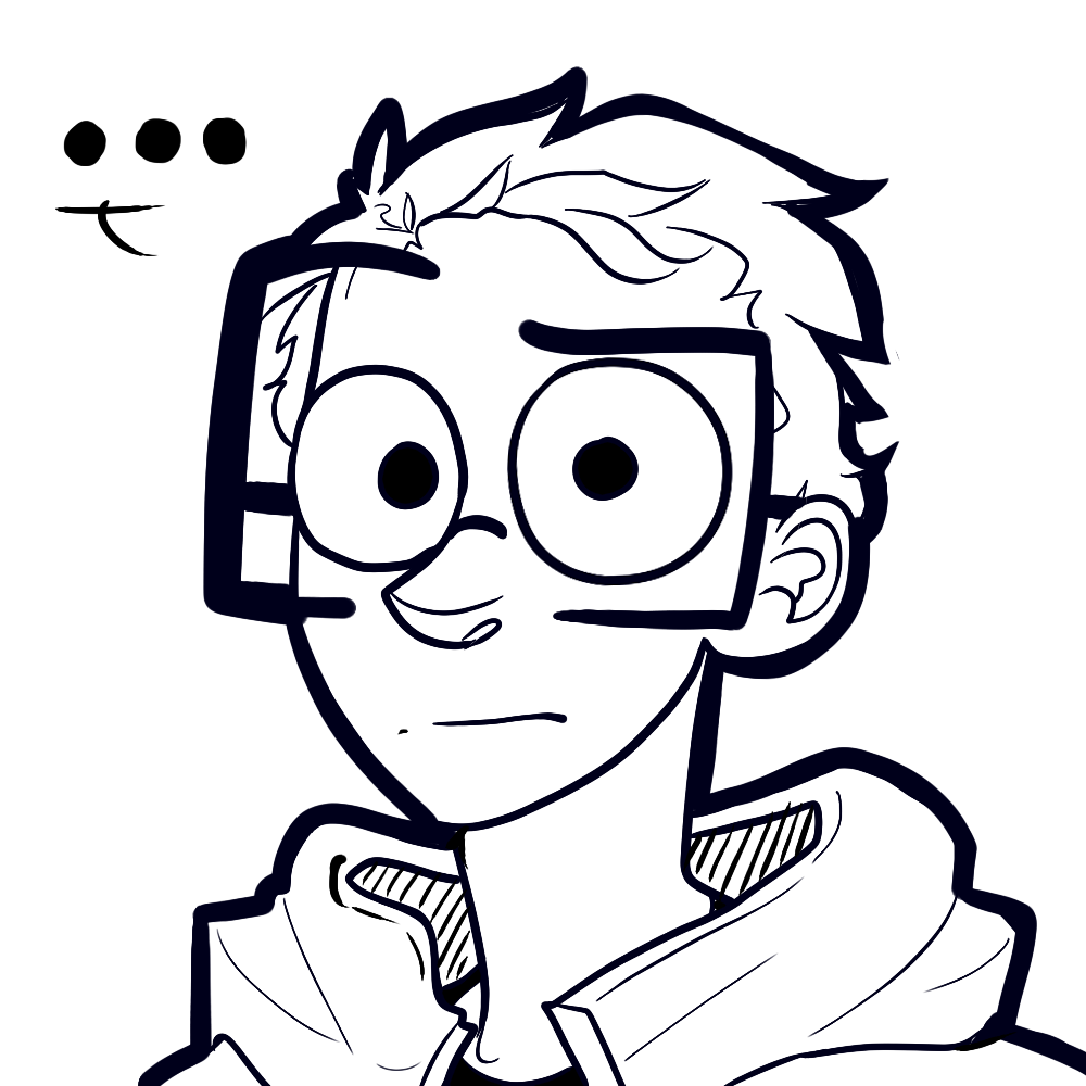

What do you guys think? I'm mostly concerned about the eyes being too big...
Speaking as a subscriber, I do love your original style. I also like the second one and how you're keeping the "top rim of glasses being your eyebrows" thing! Definitely with the second one it would be easier to distinguish characters. But the change is drastic, since you're adding more complex eyes, nose, hair, and ears.
If you do go with the second style, I hope you don't abandon the original style's character structure, I just find it really charming! Maybe it could be a personification of your conscience or something.
Not a huge fan of the last doodle though, it reminds me of Angry Birds for some reason. XD
Thanks, I still have absolutely no clue how or when that started though...
I really like that idea. I didn't want to drop it all together so I think I could work with that (or maybe do a sort of half and half thing where I do some in the more realistic style and a few in the old one) 
Yeah, I was going for something like "I Hate Everything" with the eyebrows, but it may be kind of overkill.
Hey Kall! So in-depth analysis here.
I personally like your style because, well, it's unique. While the new style you're trying out looks AWESOME, it really looks like many of the other art styles that there are already an abundance of throughout Tapastic/the Internet. Though that's kind of a vague description, I hope you sorta get what I'm getting at anyway lol What I liked about your style is that it was one-of-a-kind; if anyone who was a regular member of Tapastic saw one of your comics, they'd immediately be like "Yep, that's Kallehmono!" whereas this new style wouldn't be differentiated as well.
However, I do think the new art style is a much better representation of your abilities and skills as an artist. If it's a style you want to try working in, make sure that you're able to stay consistent with it. Practice with it, and maybe do a few test strips with it (so your readers can give an opinion too!)
As for the body shape, how well would the head actually fit in with the body? As you have a very cartoony, "chub" look going for the body, and a more semi-realistic style for the head. Those might clash and might not work well together. But you'd have to try it and see what happens. This is another case as well where the body looks a lot like how everyone else draws their comics; so if you did choose this path, think outside the box, come up with a way for it to be your style, and not just a reflection of others. Whether this was your intention or not, I know you're super creative when it comes to your style and ideas, so I'm sure you'd be able to make a style all your own that still reflects that creativity from former styles
ALSO, if you stick with that thick linework (like the "border" style you've got going"), maybe tone it down a little on the body? The head's been fine all along because it's just a circle head lol but when you make the border that thick on the body, it takes away teh flow and movement you could otherwise achieve with thinner lines. Everything just sorta reads as one big clump when you do it that way. You can keep the border, but maybe just make it half as thick? Especially if you decide to stick with your original style.
Overall, make sure to do lots of experimenting before you make any big leaps. It's your decision, it's your comic - do it in the style you want. Don't worry about "what sells" or "what the readers will want"; people already recognize you for your style and characters, and they enjoy it (as do I). Whichever one you choose, both are awesome in their own way and demonstrate different but equal values of your style and skills. Good luck ^__^
Thanks for all the feedback XD
Yeah, that's my biggest concern with this (well, besides the eyes, but that doesn't seem to be as big of an issue). Because I kind of think I've branded myself with my current style; but I'm hoping to find a way to keep using the old one in conjunction with the updated version. But how is still beyond me atm...
I have a few ideas to change up the body type beyond the normal boxy look. I've been doing figure sketches and a few studies of other styles I thought did a great job with that but I don't have anything pinned down next for this I'm comfortable showing anybody yet. Most of my time has been devoted to the heads and faces. (The final sketch I added was a sort of simplified version of the body I added at the last minute)
Also thanks for the tip with the line-work. I'll keep it in mind
I'll keep experimenting before/IF I make the switch.
I just got a 2nd hand tablet not long ago ... and that leaves me thinking "Should I stick to vector or not?"


And also any tips and suggestions are welcomed!! 
I can't really decide on how to Draw Tronald Dump. Sometimes I make his face very fat and squishy and other times it's very taut and rigid. Also I think I draw his hair differently every time... what do you guys think?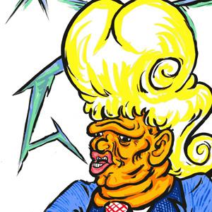


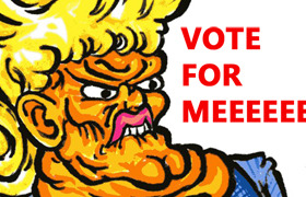
I feel like I should settle on one style, but I'm not sure which to settle on.
I am guessing the lower pic of "random stuffs" is vector based. It looked more clean and the shapes are simple to catch. While the two above looked kinda sketchy. Since you mentioned that you just got a tablet not long ago, I am assuming you still need some time getting used to it. =) I do have the same question as well myself. But to pick one of the 3 picture displayed, I would prefer the art in "Random Stuffs", because the lines are smooth and not to say it has distinctive colors. Hope this helps.