I think it comes down to taking inventory of the scene. And just playing with the principals of design.
A couple quick notes
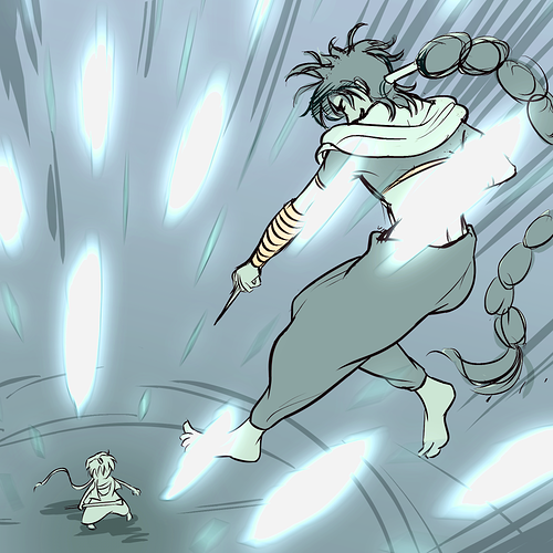
1. The character is generally dark color complexion. Which gives references to what is a dark hue.
2. The background is high detail and the foreground is minimally rendered in comparison.
3. The subject is the focus but the background pops.
When I used to paint landscapes, I would spent 30 minutes or so mixing colors and marking the canvas color. It's not supposed to be an easy thing to catch in 1 or 2 passes as much as it's holistically adjusting as the imagine develops from my experience.