Aim: Reflect the sketchiness of the comic's artstyle, as well as the grittiness of its subject matter through reds and solid blacks. I was considering to make the thumbnail well-painted and all, but I felt it would be misleading to the general nature of the work--thoughts on this sentiment?
@Mangocado
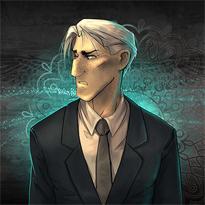
I admire the simplicity of your thumbnail. The general tone of Sheshesbens being enveloped in light goes well with themes of self-discovery and going into unknown territory, which is nice.
However, I worry that the glow of the light obscures his silhouette. I really want to see the profile of his face with clarity, but the bloom makes his features ambiguous, especially in a smaller size.
Despite this, you can still tell his general form and facial features from afar. I'd say if you want to keep the glowy nature of the thumbnail, it should stay as is--it's real nice!
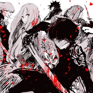
@punkarsenic
I quite like the focus on silhouette--it creates a great sense of clarity for the viewer, while also lending itself to themes of war, as mentioned previously in this thread.
However, I think the silhouettes could be improved with tweaks to their placement in the frame. Right now, there's an uncanny empty space on the left side of the thumbnail, and I feel it makes the composition look unbalanced. In a way, the focal point of the thumbnail is slightly vague--on reflex, I'm not sure whether to pay attention to the empty space, or the characters.
I think it would be much clearer if they were placed in the middle--however, the thumbnail overall is pretty great and serves to reflect the comic it represents.