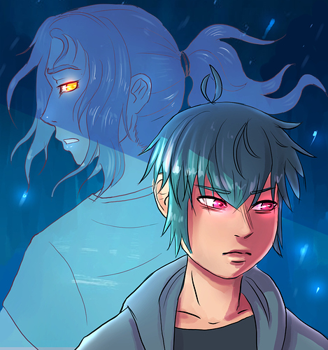
@JeanGuillet I think this is conveying what you're aiming for for the most part, I agree with what others have said about drawing more attention to the glow, it doesn't read magic right away so much as stylistic effect, especially paired with the background. Really gorgeous but maybe not conveying the information you're aiming for. Maybe having him more in a grounded real space would convey its a full colour comic more directly?
Also thanks for the feedback! I might go for a gradient across the image and see what that looks like.
@punkarsenic I see your thumb all the time cause I follow you haha. I gotta admit, before I saw it big I wasn't reading it as two figures. I love the handhold, it would be cool to see emphasized more in a future version. The colour scheme feels almost like your branding for me at this point, I picture that orange when I think of your work, so you really got distinctive going for you. Also I really like the contrasting colours between your banner and thumb, just to give you conflicting opinions haha
@kainatarma alternate, definitely alternate. The minute you put a face on it I suddenly want to click. That art is goooorgeous
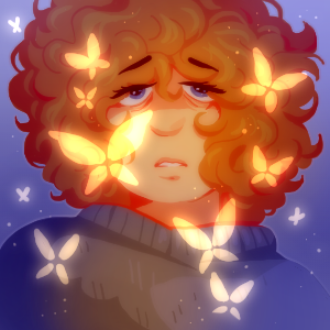
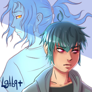
@Mangocado I think I'm just echoing what others are saying but you really lose the characters profile with the fade if you're viewing it small. Sharper lines, maybe a dreamy background that isn't white? I like the mood, but it doesn't tell me much about what the comic is about. It's hard to convey those subtle themes in one small image haha. Music is such a huge part of your comic, is there a way of incorporating that into the thumb?
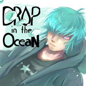
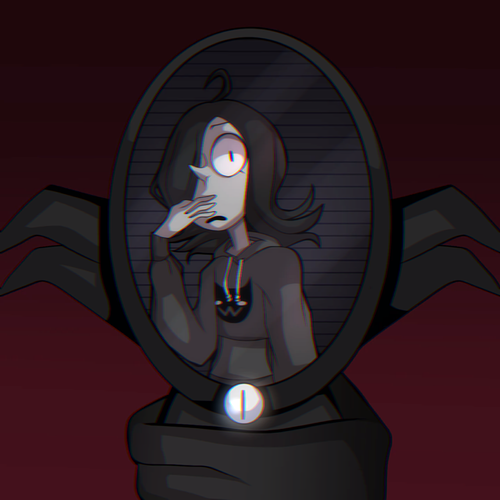
@monotone_ink I mean some of the detail gets lost at the small scale but the composition and colour contrasts are so solid I don't think it matters. You won, you won the thumbnail contest.