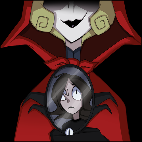
here's my thumbnail. it's supposed to showcase the two main characters, but with more emphasis on the protagonist. (the hand belonging to the antagonist) and the main object, the mirror.
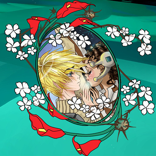
I feel like this picture is outdated and I was thinking of replacing it with my new cover, but I don't know if I should do that or just make a new picture. (the image below if what I mean)
@monotone_ink I get that you want it to be known that your comic is done in a sketchy style, but when looking at it from far away (which is usually the only way someone will see it) it's kind of hard to tell what's in the picture. I think you should maybe cut down on the details such as the black sketchy lines (but not all of them) and maybe make the canvas smaller..
EDIT: since nobody responded to this I'll just use the new cover. I was really waiting just to see if it would be a good idea or not to use that but I haven't gotten any answers.
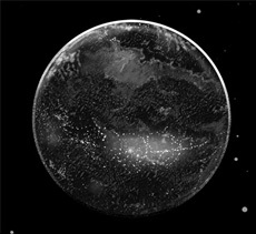
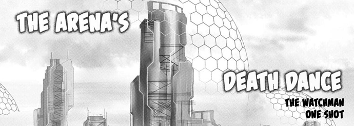
For right now, I made it with this thumbnail, planet Shatazar. Supposed to be an action, sci-fi, romance. But this story is a One Shot from my original series, "The Watchman." Just using the same characters and location.
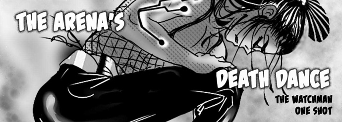
I didn't know which banners to use...ended up with the cityscape. Let me know if I need to replace either one for more excitement or if there is anything else you can help with:
I didn't use this one because it looked too sloppy and the comp isn't good at all.
On the planet Shatazar, Teeabu, once a young priest now turned slave-warrior, has one shot to save the lives of his little cousin, Delah and her childhood friend, Pa-ul. Being held against their will by the Watchman, loving and fighting in the Arena's Death Dance may be their demise.
@ghostieblu sorry I started this a few days ago and completely spaced haha
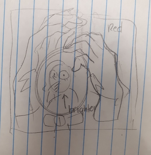
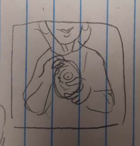
I like the concept of this, but didn't actually register the hand in your thumb because of the lack of contrast between colours. I'm wondering if you could do a similar thing but like (forgive my messy sketch)
Where the hands are like, menacingly around it, and the background is red in a tie back to her cloak. You could even pull back further and include her in the shot like:
Anyway, messy ideas but I really like what you're starting with. Your villains so good so I think including her in the thumb is a good call 
I really like the planet, the art is beautiful. I don't know if it would grab me right away, especially since it's hard to gauge your art style from it. I often find I gravitate towards things with faces and people in em, cause I tend to like plots that are more character driven. That's also why I like your second banner more, despite the composition being kind of weird, it's a lot more interesting. I am trying to think how you could change that compostion without overhauling it, but I don't know how much you drew beyond the crop  all I can think of is shifting down and left to see if you can fit the font on the other side but maybe that does work either. Hmm.
I mean if you are also trying to grab people who like world building a focus on architectural stuff and planets might ring true for them. Hmm! This is tricky. I like your art though, it's lovely.
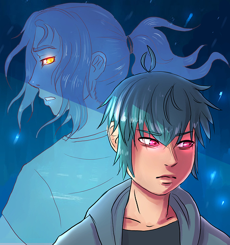
@catluckey It is a great and very detailed cover, which is I think artistically excellent enough. It's more unique, contains recurring aesthetic in the comic, engaging, and in colors too! Way better!
The cover also gives potential reader ideas about who are the characters and what connection and/or relationship they may be having.
I'm just questioning, what is actually your focus on this image? The decorations or the characters? If the latter, I think you should give more focus to them by enlarging their proportion to the image... In case it is a bit hard to see on small screen of smartphone.
 1
1
The comic is about an alcoholic vampire and ex-gangster. I want to convey a classic vampire in a more modern style. Not much angst, pure fun and maybe a little uncomfortable as vampires can be to those around them.
I think the style and colors used in this thumbnail conveys well what the themes are and what to be expected; it looks fun and fresh. It looks distinguished and clear enough in mobile. The shot also (I think deliberately) focused on the teeth as the title alluded, so that's quite smart and great work. 
I can't offer you good critique or commentary due to my limited expertise and I think it's already doing the job  , yet I think it can look more "pop". I think the cover would be more interesting if you add extra effects such as shadow or texture, but in another side the simplicity is also what can make people have an idea this gonna be some fun non-complicated read. You can also outline the character with white or light colored stroke (to contrast him with dark background). Maybe it's only my opinion that cover needs to be "special" quality-wise
  .
.
One nit-pick thought, I guess the pattern on his shirt can look more natural and less flat if you tweak and warp it.
here's what I got after using your suggestion @paperwren
Hiii! Would you mind checking mine? I wanna redraw it but I have no idea of what to do 

Here is my comic for reference:
@ghostieblu I love that new thumbnail, looks super pro and intriguing!!
I do think it is neat as an artwork and it has brilliant lighting-shading with all the colors  It conveys the fantasy element well and we can already see the main characters
  The characters and their pose are clear and can be distinguished even in mobile, it's a good job!
I think it can be better if you use less empty spaces, and focusing the zoom to the character. Maybe it needs an alteration in composition such as Shade is moved slightly closer to flare. I think it can be a bit hard due to their height difference to preserve the exact pose and angle while being zoomed in, so this is just a suggestion and take it with grain of salt.
Is the "BS" thingy supposed to be the logo? (Burning Shadows isn't it) I think if you did intend to make it a logo, you'd like to make it bigger and more prominent. Also it is me being nitpicky again, but is it your style to make it handwritten (because it seems so in the banner)? While it is certainly okay to as mine too, I think it will look better if it's tidied and polished a bit so it won't look like you scribbled it in a rush. I actually prefer the style of writing you used in your thumbnail, it has more dimension and magical ring to it.
This is just an opinion of an unqualified  so I'm most likely be wrong.
I would like to see something that emphasizes both of their wings more, the colour pallette means flares got lost for me, I didn't realize she had wings until I started reading your comic. Maybe a split down the middle and a front view that's mirrored on them both to emphasize the duality? So they're both facing forward and you just see half of each of them but mirrored.
Or you could do more back to back with their wings wrapping around each of them. You're pretty good at drawing wings, especially some of the feathered ones, so the thumb would be a good place to show it off a bit more. With the back to back you could even emphasize the height difference and have the guys eyes cut off so he's more mysterious, but have her full profile in frame.
Also you can probably get away with not having BS in your frame, Burning Shadows is a great comic title but given that it's initials are also the short form of something else it's a little distracting. 

