@simplykit19
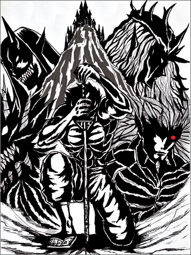
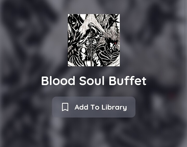
Great inkwork on your cover!  The style reminds me of Berserk and indeed gives reader mysterious and dark fantasy feel. It also gives reader idea about what kind of graphic they'll be seeing, and would it be colored or not.
The only thing is while I think the composition, intricate linework, and shading are brilliant in large scale; yet all the details and entirerity of the composition might not be conveyed in small display of thumbnail.
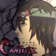
It looks like this on mobile site
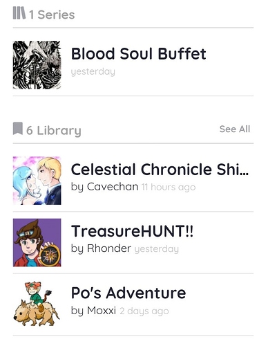
And even looks smaller on desktop site (already zoomed)

Compare with other series from your library, see the difference?
(I apologise to creators shown in this image if you don't want your work or name displayed)
I think zooming in the cover image used and crop it at that size might help, refocusing it to a single character or small portion of it may also help. Giving clear boundaries between characters or an effort to make them more distinguishable in small scale is a good idea, such as adding different colored outline or color the character