Regardless of what medium you use, I think a big way you can improve lineart is by thinking about lineweight!
here's an example from one of your panels:
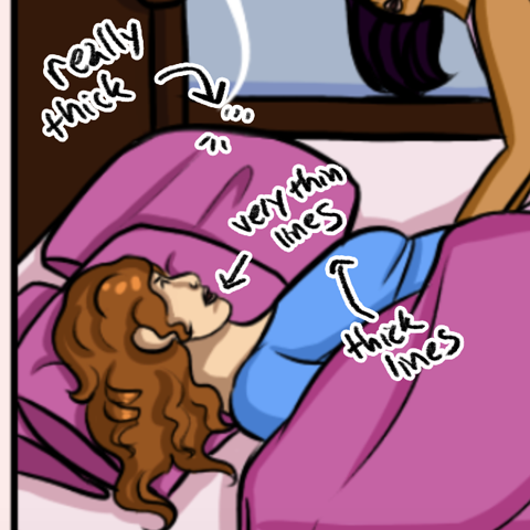
the lines sort of get thicker and thinner at random -- it seems like the individual strokes are being tapered, so each line goes from thin to thick to thin, but the thickness and thinness isn't being used to strengthen the form of what you're drawing!
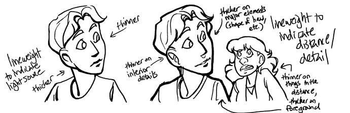
There are a few different ways to do this -- here are a couple sort of slapdash examples!
The first one, on the left, is varying the lineweight based on light source -- lines get thicker to indicate where shadows are.
The second one with the two figures, on the right, is varying lineweight based on distance and to some extent detail -- the entire figure has a heavier lineweight to make it stand out, so that the figures closest to the viewer have the highest contrast, where things further away have thinner contours and don't stand out as much.
I've used both, but I tend to use the technique on the right more often -- I have a tendency to draw with a lot of detail, and using lineweight to emphasise the important /close stuff keeps my figures from getting lost. Either way, these sorts of things might be something to look into and experiment with!