@The_Chosen_Z
I think your manga's panel layout could be improved to make it look better.
First, the panels are a bit too close to each other. Usually, the distance between rows should be greater than the distance between adjacent panels on the left and right, which makes it less confusing for readers.
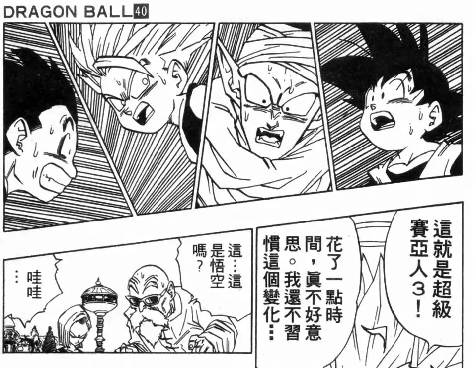
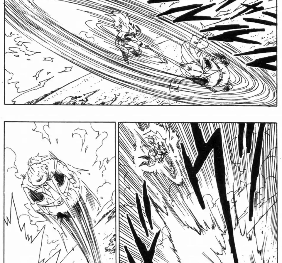
For example, Dragon Ball,
Look at its panel layout, there is a noticeable difference in distance between rows and between adjacent panels on the left and right.
Next, you used too many 'diagonal' cuts. I'm not saying you can't do this, but panel divisions should primarily be vertical and horizontal. Otherwise, once not well-controlled, it can make reading feel less smooth.
Taking Dragon Ball as an example again, it usually only has diagonal divisions during intense battles to express dynamic movement.
Moreover, even when diagonal divisions appear, in most cases, there is only one panel per row, rather than each row being divided into more small panels.
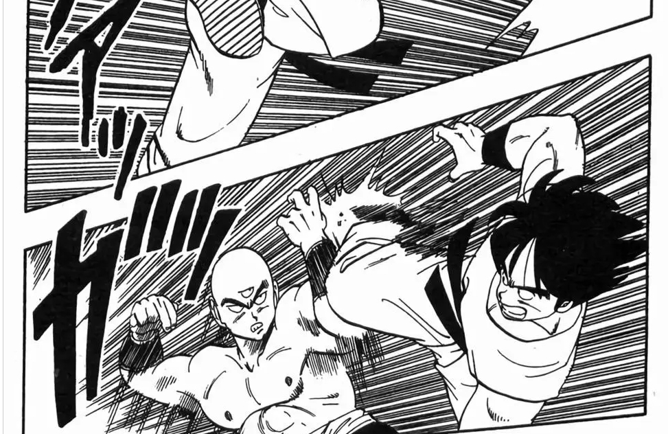
Even when this occurs, either the top or bottom row will only have one panel; there won't be situations where both rows have two panels
(actually, this does happen in Dragon Ball, but because the distance between rows is opened up enough, it's still acceptable).