So I'm going to put on the face of disappointed father now cause we're at that point where I have to talk to you like were part of a store, and as the store manager I hate to say it @michaelson but ya'll done fucked up a bit. Theres a long list of things to get through so i Apologize if I miss something or if its already been repeated about 30 times- these things tend to happen when you make drastic choices!
So lets first chat about all the UI stuff- these complaints are coming from both creators and readers. SOME of which are programmers so i feel like their knowledge is helpful. First off the staff picks "see all" is broken, it just takes you to the front page rather then anywhere else. You've added "free to read" and "pay to read" columns which is useful to people who just want to read without a pay wall- However it seems you've done away with the idea of looking for comics by GENRE! Which is incredibly backwards. Why even have Genre tags if we cant search through FRESH/POPULAR/TENDING with them?? People have particular things they want to read- Some people want to read romance, some action, some drama- taking AWAY UI is a horrific idea- How the actual hell are people supposed to get their fix if they can find it?? This problem is doubled by the fact you TOOK AWAY fresh! Which is the MAIN way readers FOUND NEW COMICS.
Please understand that this is the exact reason why people think you dont actually care about non premium comics when you've gotten rid of FRESH and replaced with your premium new releases  great effort, but swing an a miss when it comes to making us small creators feel like you give any shits about us. Trending is nice but youve taken away genre searching and if im going to be completely honest- your algorithm tends to make "trending" a different kind of "popular" without the genre search. People who get a spike of veiws will be on tending for maybe an hour before they are Completely removed from the bar- which might i add got a lot smaller!
I think enough people have already pointed out you've taken away the side bar so you can see where you are unless your WAY at the top or WAY at the bottom. people have pointed out the hidden sub bar, the lack of a banner which means lack of a personality for each individual comic making you even MORE of a copy of Webtoons while also making everyone's comic very similar and less personal. broken text for novels. so on and so forth.
Now. There's nothing inherently wrong with your UI at first glance by the untrained eye- infact- its pretty great! Looks clean and pristine! However, I have absolutely no idea who the hell your looking to get an audience from with this UI. IF your looking to loose some readers who liked Tapas for being... you know... NOT webtoons- and trading them out for Webtoon readers- im sorry to tell you I cant imagine this working out for you in the long run, the UI in webtoons is simply better then your copy pasta you made- and im sorry if this hurts your feelings- but you copied it. thats it, please dont try to gaslight us on this. You have copied webtoons UI and made it WORSE. So i can only imagine Webtoon users looking at Tapas from afar and shrugging when they say "oh hey look Tapas is discount Webtoons now... neeeeat." and then continuing on there marry way on Webtoons. All i can really see happing here is you're either gonna loose people to webtoons cause the UI is better or your gonna loose people to some other new and hopeful comic website. Cause the only people who are impressed with this are people who hever NEVER SEEN WEBTOONS. sorry not sorry, this is an unfortunate reality.
On that note im also really upset with the idea that you think DESKTOPS and IPHONES should ever have the same UI setting. People who sit at there desktop have a diffrent screen, diffrent hardware, and a completely diffrent reason to sit down and read at a desktop then their phone. People at a desktop wanna sit down in their chair and stare at there screen with their keyboard and mouse in hand ready to do some work. You dont WORK at your phone- you're leisurely doing things- relaxing- playing a phone game. When we sit down at our desktop we want things to be optimal and we want to be making the least amount of clicks and the most of our time when we're working. People make keyboard shortcuts in photoshop for a reason. Id LOVE to see your raw data of why people want to do away with Desktop UI for EVERYTHING to be phone UI cause its always fun to hear people say "data shows" without showing any data, cause guess what?
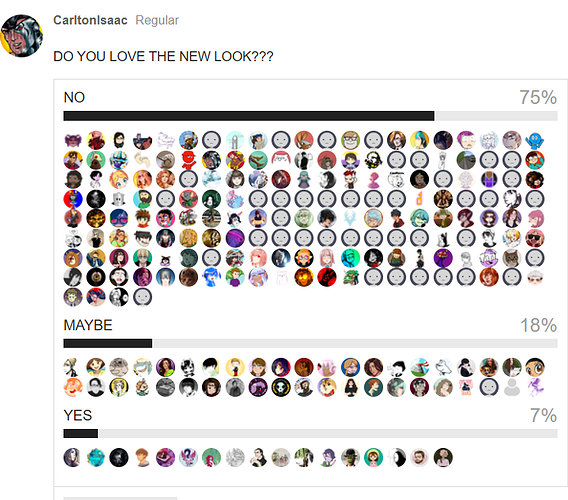
I can hack this up to tell you only 7% of your user base is satisfied with this choice you made.
Honestly it just feels like your making excuses and gaslighting us that this is totally fine and we're definetly getting what we've been needing/asked for, even tho the things we HAVE been asking for are never done such as night mode, two genres and being more clear about how the INK system works with our audience.
I honestly Cant imagine how you can be confused that people are upset and dont want to do the job of BETA testing your sight for you when you've made mistakes that (from what my programmers have told me) is an easy to find and easy to fix mistakes such as missing italics and bold- which really THAT should never get to us as users. You want free beta testers? thats chill, im all for that- but at least try to make a mirror site first so that we can test it while still using the VERY usable and actually still good older site without forcing both us and our readers to deal with things breaking.
I hope you dont take my words too hard because im honestly just upset for everyone here- People are upset and you're not the only ones who could suffer for this. creators can suffer for this because readers who liked you because you where TAPAS and not WEBTOONS. could leave, and as many new Readers have stated before hand- it REALLY SUCKS when they're the last ones to hear about ANYTHING going on with the website that they should really be the first ones to know about- because THEY are the ones who are giving both you guys and us creators the ability to keep going.
I don't think we need to got back to the old site and stay there but maybe we need to go back till things are fix and we can do some actual beta testing? cause this is pretty bad for the PR from what a lot of readers have been explaining to me. I honestly think the new look could be a really good new beginning but its A. WAY too much like Webtoons and B. already showing a lot of problems taking AWAY intractability such as looking for genres, having some separation between desktop and phone, and taking away really simple and spice of life things like knowing who liked your comment and having a freaking FRESH section. We had more in the old site then we do now- we LOST a lot, and youve given us no choice to go back- So its very upsetting when you pikachu face at us.