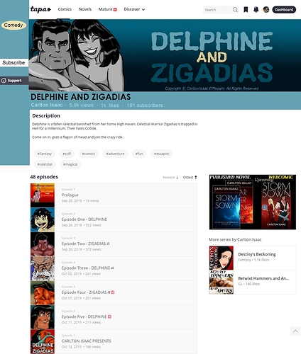
So, yesterday I read a two weeks backlog of subscribed comics on website.
It was a nightmare. Seriously. Horrible.
I had to zoom out 4 times to be able to see enough of the page I was reading.
Which means the comment box and what I was writing was tiny.
The arrows on the wrong side of the page are super counter intuitive. Most comics published here are left to right and the Latin script is written left to right. It does not make any any sense to put the arrows on the left. I can't even imagine that it's a (failed) attempt to give a 'real book page turning' because the scroll format is so heavyly prefered on Tapas.
All that take all the fun away from reading comics.
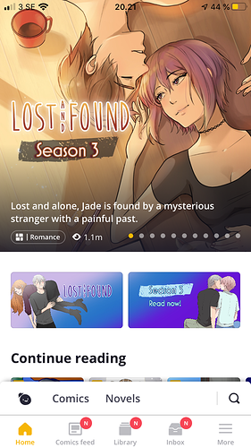
I think I will unfortunately have to read all the comics that are on other platforms, on these other platforms.
My eyesight is not really good, but I could do alright before the changes. Now, it's not readable for me anymore.
I don't understand the point of all these changes that basically only make reading more difficult (except again, if it's the point, to force people to use the app).