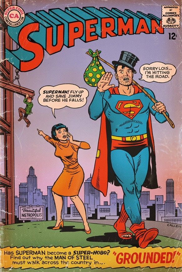
The cover you showed, if you put it on Tapas, would be displayed at the size of a postage stamp on a phone. Nobody would be able to read any of that text, and Jimmy would barely be visible.
It might have been a perfect cover to be on a rack at a drugstore in the 1960s to catch the eye of a passing ten-year-old boy, but it wouldn't be a good cover for a modern webcomics platform where the most common reading platform is a phone, and most of the audience are 20 year old women. That's a cover designed to advertise a single, outlandish scenario for the purposes of selling that one issue, not an ongoing series, and it leans heavily on the established context of already knowing who Superman is, and that his present behaviour is out of character.
As a superman cover at a certain time for a certain audience, it was probably very effective, but I don't see how it's a fault in the audience to think a "pretty anime protagonist surrounded by flowers" is a worse cover than this, if the story is in a pretty anime style, features that protagonist, and is a shoujo romance, making the flowers clearly communicate the tone, genre and intended audience (especially when manga often uses the language of flowers to communicate additional details). It'd probably read a lot better on a phone, which is where most of the audience for that type of comic are reading. If somebody is making a cute romance story to go on Tapas, and they make a cover with a complex scenario that needs speech bubbles to understand and relies on established familiarity with the characters, then makes the characters and text too small to read, and nobody clicks on it even though it's technically well-drawn... I personally would definitely say that's the artist's fault, not the audience's.