My style is manga-style so I will speak strictly in terms of manga-style paneling since it's different than western-style paneling.
Number of panels - For manga-style, a typical page has 2 columns and 3 rows for an average of 6 panels per page. So you have your basic panel layout and then you can move around those panels, make some bigger, some smaller, remove some, add some, some bleed off the page, some don't to create the page layout. I usually start from the top left of the page and go in reading order.
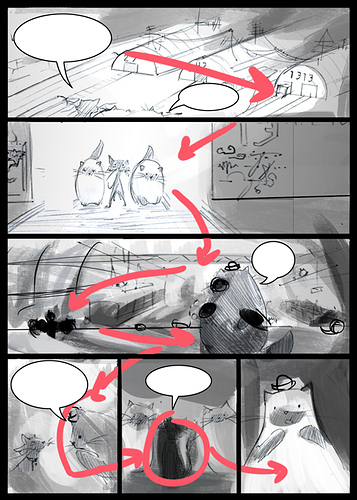
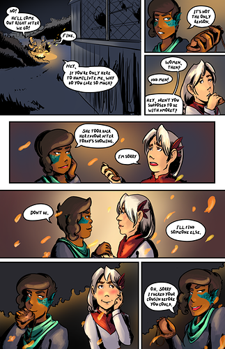
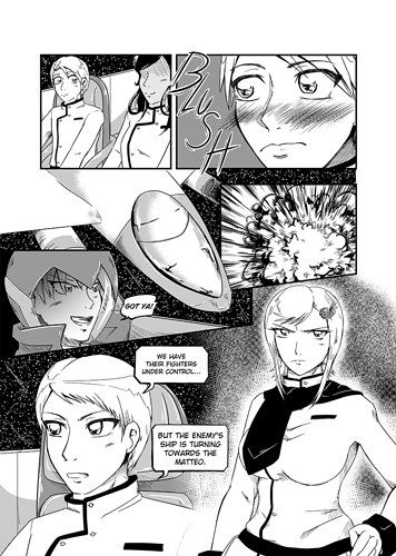
The rows will typically go together or work with each other in some way. For example, below. Notice how the first 3 panels go together, then the 4&5, then the 6&7.
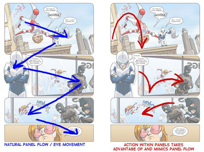
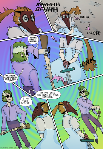
To be honest, when I lay out my panels I rarely consider any sort of "flow" like how @tchotchkeco mentioned. I base my panels more off of dialogue and full page composition. Well, my stories are more focused on the dialogue than much of action anyway. If someone is saying something dramatic, typically draw a close up of an expression. If someone is explaining, than a more subdued look. If there is action, then tilt the panels. It's important to vary the size and angle of the panel in order to match the feeling of the characters.
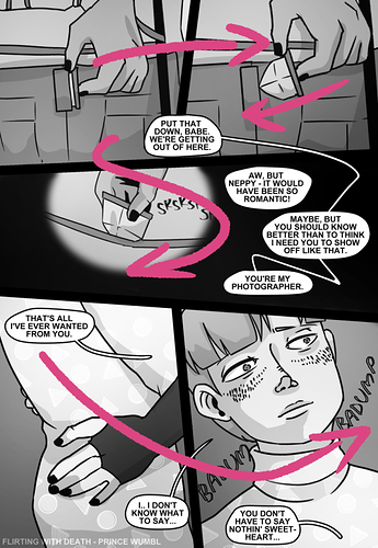
But also not too much. I am very adamant in my own work about keeping to a grid with clean panels and not straying far from it. Not trying to say that it's wrong/right, but in my personal view I would consider some of @Prince_Wumbl's examples to be messy and this is where it gets into my preferred aesthetic of manga versus western style. For example, in the 1. Density example, the placement of the bubbles is a bit confusing because of the strange intersection of panels 3&4.
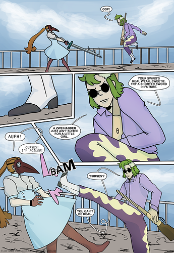
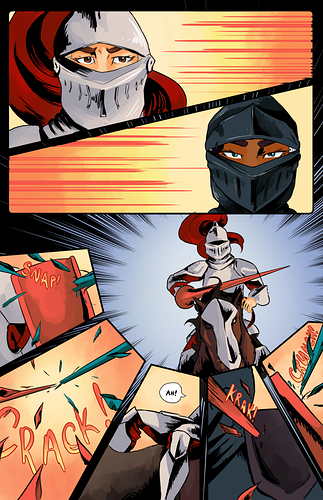
Mind you, this page below is still the craziest I've gone in regards to panel layout.
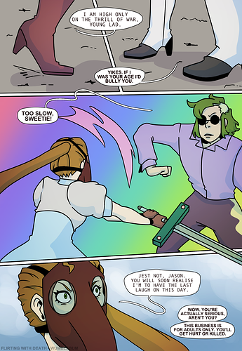
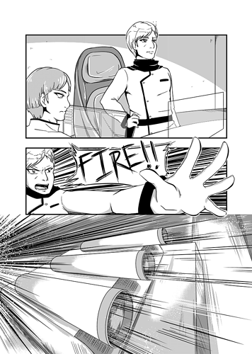
I don't think you need to go crazy to show action. Just angle the panel borders a bit and make the drawing more angled too or popping out of the borders:
Hierarchy. This is the size of the panels. The biggest panel will be the most important panel and the most important shots can take up almost an entire page, an entire page, or a 2-page spread.
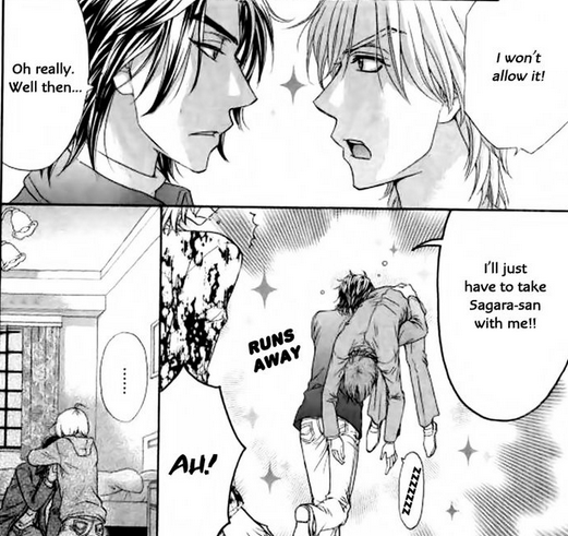
Space between panels - super important. In the first Love Stage example from @nostalgicroxas it is suffering from not having any space between the panels. I see this type of paneling more in shoujo or BL manga, but I still think it's better in general to have breathing room between panels. I guess I would equate the negative space to a frame on a painting.
It's important to keep in mind that a comic is not first and foremost about art nor about the story, it's the communication. So I think it's important to always utilize techniques that will help in what you are trying to communicate. More daring scenes or emotions will have more dramatic paneling. Action scenes will typically have more diagonal paneling.