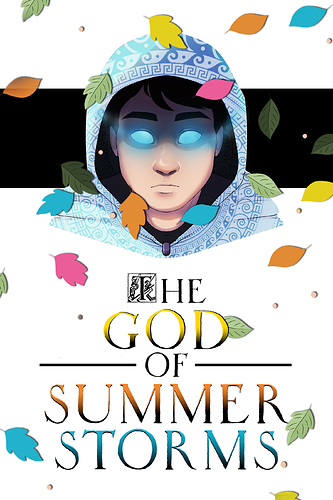
Frist cover does look like it would attract a younger audience because of all the colours I feel.
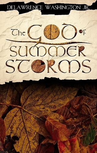
The second does look like it's aimed more at an adult audience indeed.
I will add that the character on the first cover suggests magic and fantasy, but the second cover feels more generic in the sense that, to me personally, nothing says high fantasy when I look at it. As far as I can tell that book could be any number of genres and I would have to click on it (or pick it up) and read the back to find out more before I decide.
It all comes down to what your target audience is, and what readers you are trying to attract. If you want the older audience because that's who your story is for then the second cover would probably work best. If you are after a young adult audience then the first cover would work best, and it also has the extra advantage of (at least in my view) hinting what the story genre is.