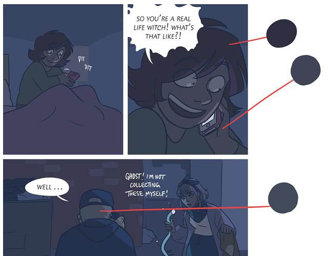
After creating art for several years I've come across many bumps in the road when it comes to progressing my skills. One of which I cannot wrap my head around is color theory. I am not qualified enough to discuss color theory and provide tips, but I do know the very basic idea of the color wheel and complementary colors. Beyond that - nada. It wasn't until very recently that I realize that my use of colors just about ruins the original line work and muddles the image, and I want to know ways to work around it.
I know entire workshops are devoted to learning and applying color theory in artwork, but I figured we could have a (more recent) thread expanding on rudimentary color theory concepts and how to apply them to our respective comics/art pieces.
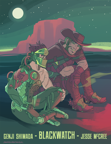
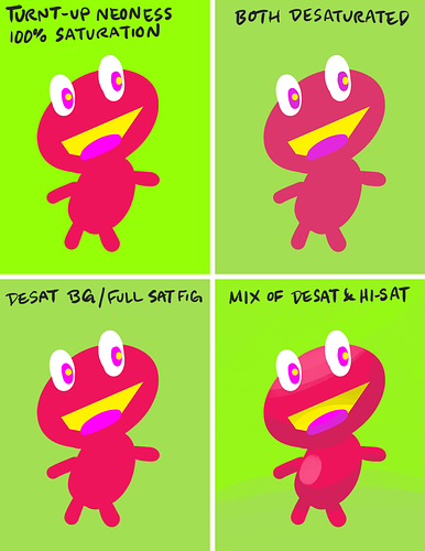
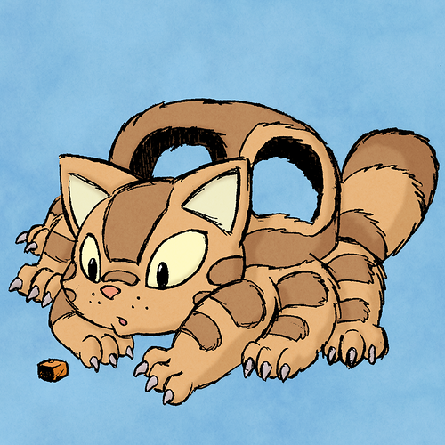
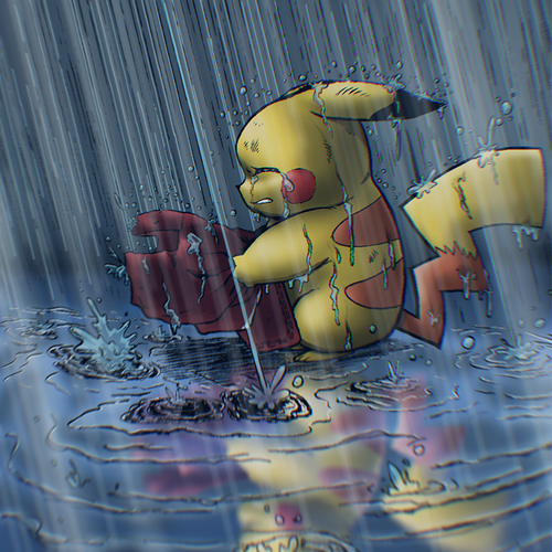
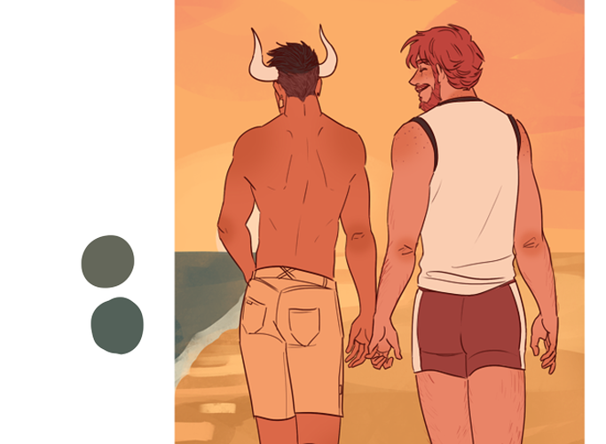
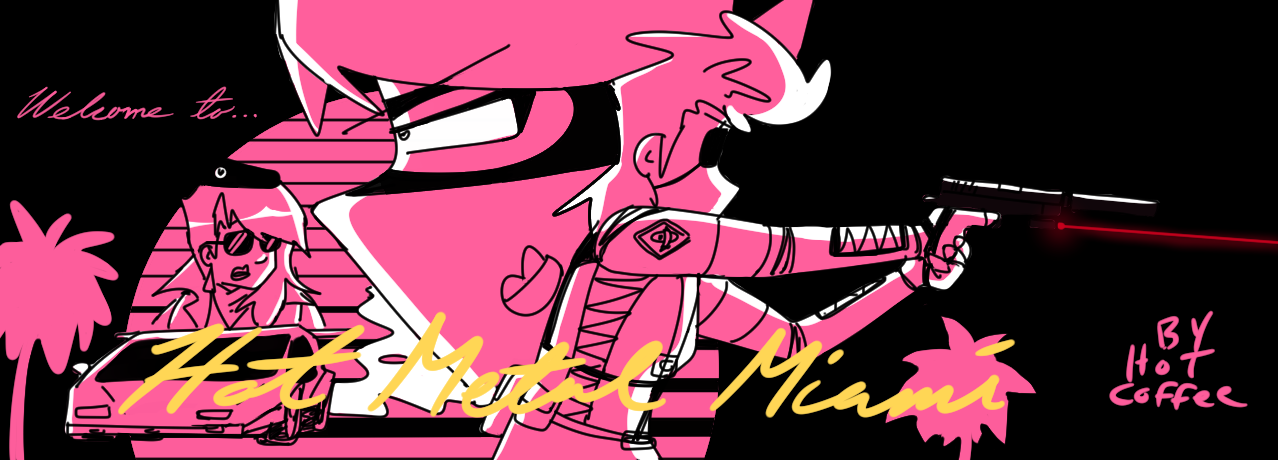
Provide examples of ways colors are used well, and juxtapose them against those used poorly. Explain what should be remembered and what should never be done. I feel that it could be a beneficial resource for those looking to improve, as well as an easy to comprehend introduction to color theory for those unfamiliar. Or, post your own art and ask for advice on how to better the color scheme.
Personally, I want to know about how the colors of the background affect the image and how to chose one that manages to emphasize the focal point without being obnoxious - for example, the complementary color for pink might be lime green, but it's not a color I necessarily want to fill up the background.