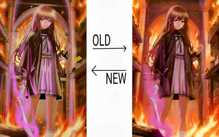
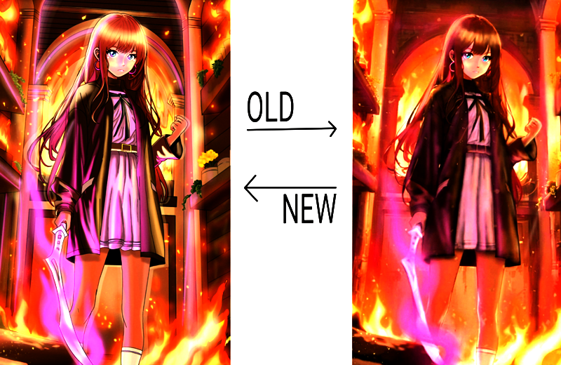
If you want to get a better lighting effect you can play around with the different layer blending modes. If you're only using "normal" layers it can be a bit harder to get the right contrast to make dramatic lighting stand out. It's why the purple looks more dull than if you'd used an "add glow" or "glow dodge" layer.
The other thing I would point out on why the picture looks odd is that, considering all of the dramatic lighting you have in the picture, there should be a lot more contrast between colors. Her legs, for example, look very flat except for the bit of rim lighting, but if the flames are below her, then there should be brighter lighting towards the feet and fading upwards. In the old picture it looks like you did that part a little bit better, as you can see the gradual shift in brightness. But yeah, the airbrush definitely gives it a sort of muddled look too.