The first thing that comes to mind is the presentation. That description... Isn't going to jive well with a lot of people. Being tongue-in-cheek is a risky game to play, and your summaries on the forum might've send a bad impression too.
Next one, your panels are a lot of talking heads, elipsis, and kind of unnatural short sentences. Realistic isn't always enjoyable to read, check out other similar comics to see how they do it! And though there's backgrounds and that's good, the biggest problem with the talking heads is just the unecessarily close shot of their face - you can show full body too, even if the background isn't detailed in that frame.
I would like to participate, so maybe I'll check five or so suggested comics here before placing my own and:
I... kinda liked it? So far...
I liked the colour choices you did, but your linework seems a bit diffuse for my tastes (though it is enjoyable).
I think the initial pace of your story is a bit slow. Meaning the pages seemed short, but reading in a row it has no problem. Also unsure if fantasy or common-world setting.
Well, I wouldn't read it if I wasn't introduced to it first.
Your comic has a very nice story!
I liked the characters (perhaps the Hana guy was a bit over), but they're all nice!
Haven't read everything but I'm curious to see how it develops!
The scenery (drawing) is a bit off, maybe some photos or 3d models to help you cover that. Some poses are also kinda stiff, just more practice and attention to should cover it.
Your style is concise and clear. Your story is not my personal preference, and I guess the appeal to your stories are on their subject.
You actually did a reference to preferences of style on the 10th page. And what you named "Awesome Art" I would rather call "Appealing Art". It has more depth (on this aspect) and that's what catches more people's preference.
The sinthetic/limited use of shapes and colour carries a multitude of meaning and possibilities. That's why I think it's tricky to get away with it. It's more appropriate for big Ideas or religious ones. Unless you really want to push it.
Oh hello @muricio and thank you for reading and honest feedback.
Not sure exactly what you saying but I think you don’t like the very simplistic style in art and story because it can be confusing or something?
But thank you so much for taking the time to read.
(@muricio Just saying, if you're jumping into this thread now, perhaps it's better review some comics from the bottom of it The ones posted a while ago probably all got a bunch of comments already.)
Alright so I looked at a few comics here... again, keep in mind I'm a very amateur comic creator myself and those are just my personal views
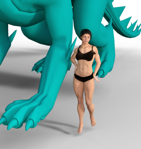
@writercynknapp I'm honestly pretty confused by your comic lol. I only read a few episodes, but well there's so many of them... I can't really figure out what is happening in it at all, and I'm not too fond of comics using primarily 3DCG graphics... Well, overall it's just not for me.
@alzbetarudisova hmm it's not really my preferred kind of story, but in a technical sense I think your comic is already very solid. The simple linework works well, the characters all look unique, the color palette is nice, and overall it's easy to follow. Perhaps someone else will have a more elaborate comment on your comic?
@TheXtraordinaryX This is a pretty good intro honestly! It does give the reader some insight into the main character's life, and I can see the hints at future events. Looks like a solid comic in the making. If I could comment on anything specific, maybe it's how in some panels the backgrounds look a little flat, like, too geometric.
btw I don't know if this is an issue on webtoon's part, but on webtoon your comic looks really blurry and stretched out (on desktop at least), you might want to look into that.
@jessicayan128
Alright so BL isn't really my thing and that's the main reason I would not be interested in reading your comic but I thought I'd check it out.
I noticed drawing faces in profile doesn't seem like your strongest suit - with this kind of art style, you might want to draw them in a slightly more realistic style rather than very simplified anime like they appear now.
I don't recommend using the basic serif font - there are many fonts better suited for comics... also there are instances where the text touches edge of the bubble or just goes outside it - this is not good. Idk what do you use to draw the text bubbles but the jagged edge looks weird, perhaps you should use a different brush for them (or draw them by hand if they're not).
For your first time making a comic, it looks pretty good other than that, though!
If anyone feels like giving it a look, I'll be plugging my comic again It's been reviewed in this thread before, but I always could use more opinions.
Not symplistic in the sense of dull, limited. But in the sense (sorry english not my first language) of lack of refinement, you work with fewer elements and relations. That leaves space for more content in other areas (text, or gestalt relations). I mean, many artists who are not willing to invest in drawing/coloring but have so much to say still come out with their art, and that's what "sustains" the whole work, see?