@mouldybrot Hey! I checked out your comic and I think the worldbuilding you're setting up is really interesting! You've got a cool art style and the concepts going on at first glance seem like the sort of thing that can carry the story a long way. I will say though that it's a little difficult to figure out who's talking in the initial episode, which makes it hard to figure out what the situation is beyond the whole deathmask thing. I know that your pilot is in black and white but maybe you could differentiate speakers using a really muted set of colours in the speech bubbles that didn't pull away too much from the greyscale. Either way, I'm subscribing because this kind of stuff is my jam.
@kelchan I agree with the feedback above about the comic, at least from the first episode. I also think that the paneling of the internal dialogue makes it a little difficult to follow the order of what they're saying. But I think you really paint a clear picture of mental health issues, and you really feel the absence of feeling that comes with heavy heavy depression. It feels super genuine! And I think that really speaks to people.
@sonten Your art style is really wonderful! I really like the individual designs of the demons! I also see that initially there was some shakiness with the speech bubbles but you were clearly workshopping it and you made it look a lot more streamlined. I see why you're nearing 1K subscribers.
@Ariaz Your comic is so effin cute! I also really love how much expressiveness you pack into each character. And the colour scheme is really sweet looking. The one thing I would say about it is that the layout is a little disorienting at first but it seems like you switched that up as things go on. Looking forward to more.
Also here's my thing - I'm aware that I've got a lot of issues with the paneling and artwork at first, which has made me a little nervous about posting it here tbh, but I'd love some feedback.
@brilliiant Hello there! I read the first 4 episodes of your comic! here are my thoughts:
I was really taken in by the design of your title page which hooked me immediately. overall, your artwork in the first episode is not bad. It can be a little stiff, but the characters are all really expressive despite this and you use them for really good visual storytelling
Our first interaction between Amara and Brair makes up for any doubts someone might have about the artwork. I was drawn in by the fun chatting between these two on page 1; it feels really natural and I could almost hear their conversation in my head (this goes for all other dialogue and banter among the characters so far).
The characters so far are easy to recognize albeit, their introductions feel a little rushed, but who remembers all of their new coworkers immediately, right? ;D
However, I did get lost around the second half of page two because I didn't know which balloon to read first. Unfortunately, this is where I think you might lose most readers. The characters still have cute interactions, but Amara (and by extension the reader) is given loads of information from coworker names, to the history of the founder and what he does to his employees. This is obviously key information you are providing but it is unfortunate that it comes after a confusing section of panels. This section also just comes a little too strongly as "exposition dumping" within, otherwise, really smooth and fun dialogue. I think you did a much better job with the backstory aspects in ep 3-4 by including more visuals to go with Peter's story
On a final note, I will keep reading. Your dialogue and the overall expression in your artwork is really strong and I want to know how this whole gods thing turns out for our cast of characters 
If anyone is interested here is my comic:
@MossyRabbit Thanks for giving me such a thorough response! I really appreciate it, especially because I've been really considering reworking the first couple episodes. It means a lot that you're into the dialogue because its one of the things I think is strong about the comic, and that can maybe bring people in when the art/layout is confusing. So it feels really good to see that validated. Thanks so much for your support.
I read through Vagrant Vultures and I love your art style - particularly how you lay out scenery although the character designs are great too. One thing that really stood out to me is how you choreograph action - it's all really easy to follow and the dynamic movements you've got going on make it feel like you're looking at a storyboard for a cartoon. A lot of comics feel like they play fast and loose with the space around the characters but yours feels very grounded in a specific area, which I think is also to the action's benefit!
As for the characters I think the group dynamic you're setting up is really interesting, the rag-tag familial vibe really comes through and it's easy to see how they could carry a narrative for a long time. It's also not super expository which is cool because it feels like you're just hitting the ground running with them on a typical day in their lives.. Sonny and company seem really cool and I'm interested to see what happens to them. The only thing I'll say against it is that I had to go back a couple times to figure out what the relationship was between the three of them - but that was honestly it and it could have been me having a brainfart.
Anyway, definitely subscribing - looking forward to seeing what you do with it!
Yeah, having others look at and revise your work with fresh eyes is really crucial. It's becoming my favourite part of the process because it needs least effort from my part haha
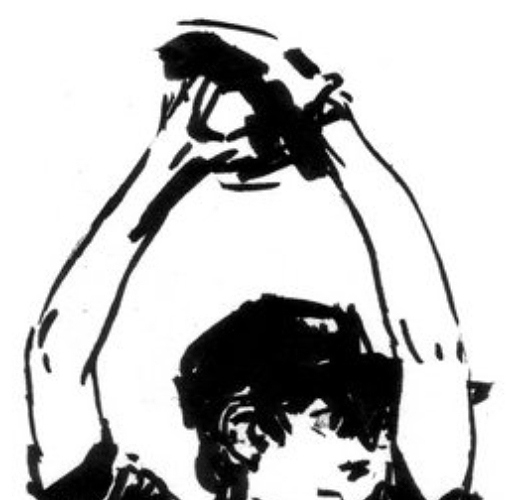
Here are some visual examples...
In this picture, the thicker parts of the lineart show shadow and weight of the fabric, contrasting to the thinner lines of the arms. In action scenes, you can maybe thicken the parts of the lineart where you want to draw attention to.
the artist is rvsa3 (nsfw warning). I think they have a lot of great examples of dynamic linework.
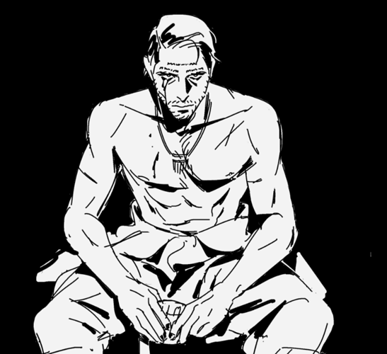
This example is for showing more examples of adding shadow with your lines/inks and really adding more life to them. The use of black in the image puts more emphasis on the figure, lets the viewer give more focus to the details that are there and adds a dramatic effect. This is something you can possibly utilise in a critical/climatic moment.
Artist is grassdlc3 (also nsfw warning
 )
)
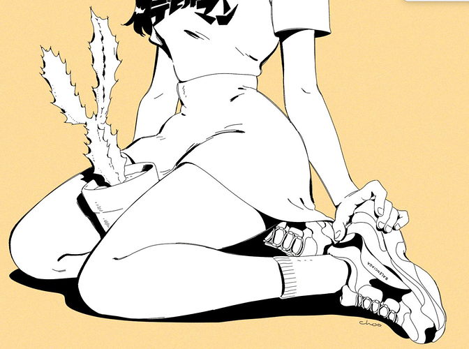
If you want an example with cleaner digital lines, chootalks4 has quite a lot of them too. They balance shadow with neat, thin lines.
Take my advice with a grain of salt though, I could be just biased by personal taste. I've seen a lot of webcomics with very clean and 'monotonous' lineart that works well, even if it's not my thing.
I can really relate to the story problem, we comic creators get so excited over our stories and just want to get everything out at once. You can either trim it or give it more room to grow while giving the story some breaks. Consider getting beta readers as well and ask them what they think is going on or what the story is so far (in the storyboarding/thumbnail phase), that would help narrow down the more problematic parts.
Honestly, I would describe your comic as good though, especially if it's your first one.
@morganicfoods I like your clothing designs but they are a bit stiff on the people. The beginning of the story is average, as there isn't a super strong hook to it, but there's nothing wrong with it either. I'm not sure why some panels have shading while other ones don't. If you break consistency, it's better if the reason for that is obvious to your reader. I also think you can think about your gutters more, as reading the comic without them makes it feel a bit cramped.
@MossyRabbit you put in a lot of effort into the art, I wish you put the same about of care into your speech bubbles. Also, your backgrounds were great in the first episode, so I felt that they felt short in the episodes that came after. I do get it thou, it's a lot of work. Overall, good job!
@Ariaz I'm bit confused about what happened in the first episode until ep. sweet, but other than that, it's easy to follow. Really enjoyed that hang on poster lol. Backgrounds could be improved. Think about the space around characters.
@kellychen Thank you so much for the feedback! I really appreciate it! 
Here's my comic, Far-Star Summer School. It's just starting out, and I'm curious to know how the pacing feels to new readers? There are kind of a lot of characters being introduced one after the other, and I'm not sure if they get enough screen time to make an impression. I also don't want it to feel like too slow of a start.
Any additional critique related to the art, writing, historical accuracy, anything really, would be SUPER appreciated. It's my first time taking a webcomic project seriously, and I'd like as much input as I can get. I'll try to read some of the other comics here and come back to offer my own feedback, but I'm always so worried that I'll hurt someone's feelings. Which is silly because that's why we're all in this thread.
It's been a long time since the initial release of my main webcomic, so I'd like some feedback on how I can improve the first impressions, as I'm thinking of redrawing/retouching the first chapter to show the level of art it's currently at right now. Story related critique is highly appreciated too.
@Pebphiz Yo I just read through the first few pages of your webcomic, and pacing wise it's actually pretty good--it's going slow enough that I can digest the different characters being introduced, but it's fast enough that things are moving at a brisk pace. It's very comfy.
I would say the most pressing issue with your webcomic would be the panelling.
Your panels are really small and the layouts are very cramped--this leaks into the sizing of your lettering and speech bubbles as well, which make things really hard to read (especially for phone readers).
Consider making your panels larger and more spaced out--this makes it a lot easier for readers to follow what's going on, and it'll be a little gentler on readers' eyes.
I was about to say to be more careful with the placement and flow of your speech bubbles, however after taking a closer look, I realised you actually know what you're doing, so good on you for that. Just be careful not to go too wild with it, as it may confuse readers.
Other than that, I wanted to say that the draftsmanship and polish of your art improved a lot in your later episodes, so I was really happy to see that.
Good stuff mayn, and best of luck for this project--it looks very promising!

Always a good idea to get feedback, although might be risky asking it from strangers...
I like your use of colours and negative space, and your characters have a seamless flowing feel to them. Rather unorthodox style of art.
However, sometimes putting the speech bubbles in unorthodox places and having the text and bubbles a similar shade to the characters makes it a little hard to identify and follow. It kind of blends together.
And as with unorthodox styles and techniques, it does make it tougher for the mainstream crowd to accept.
Also the graininess in your recent episodes doesn't feel aesthetically pleasing to me - just my personal taste.
That said, your art certainly has a very unique feel and look to it! Keep up the amazing work!


