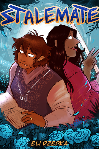
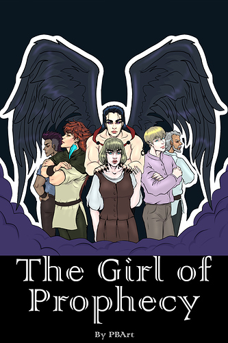
Would I click on it? Probably not, it seems like a childern's book and something I wouldn't really read.
My opinion: It looks fun and adventurous! One thing I would consider adding is textures (grain, paper, etc.), as gradients and the coloring feel flat (this happens across a lot of digital drawings). But don't go overboard, a cover that looks like a crumpled piece of paper won't look good.
What can be better: The largest issue I see is the details and its inconsistencies: the tree in the background is too simple, the main character's style (in terms of highlights/shadows/shading) is much more detailed than the ground. I think making the tree and ground slightly more shaded (I don't know the right word, basically just add shading) to match the main character and sky.
I'm not a big fan of the font on the bottom text, the spacing is too wide and the font seems too serious for the rest of the cover.
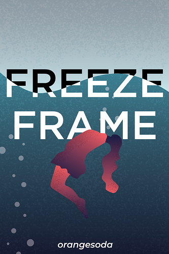
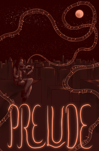
Here's my cover, series isn't released yet so it's just a cover right now.