1 / 258
May 2021

As the tittle says. Post cover of your comic/novel and I will judge it by it. (as well as link to the comic/novel)

  • Will I click on it
  • What's my opinion
  • What can be better
  • 100% honest opinion

You can do the same with mine one.

Edit ---- Sorry that I didn't answer on any of your post. Firstly I didn't expect so many xD
Secondly I was bit busy with other things. I will answer on few of them every few days at least I will try to xD

Edit edit --- from now on I will be only judging covers of people who judge mine.

Cover before

Cover after your critiques, I must say that I'm quite happy with end result

Hah okay it sounds like a fun game/feedback sessh.

For you:

  • Will I click on it?
    • I wouldn't, but I don't feel like the target audience
  • What's my opinion?
    • It's rlly cute! Very children's book-esque. The title and font confuses me though–it's such a serious title in a pretty serious font, but the art is so cute and childlike. It makes me wonder what type of story this is?
  • What can be better
    • I think you could work on contrast and values a bit more. Right now everything looks pretty close in its value-range, and all colors feel quite muted. Try turning it to grayscale to get a better sense on where the values are, and work on making the character pop with both more saturated colors and more contrast in the values.
  • 100% honest opinion
    • I gave it lol

Here's my cover and comic


Will I click on it?

Maybe.

What's my opinion?

My first instinct is thinking it might be some sort of Metal Gear/Rambo parody.

What can be better

The background

This is my cover with art by @RedLenai (I know it's missing the title (Centris), the current one in my page is a placeholder until the actual title card is in place)

Will I click on it?
No, it doesn't draw my interest.

What's my opinion

My first instinct is thinking it has a medieval/fantasy setting and it has a romance plot

What can be better

I'm not an artist, but I feel like the lighting is off somehow. The character on the foreground has highlights on the hair but nowhere else.

  • Will I click on it
    Probably not
  • What's my opinion
    Looks cute but it's not the style I prefer. It also remind me of something for younger audiences or comedy, which it's not what I'm looking for.
  • What can be better
    Maybe add more contrast? And by adding more textures it'll get more definition.

And here's my cover and webcomic:


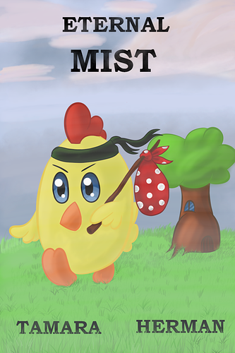
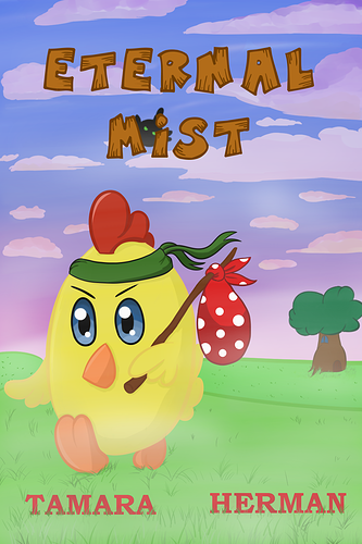
Well... I make a different cover for every number, so HOW WILL YOU DEAL WITH THIS!!

haha! Well, anyway... for this thread porpuse, let's just take into account the first one n_n

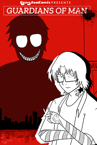
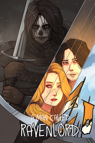
And about yours, here is my review.

Will I click on it - Not as it is*.
What's my opinion I think that it looks as a child's tale, but the title is really not childish. I think that its a mush-up, like something cute, but things not cute happens on it.
What can be better Depth of field. As he is leaving his house, the grass should look farther, but everything looks kind of plain. Besides the size of grass, you can help with other things, like a fence, or a road, some cliffs that let us see that a distance has been travelled.

*I clicked on it anyway xD

Will I click on it?
Personally, no.
What's my opinion?
I don't think this story would be targeted towards me based on the cover alone. I would assume that the story would be about the chicken leaving his home to avenge someone or train for martial arts(?) which doesn't interest me too much.
What can be better?
It has very dull/calm colors, which is not bad especially since I do the same thing, but I think at least something needs to be brighter to stand out. For example, if you turn up the saturation of the chicken because he is the focal point. The font used for title and author is also a bit bland in my opinion.

This is my cover:

I love your covers, they're so colorful and they say so much about the characters with the enviormental storytelling, you should post a link to your comic

Tapas has a different version of the cover than everywhere else I post due to their size limitations :s


As for your cover OP
Will I click on it?
Probably not, it looks more slice of life which doesnt pertain in my interests
What's my opinion?
Its very simple, but if your storys simple thats ok, the main character is running away from home or going on an adventure, the image tells a story itself and i like the idea you have for the cover
What can be better?
the perspective is a little odd and the coloring could use some work but your art style is adorable

I would totally read yours, in fact I just subbed. I'm a sucker for historic fiction and yours look pretty cool, plus I have some Polish blood from my mother's side and I would love to read something set in Poland. (My mother's maiden surname is "Szulga"

The only thing I don't like is the angle of the sword, looks a bit wonky.

I think you should mention the genres of the comic. Because I can't say much about a comic that I know I wouldn't read to begin with, as im not the target audience ha.

I wouldn't open it, but I think the cover is pretty neat. For the same reason though, it looks like the kind of comic I wouldn't read but just because is not my kind of story. Yet I can imagine that because the cover conveys it so much.

My only gripe is that I feel like the title is a bit off-center (Or maybe is just the 3D effect)

Will I click on it? no
What's my opinion? I don't know what i'm looking at, if i had to guess it would be a traveling chicken but that's not really a compelling thing to hook adult readers so that makes it hard to get invited enough to click.
What can be better. find a compelling part of your story that leaves people wanting to know more. think about what you would wan to click on.
100% honest opinion. the art is good it's cute , but is cute all you're going for?
mines not great but it get the point across even asking a question to set the tone. https://tapas.io/series/Fairy-Stepmother/infocute2

Thank you very much!
I forgot to add my link before xD If you had not told me, I never would have add it xD

  • Will I click on it
    No. I personally think that I am not one of the target audience of this book.
  • What's my opinion
    Based on the cover, I think it's about a chicken embarking on an adventure. The cover is what I usually see in children's books - cute and with "life lessons" that the chick will pick up throughout its journey.
  • What can be better
    The choice of font style. The texts feel like "floating" and do not belong with the art. Try a more cutesy and fantasy-like font style. What I do about font style is to click every font style I think would go with the book cover and choose the "right" one. It's a tedious work, but it might give you the "best" .
  • 100% honest opinion
    Refer to :point_up::point_up: :slight_smile:


Thank you!
Oh that sounds great :smiley:
Yeah is wonky cause it isn't a regular sword but it's a saber. Sabers was very inportant weapon and they also were part of sigificant sarmatian polish nobility look :blush:

Eternal Mist
Will I click on it:
Uh, no, I don't think I'm the targeted audience.
What's my opinion:
It looks cute, a yellow birdie on a quest!
What can be better:
More contrast and also, the word spacing perhaps?
100% honest opinion:
It's not a comic of my preference, but maybe I'll show it to my kid if I have one.

Here's mine:


•i wouldn't, cause I don't think I'm the target audience.
• is a really cute cover, but there are definitely many things that can be improved, there is no contrast I'm guessing is outside and during the day but it doesn't look like it, second composition: the tree and the chick are in the almost in the same place and the perspective is off also try working with a focus like a camera, if the main thing is the chick then the tree should be a little bit blurry, third the typography is not very accurate since is too formal, try a sans serif one. and at last the colors you use for shadows have too much black so it doesn't feel like natural shadows. This is my 100% honest opinion.

I think I answer all your questions there

Here is my webtoon

And my cover art

To see the whole image you have to tap on it idk why lol

this seems fun : D

let's see for the OP:

Will I click on it
- probably not. If I browse the new tab, I don't think it would catch my eye

What's my opinion
- it is really cute tho. When I actually look at it, it tells a few things about the story like.. the mist is probably a problem and the chicken is going on a journey to maybe stop the mist?

What can be better + opinion
- it doesn't really communicate the genre imo. it's weirdly serious and dull colored even tho the character art is super cute.
which isn't bad per se. but a 50/50 mix is usually not as strong in either direction.
imo, if you either made the composition wayyy more dramatic, so that the cuteness of the character is an actual catch, or the other way round where you exaggerate the cuteness, but keep something unsettling in there..it will grab much more attention