

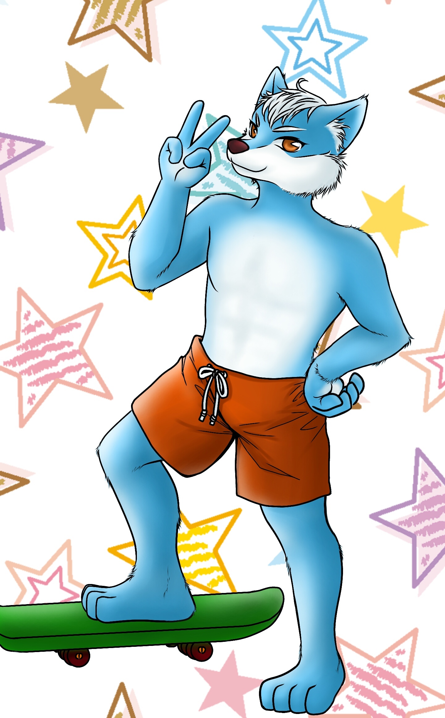


Nice clean lines, the pose is a little stiff, like he doesn't have all 3 dimensions. try exercises like this:
simplify your figures to simple 3d shapes then try to move your "camera" around to be able to draw and pose from any angle and train your brain to think about that 3rd dimension.

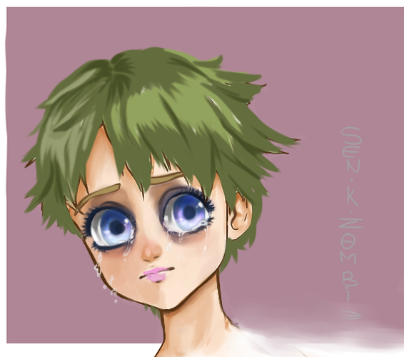
cute colors, love this. It's feeling so soft and calm, but it's very different from the first one. Did you use some kind of reference for it? your water coloring is beautiful anyway, but there are some beautiful properties to this medium that you can use. Perhaps try more changes between different kinds of blues and not just one color in each thing. Try more color mixing that could be fun.
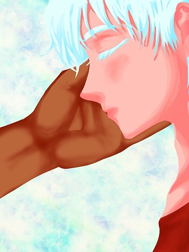
with this one I see you try more levels in shading and you change hues a little which is great. but not in the right direction. everything is bright all the time. and you don't move to the darker colors.
Don't be too afraid to go darker, grayer, or desaturated. if everything is bright then nothing is bright. also the base color for the face is all the way up there.

which means you didn't give yourself enough room to move around with the colors.
Take some photographs of real models and real people, then saple some of the colors around the face. you will see that these colors are not what you expected them to be. I always say that colors are visual tricks in a way.
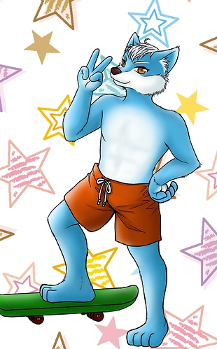
here's my version of this
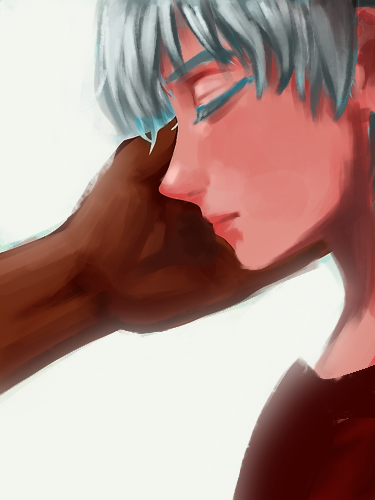
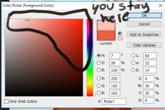
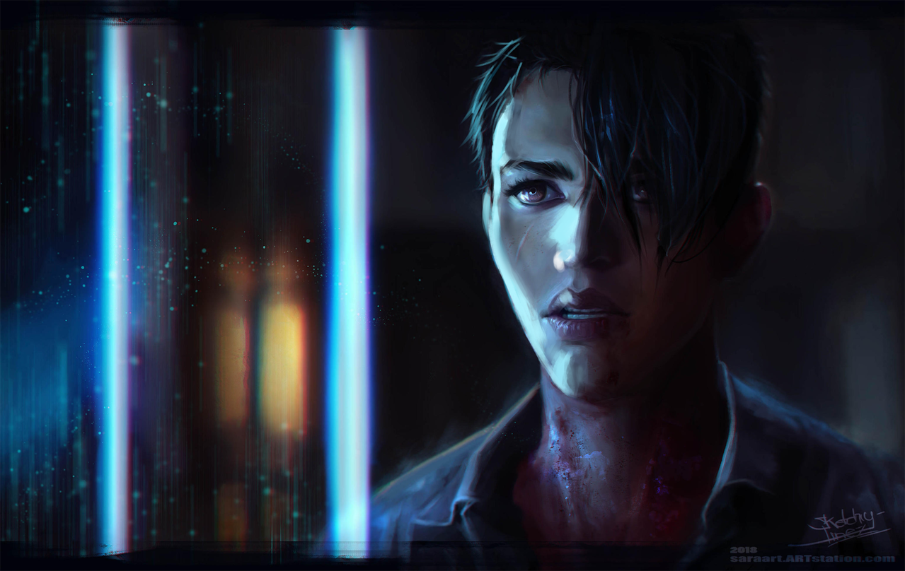
First I duplicated the drawing, muted everything, then set it on multiply so now the whole thing is darker.
I gave him more chest so he can have lungs... the color white in the hair needs more darkness to appear white (yes... I know)
I desturated the skin a lot more so that I can add highlights to the brighter areas of the face, but it could do more if you ask me. The face is too red but maybe that's the character's design? I added more contrast to the hand. and I think you wanted the background to be light? so I made it glow. Either ways you don't need all these small details in the background they are distracting.
TL;DR make the shapes 3d, mix more colors, use darker tones to make things appear lighter. Avoid using the brightest colors immediately.
Hope this helps 

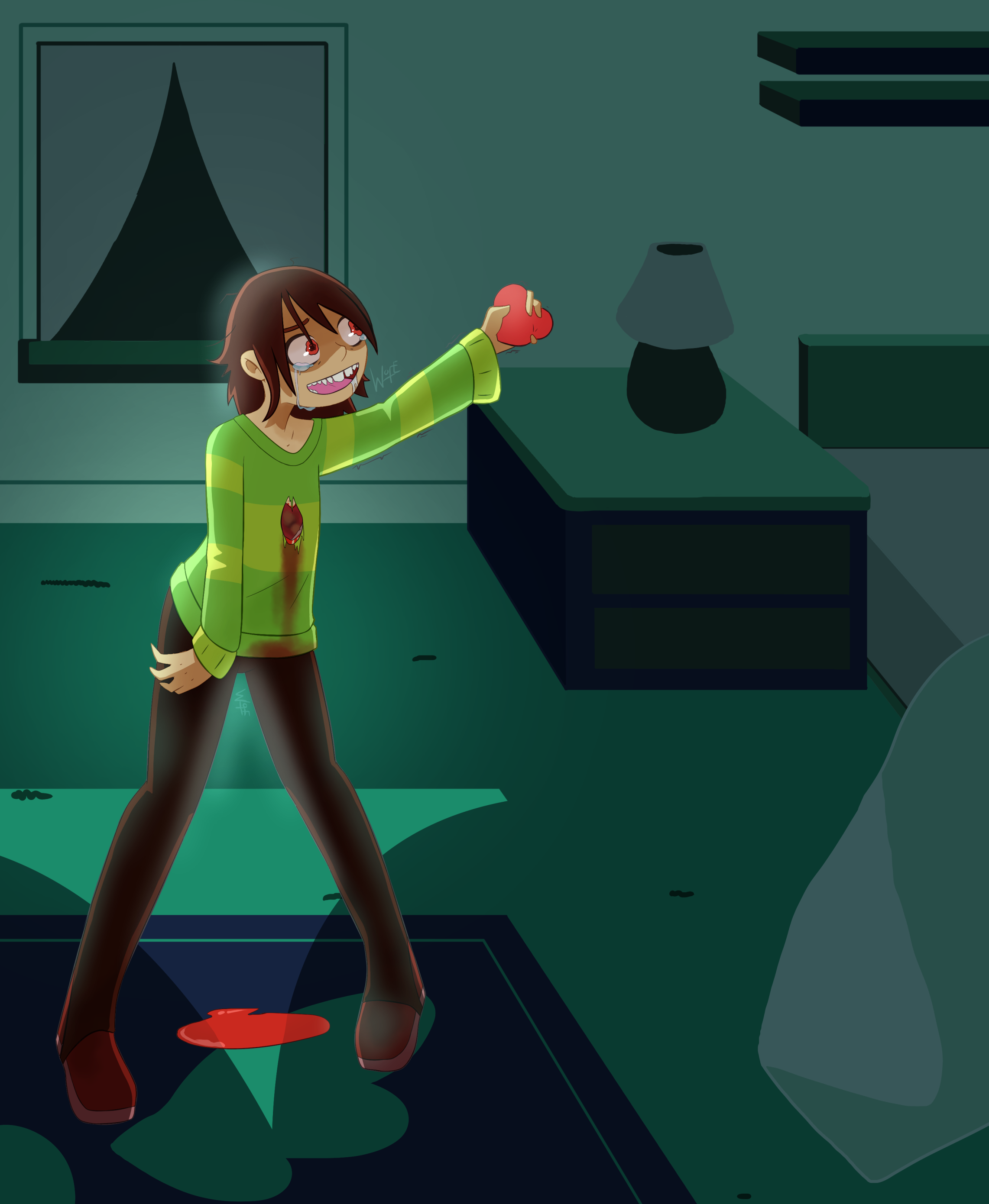
Nice background, simple and easy. I like this and it really shows how creepy that scene was ;v;
the perspective looks off. the camera is looking down at the floor, so we should be looking down at Kris. But he is drawn from straight ahead.
The lights and colors are sharp, but the glow is soft. So you have to pick one. also the light is coming from the window and yet the window itself is dark. we see the light of the window fully on the floor, if any of it hits Kris we should be able to see his shadow where the window shines on the floor.
The blood is too bright. it's darker, and should be absorbed a little by the carpet.

so I improved some lighting and gave kris more shadows opposite to the light source as well as darkening the whole room to point eyes to the center, and make it look like the window is illuminating a little bit. Hope this helps
I really love your work btw
Thank you for your help! I'll make sure to remembering your words. ^^
You could say that all of the above is my first time. First time doing anthro, first time doing watercolor, first time doing lineless, and I wasn't really looking at tutorials or model, so basically I don't really know what the heck am I doing. ^^;
I'm still trying them out, and don't do coloring (digital or traditional) often, so I'm kinda stuck in that aspect.
Thank you once again for the tips, and also, your version is very beautiful.

Honestly I love it!
I don't know what to say to make it better I already like it, I think you may need someone professional to give you feedback.
all colors are flat though. would you want to move on to a more painterly style or is this good enough for you?
Oh wow!! I wasn't expecting something so in depth XD
But curses.... perspective
This was really helpful though! The brighter light contrast definitely makes it look better .3. Thank you!
//and also thank you for the compliments lol
Here I go XD my character Keiva. Also your art in your comic is very neat! I like the warm colors :]

The recent problem with my art I have faced just today:
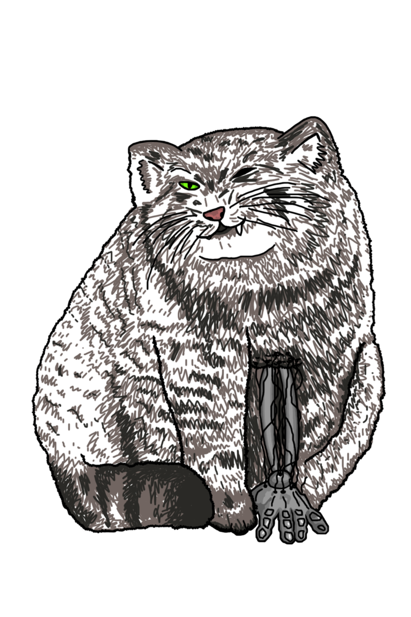
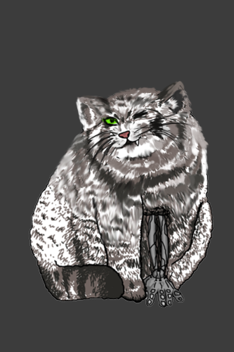
I wanted to make this cat looking furry, but instead it looks just fat...
 It has been turned out that I have no idea how to draw fur prettily and efficiently. I've spent a two hours or so to draw all these dashes, but they still look very rough.
So I would greatly appreciate an advice from the professional, about how could I draw this dude better!
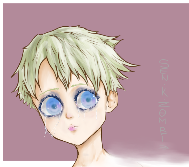
The skin is too light and samey, don't be scared of using stronger colors, I had to draken everything so I can have more room to shade and highlight areas. The mouth is cute, but too small, made it slightly bigger. the nose was from the wrong angle.
they eyes are stunning, but the eyelashes are too messy, the eyelashes grow on the direction the skin takes. and btw skin wraps around a ROUND eyeball, you can see that on the left corner of the left eye. Also the style of the eyebrows doesn't match the face. you can do a lot with the eyebrows to show an emotion as well, they could be very expressive.
Cool trick: to make sth brighter make things around it darker. which is what I did with the eyes. the top eyelid drops a shadow on the purple, use the shadow to create more contrast around the eyes. I made the nose and eyes a little redder to give the face more emotions.
fixed the shape of the neck. nicks get a little wider as we go down, they don't curve. and finally the coloring of the hair and the lines of the hair are not going together, like two separate people did each without seeing what the other person is doing. colors need to add form to the shape, to show where the hair comes out of and in what direction it's moving. I hope this helps you! your colors are cute I'm sure you can improve so fast!
Here's a summary: 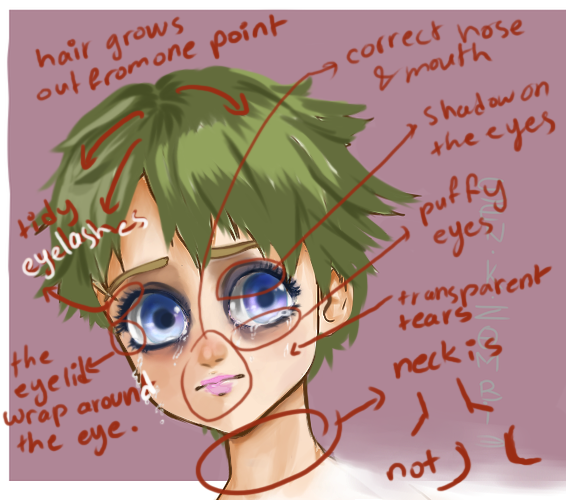
How could anyone criticize that??
Me... I would. lol
now I'm not that great with sharp edges, so I'm doing this my style. fur is soft and fluffy anyway so
I didn't finish the whole darn thing but I'm sure you got the idea. grab a bigger soft brush and save yourself the time and effort. I even saved even more time by using the smudge too in photoshop. i never owned a cat so i don't remember how they looked like. I followed your colors placement which was excellent.
BUT WAIT we can take it a step further by adding a new layer on top of it, lower the opacity, set it to multiple, and with a grayish brawn and a semi soft brush...
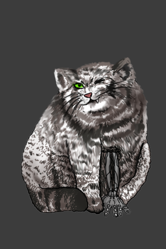
add a bit more shadows cuz I love me some 3-dimensionality
it's not too heavy, but still adds a little to this
I do have a question about shading and highlights for darker colored skin!

I'm currently using a darker purple for shading because I feel that a darker brown will wash out her face. As for the highlight, I'm not sure how light works on dark skin tones.
Any advice would be appreciated!