Your horizon line is really, really high, so that we're looking down at the scene in 1 pt perspective--and I like 1 pt perspective rather than 3 pt most of the time, so that's OK, but seeing 3 sides of the wall at once makes the room feel really massive. Make our people seem itty bitty. Something that I find helpful, is to maybe not do 3 sides unless you need to indicate the massive size (like the stuff on the left--that's not necessary, you can crop that left side entirely, imo)
And another thing I like to do is measure perspective from one back corner point, so that way, all the furniture, the doors, the ceiling--they all relate to one place. I'll show you what I mean because it's awkward to explain.
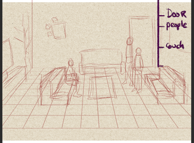
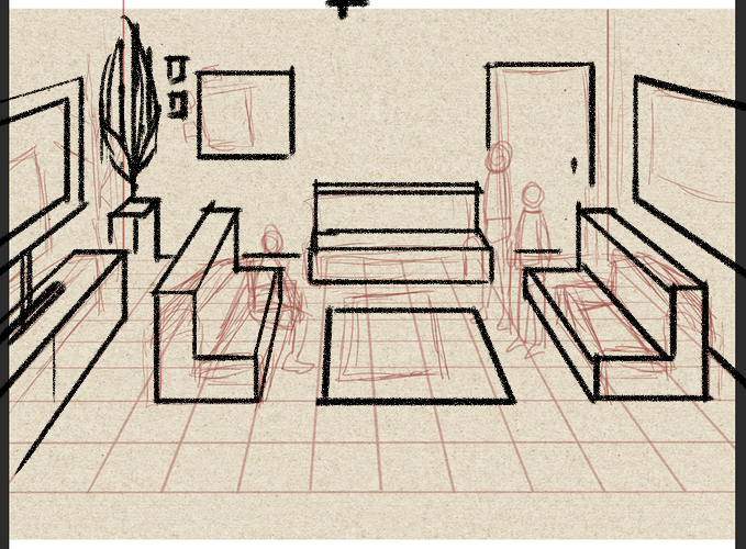
First off I did find the spot where our 1 pt perspective comes from, but didn't mark it until later--but you really need that spot. It's hard to draw just on a floor perspective, you always need to go back to that one spot.
So in a back corner we figure out the landmark heights of everything in the room, and I've marked that in purple.
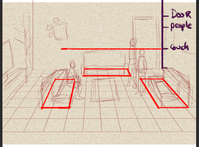
And on our floor plan we figure out the placement (this is the couches.) We'll extend out the line for couches along the back wall to use later.
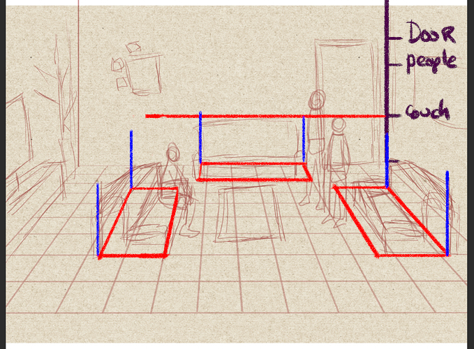
We'll draw some lines upward, since this is 1 pt and we know that up is always a 90 degree angle, and so we don't have to measure from a point in the sky. Just always up in straight lines. These will mark the back of the couches. But, while that works well for the couch touching the wall in the back, how do we connect these central couches to the height in the wall?
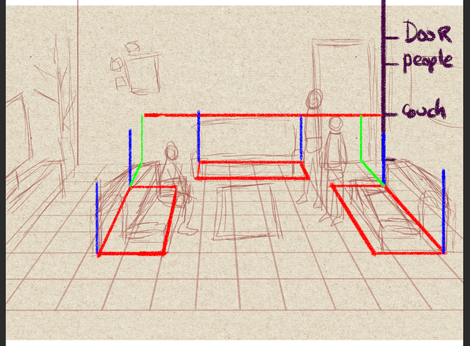
We extend the line from the couches in the middle of the floor to the back wall, so we can create a square in perspective that will be based on the height we made in that original reference corner. Which is easier to see than to explain.
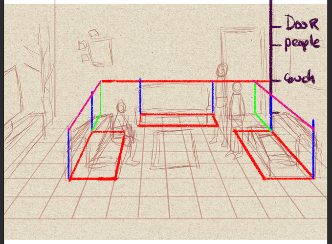
So now all our couches are the right height, and we can do this. (I did this really rough, since the couches are round anyway and this is just a base grid)
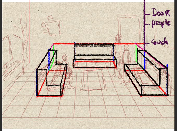
And using that we can do this (I've actually marked my reference point in this one, which is that little T on the top)
And then finally, we can fit the people in it with that same method of referencing that back corner.
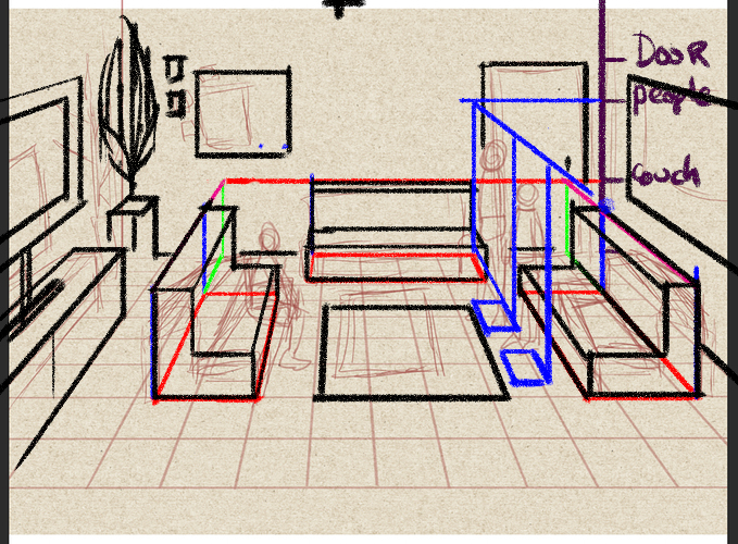
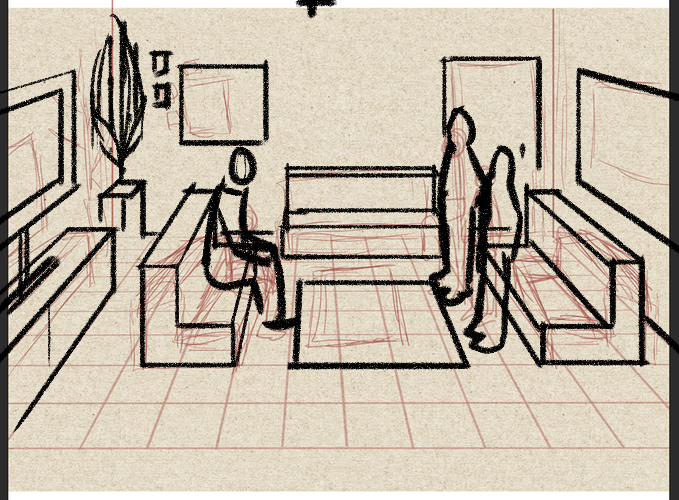
(I made the sitting guy kinda big but wtv) So I think you were getting there with the floor plan in perspective, you just needed to get that height also in perspective.